(Archive) Advertising District / Dreamport!
-
 31-January 08
-
 Coaster Ed
Offline
That last screen... I don't like the building, but everything else about it is lovely. It just looks a little flat and uninteresting, from this angle anyway. In context though, with other buildings around it not seen in this screen, it might work well though so I guess use your own judgement. Judging just by this angle though I think you can probably re-do and make it better. Especially having seen your other screens.
 -

 Austin55
Offline
wow, I hasnt realized how far along you were. I loved the last update aswell, this is really fun to watch.
 -

 Cena
Offline
I don't like it JK, you have been lazy with the screen and it shows just that. You should have put some extra time it, to buld the things under water as well.
 -

 Liampie
Offline
Awesome as always, but not your best screen at all.
- Build underwater
- The waterfall looks bad from this angle
- The plateau is too high to be flat IMO. Not unrealistic or whatever, it just doesn't look right. Might be the bareness though... Some land elevation or simple foliage will probably solve this.
- The cow is too skinny
- Nin has a point about the foliage.
The overview is amazing! And good luck on finishing! -

 BelgianGuy
Offline
I like it but it looks less finished than your other screens so far...
Still looking forward to seeing this on the front page -
 Splitvision
Offline
Overview =
I'm with everyone who has pointed out that the waterfall needs refinement. For such a small scale waterfall you'd almost need 1/8 water/land pieces to make it look good. The arch where over where the coaster comes out from needs bulking up, (I know that can be very difficult when it's diagonal), and also where it joins the T-shaped land pillar. And yeah some sparse foliage on the plateu would be nice IMO. I can also say that I agree a bit with Coaster Ed on the building, have you tried to add trims to the roof? Might give it that little extra I feel it needs. I don't like the all-brown awnings either, I think white would work well there. Some stuff underwater, as mentioned, would also be an improvement. Oh and for the cow, I think just doubling the deco pieces would thicken it enough, if you haven't already done that (hard to tell from the angle).
A lot of points but I think it's good the community is pushing you to do your best
-
 Peeee
Offline
What I love about your screens is that everything flows together so well. I love the building in the last screen cos its so well integrated into the landscaping. Also love the coaster interaction, agree with Liampie and Cena though that you're missing some underwater work.
 -

 Cocoa
Offline
thats pretty good, although the landscaping is a little too barren for my tastes. I can't believe this is nearly done!
 -

 J K
Offline
Neither can I! Thanks a lot guys. I will get round to replying after a few more comments. Louis's post certainly gave me a lolcano!
 -

 Kumba
Offline
This project is really looking good. Loved that helicopter update and this new one looks great two. Got to love cardboard sheep
-

 J K
Offline
16/12/10
Wow this thread hasn't been updated for a while. Possibly the last update of this, I'm not sure.
The Little Shop of Horrors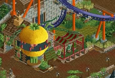
Here we can see a shop based off the common story in the Twisted Acres section of the park. The Little Shop of Horrors sells fake plants that look real scary! Buy one, at a sensible price to scare your parents, or for a true memento of your days experience. Towards the back we see the terrifying B&M flyer Lycan!
Grand Central - 100%
The Enchanted Valley - 100%
Agrabah - 90%
Deep Sea Legends - 75%
Old Town Mexico - 90%
Twisted Acres - 80%
Park progress. . . Not telling you
Please comment as always and show some love. -

 Louis!
Offline
I dislike the mouse track used. I dont think it adds anything to the screen so isnt needed. The brick walls around the path also seem too thin, maybe use RCTFan's deco blocks to make it a thicker wall and less paper thin.
Apart from that, it's a cute little screen. -

 Splitvision
Offline
(100+100+90+75+90+80)/6 ≈ Average park progress = 89,16666666666667%
I love it. The unusual colour combos, the coaster interaction, the cute archy, the foliage... Great job. Some vines on the grey stone wall perhaps?
 Tags
Tags
- No Tags

