(Archive) Advertising District / Dreamport!
-
 31-January 08
-

 Casimir
Offline
I'm pretty thrilled about that helicopter ride. and that's a thing you don't hear from me very often. xD
The custom traffic lights struck me at sight, what is their purpose?
Overall, I'm loving the atmosphere. If this doesn't get spotlight, you'll be seeing me dancing in front of Buckingham Palace, wearing nothing but a Union Jack xD -

 J K
Offline
Lmao! It's just a themed eatery. I didn't want to build random architecture so I want to give each building an identity and let people delve into my work a bit more.
Keep the comments coming guys. -

 nin
Offline
First off I'm really loving this "everything built on top" style that's working here. Many are saying it's cluttered, but it's just a bit unrefined at the moment. Specifically the left side, it just seems rather sloppy and rushed. The brick work seems rushed and just doesnt flow at all, and the brick archway seems like an afterthought. I'm sure none of this was that, but in the overall picture it seems so.
I do however like the 3D cloud portion, it works well here, and the red tower almost gives off a nice Jules Verna feel to the area. -

 Milo
Offline
The gray brick is holding this back a little bit. It causes the metal bits of the tower, tarmac and the cement floor on the top left to blend in too much, creating a closed feel that makes the area feel more constricted than it really is. The street light is a little iffy as well. With your skills I think you could make a fully custom version that looks better.
It's all still very nice though. Cool use of a neglected ride in your park. The tunnel for it is very cool. -

 Goliath123
Offline
Everything is awesome, except for the stairs on the left, surely a custom path would look better?
 -

 Fisch
Offline
I really love that there's finally a little more color in the screens. I don't know if you remember my complaints about there not being enough color (especially red) but it's good now.
 The only real complaint I've got is that the stairs still have the standard railings. Besides that it's great!
-

 J K
Offline
Fisch I've learnt from that talk we had and there is a lot of colour everywhere thanks to your feedback. That really helped so thank you.
 -
 Wanted
Offline
So clean and fresh. The whole stoplight thing is so cool and original. I can't want to see what you do with that empty area in the back of that screen
-

 Cena
Offline
The screen looks good, but you can clearly see you haven't played much lately, you are a bit rusty. The screen looks a bit messy and I hope you can clean it up a bit. The ideas are very awesome btw!
Now give us a better, new update on the next page please! -

 J K
Offline
Thanks for all replies so far. Just to show how crucial the feedback has been, here is a before and after shot showing all the changes made thanks to NEs Crit. I don't know what I was thinking before. I'm so rusty.
Before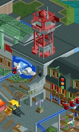
After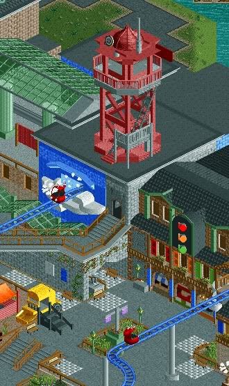
Thanks to;
Posix and Steve - I've changed some of the paths and de-cluttered the foliage so more grass is shown. It doesn't seem so texture heavy now.
Rmm, Liampie, Goliath - The pathway is now a lot more refined. I've added posters on the wall for more marketing for the attractions in the park.
Splitvision - I haven't rotated the planter but I have given it a grass surround so it doesn't clash with the paving or seem like an after-thought.
Dr Dirt - The railings have been changed to blend in more. I have also tidied up the left side.
Nin - The brick work is now supporting the building rather than standing out in a messy way.
Milo - I have opened up the area so it doesn't give a claustrophobic feeling. The streetlight unfortunately hasn't changed as I don't have a spherical object that looks good where I want to position the base of the traffic light.
Cena - I agree I am rusty. I need to step it up to make this park even better.
I have also added a stand for ketchup and mustard for the eatery; I felt it needed another little detail.
Thanks to all for the crit. I hope you can see I always listen to every comment and take it onboard to create better work. It's certainly helped a lot so thank you.
Also thanks to Sssammy, Louis, Xophe, Six Frags, RCTNW, Casimir, Fisch, Wanted, RCTFAN. -

 Liampie
Offline
It looks a lot cleaner now, well done. May I ask what the red tower is supposed to be?
I forgot to say: Grand Central has been my least favourite area, being more dull/boring/generic than the other areas. After this update however, that changed. The recent screen looks more urban than the previous screens, it actually looks like the area has a theme rather than just a style. -

 J K
Offline
^ Yeah I've been trying dam hard to cram a theme in there and it's working. The red tower is a radio mast to direct helicopters around the area. It's not working but it's just for show and to break up the flat roof.
Thanks for the replies guys. More would be great. -

 J K
Offline
22/7/10
Since it's my birthday and I've had a few here I just thought I'd surprise you all with an update. As you can see the park is moving pretty quickly as I have my mojo back.
Griffin and Jack and the Beanstalk
Here we have the first coaster advertised for the park. Griffin is an Arrow custom multi-looper with 6 inversions. In this screen we can see the lift hill in the background with the coaster racing over an airtime hill into the loop passing under the Billy goat-gruff Bridge. The dense scenery around the coaster transports guests to the days of mystical beasts and honourable heroes. We can also see the Jack in the Beanstalk observation tower which gives a great sight for guests not wanting to ride Griffin. After that we can see Daisy the cow around Jacks farm; a scenic piece to support the observation tower.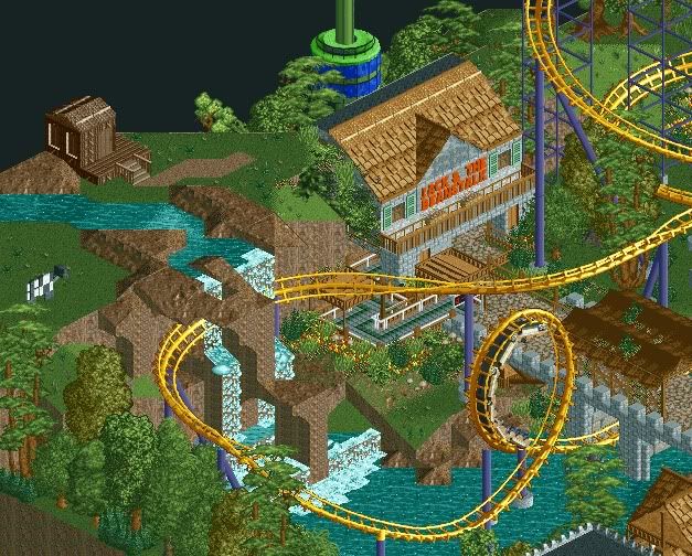
Grand Central - 90%
The Enchanted Valley - 90%
Agrabah - 90%
Deep Sea Legends - 50% (Guest spot pending)
Old Town Mexico - 85%
Twisted Acres - 40%
Park progress 84%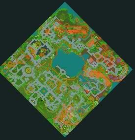
Seriously guys its close.
Please comment as always and show some love. -

 nin
Offline
Nice update. Awesome colors for the coaster, the Jack and the Beanstalk observation tower, everything. Might want to feed the goat though, looking pretty skinny at the moment, but nice detail there. Maybe, and this is a very slight maybe, darken some of the trees as that particular shade is getting a bit overused.
 -

 postit
Offline
Looking good, there, buddy. I think the waterfall can be improved upon. It looks a little unnatural. Great coaster interaction. i like what I see of the supports. I think a blue or pinkish color may help with the flowers. They sort of blend in now. I like flowers to have a nice contrast. Like the style, though. Another really nitpicky thing is the little white water tile on the half grass tile. That's really up to you but I would lower the grass land piece to water level and then use 1/4 dirt blocks, if that makes sense.
 -

 J K
Offline
Just another thing. The very first post in this topic has been updated with all the screens ever shown just so you guys can see everything that will feature in this park.
 Tags
Tags
- No Tags
