(Archive) Advertising District / Dreamport!
-
 31-January 08
-

 J K
Offline
Thanks a lot guys. The party still goes on in this thread and I think the community deserves another screen.
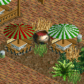
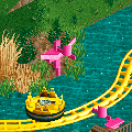
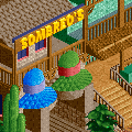
So far we have
-a sombrero stand to buy a great memory of the day.
- a splash point where Flamingos shoot water at the guests.
- Also added is a seating area were huge bowls of Mexican Gazpacho are kept. Mexican waiters walk around the seating area serving the guests when they want more.
Reply time!
Liampie - Don't lie you know you love the sound.
Cena - But you won't just be getting one teaser
Nin - Thanks dude, I don't blame the bench as I'm still really happy with it but I think the rounded roof makes up for the basic look of the top of the sombrero.
Dr dirt - I tried that first but they looked like I was selling wedding hats. I think this version looks a lot better.
Alpengeistfan1 - Thanks, all these teasers are leading to one screen that everyone has been waiting for. For a long time as well i must say.
Nin - I'm sure your'll manage them Can't wait to see how you do them though.
Nokia - I fully agree. An expensive one though.
In:Citties - I can too but I didn't like they're necks black as well. If you look on the flamingo closest to the bottom there is a flash of black near the very bottom of his beak. I've used Xcoasters letter line objects to try and give them that hint of black. Also thanks a lot for your comment. I feel very privileged.
][ntamin22 - I agree a cone shape would be ideal but I've maxed out the objects i can add to the bench and I'm not sure what shape would be better replacing this. Either way the sign (even though spelt wrong) makes up for the shape. The bigger version of the sombrero in my park is much better as it's allowed me to shape it a bit more. Thanks for your constant feedback, its much appreciated.
Louis! - You always know the right things to say lol.
JDP - I know Cena reminded me when I just posted. Massive dumb moment there.Still thank you. I hope the final piece gives you the same thoughts as well.
Theres still more to come guys
-

 turbin3
Offline
All pictures looks great, I just dont like the yellow looping-rc-track.
Why dont you make it invisible?
-

 J K
Offline
It will be invisible after Robbie and I theme it all. It's just so we know where to place objects and such.
 -

 Cena
Offline
Great way of advertising btw
 .
.
Oh guys, I know J K has a few more left, so if you are still going to post on-topic, we get more to see .
.
btw, J K, Turbin3 has a point with the yellow track, to make it invisible, make sure there aren't any hidden elements in it and use change the tracktype of that rc coaster to crooked house, that way it gets invisible)
Edit, too late.Edited by Cena, 11 January 2010 - 07:27 AM.
-

 turbin3
Offline
JK, there are some forbidden elements to make it invisible, as far as i can see.
EDIT: Fuck you Cena You were faster
Edited by Turbin3, 11 January 2010 - 07:29 AM.
-

 Louis!
Offline
I hope I can get a pink sombrero.
See, I do always know the right thing to say
J K, the ideas here are just as fabulous as they are throughout the park. I am so glad you got your mojo back, you have always been a fond favourite of mine and this park is just making me love you even more. -

 trav
Offline
I'm not really that impressed with any of it...
1st screen -
The sombreros don't look sombrero-y, the sign is misspelt, and the buildings look quite basic and don't appear to have any detail on them.
2nd screen -
The flamingos look decent, but I thought they had black legs? There's not really a lot other than that in that screen.
3rd screen - So it's some chairs and a couldron (sp?)...I don't see why people are getting excited about that? :S -

 J K
Offline
Trav all I'm doing is simply posting some of the ideas people have helped me with. Some are my own some are others ideas, the structure itself is pretty nice but such a small screen doesn't do it justice whatsoever. These screens aren't set to impress but just highlight the fact I'm building so I'm saying thanks to everyone.
Also if you see the concept of this thread each idea is behind a small teaser which I keep adding every now and then. It's just to highlight my thought process more than anything else. -

 Six Frags
Offline
trav, on Jan 11 2010, 04:54 PM, said:

Exactly what I was thinking..I'm not really that impressed with any of it...
1st screen -
The sombreros don't look sombrero-y, the sign is misspelt, and the buildings look quite basic and don't appear to have any detail on them.
2nd screen -
The flamingos look decent, but I thought they had black legs? There's not really a lot other than that in that screen.
3rd screen - So it's some chairs and a couldron (sp?)...I don't see why people are getting excited about that? :S
Also, on that flamingo screen, maybe have them a white/beige beak and more curved forms:
(since everybody is posting images here already )
)
Now it reminds me more of a pink cross than a flamingo..
SF -

 J K
Offline
^ Ding ding ding we have a winner. I did know some people would view the teasers in this way though.
The party still continues!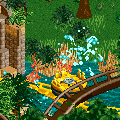


So far we have
-a sombrero stand to buy a great memory of the day.
- a splash point where Flamingos shoot water at the guests.
- Also added is a seating area were huge bowls of Mexican Gazpacho are kept. Mexican waiters walk around the seating area serving the guests when they want more.
- Also a splash section which is one of the highlights of the ride. You cannot see any details as I'm saving that for the release but all this screen is Robbie's work. The dense foliage and use of detail really adds to this section imo. -

 trav
Offline
J K, on Jan 11 2010, 09:09 PM, said:

I did know some people would view the teasers in this way though.
That's because generally, when people want to show their work, it's because it looks nice, not because of the idea behind it. Even with the ideas, I'm not completely impressed and bowled over. I guess you can't impress everyone though. I normally really like your work as well, so it's not just that I have a dislike to your work or anything. -

 Louis!
Offline
I'm still waiting for you to offer me a guest spot
Nah, I don't want to see the park in full until its in the release prep being prepared for spotlight
-

 Comet
Offline
^Yeah it does
Parks looking great by the way
As long as the coasters are good too I see this park being one of my favorites -

 J K
Offline
The party rages on throughout the night!
Although this will be the last teaser you may be seeing a shot of a coaster sooner than you think.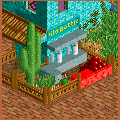


So far we have
-a sombrero stand to buy a great memory of the day.
- a splash point where Flamingos shoot water at the guests.
- Also added is a seating area were huge bowls of Mexican Gazpacho are kept. Mexican waiters walk around the seating area serving the guests when they want more.
- Also a splash section which is one of the highlights of the ride. You cannot see any details as I'm saving that for the release but all this screen is Robbie's work. The dense foliage and use of detail really adds to this section imo.
- And last we have a smash the tequila bottle game where the chance is there to claim your prize! -
 RCTCA
Offline
That new teaser is amazing. The use of those stacked cannonballs as things to throw at then bottles is just incredible. Beautiful.
RCTCA
Offline
That new teaser is amazing. The use of those stacked cannonballs as things to throw at then bottles is just incredible. Beautiful.Edited by RCTCA, 11 January 2010 - 08:24 PM.
 Tags
Tags
- No Tags


