(Archive) Advertising District / Dreamport!
-
 31-January 08
-

 J K
Offline
Wow Robbie, Grabster the screens are so dam helpful. Thankyou very much. I'm working hard as we speak to repay the community with a screen from one of the advertised areas already just to say thank you.
Sammy what is MoH:RS? -
![][ntamin22%s's Photo](https://www.nedesigns.com/uploads/profile/photo-thumb-221.png?_r=1520300638)
 ][ntamin22
Offline
I think I know what you're talking about, but none of rising sun took place in mexico :/
some of Robbie's pics actually seem more european to me- particularly vienna / vilnius. That sort of pastel rococo church is all over poland / austria / lithuania.
the pics robbie posted are a weird spanish colonial / rococo mix. -

 J K
Offline
Time to tease. Thanks to the community I have gotten outta my slump and I am building happily towards completing this Juggernaut. Anyway from all your amazing ideas I feel you need some back just to say thank you so now.
Update Time
-

 Liampie
Offline
I hate these stupid mexican sounding guitars in my head. Thanks J K, I can't get to sleep now.
 -

 Cena
Offline
I hate these stupid mexican sounding guitars in my head. Thanks J K, I can't get to sleep now.
If you went to bed before J K posted the teaser, there wasn't even a problem .
.
It looks okay ... , 14400 pixels is kinda small for judgement. But I understand it are teasers. -

 J K
Offline
Like the title says, post your thoughts and you can get another screen. Then keep going and then another one will appear and so on and so on leading to one big screen.
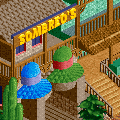
Oh also massive fail spelling Sombrero's wrong
-

 nin
Offline
Though the actual texture of the hats somewhat restricts the sombrero "look", it's all really good.
 -

 Cena
Offline
Like the title says, post your thoughts and you can get another screen. Then keep going and then another one will appear and so on and so on leading to one big screen.
Oh also massive fail spelling Sombrero's wrong
I told you that of the sombrero's on msn
New teaser please. -

 dr dirt
Offline
maybe try shortening the top of them. they look a little out of proportion. new screen please.
 -

 J K
Offline
^ Ok as I said there are more to come. I didn't wanna post em all at the same time.

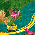
So far we have a sombrero stand and a splash point where Flamingos shoot water at the guests. -

 nin
Offline
Should have let you make the flamingos in Tahendo
Edited by nin, 10 January 2010 - 08:15 PM.
-

 In:Cities
Offline
those flamingos are brilliant.
however, you should think of a way to make their beaks black.
i can:]
oh, and you said Sombreo's. i dont think you would have enough room to add the letter R, but just take out that apostrophe and it should be fine.
unless Sombreo is a person, and owns the Sombrero stand, i dont think it needs to be plural bud:]
either way, high quality work coming from my favorite parkmaker as always.

-
![][ntamin22%s's Photo](https://www.nedesigns.com/uploads/profile/photo-thumb-221.png?_r=1520300638)
 ][ntamin22
Offline
I caught that too. I feel like the texture actually adds to the look. the giant sombreros are usually woven straw anyway. I think usually they have cones on top though.
 -

 JDP
Offline
You still didn't fix the spelling on the sign Johnny boy.
Other then that, you're incredible at this game.
-JDP
 Tags
Tags
- No Tags


