(Archive) Advertising District / Dreamport!
-
 31-January 08
-

 J K
Offline
EDIT-I understand JDP, it took a while but I got it hahaha!
Fantastico- When we built on Worlds of Tim Burton myself and the builders all tried a different style of building where we crammed a lot of stuff together to create a beautiful mess. JDP stated he didn't like our work style like that hence me saying its not a "tim" layout. Hope thats cleared it up for you dude. -
 Timothy Cross
Offline
lulz, I'm a fool. That explains everything.
You're awesome though, this park is amazing. -

 J K
Offline
Lol thanks a lot mate. I'm working on the park with a hopeful update as we speak. Unfortunately I have a few Design briefs/competitions to do so I need to concentrate as it is my final year in uni.
However the park will soon be in the hands of a really good guestspot I'm pleased to have him building on it as he saw the project at the early stages so he knows what I want to achieve.
Seriously thanks for all the comments, they help so much. -

 dr dirt
Offline
The Twisted Acres screen looks messy. Maybe it was just rushed but a lot of it needs cleaning up and refinement. It might just be me because I like things to be cleanly executed, but I really think this doesn't measure up to the other stuff you've shown.
 -

 J K
Offline
New Update
22/11/09
After a dry patch with park making I'm building a lot on this and I have found some cool new ideas to execute. The park is now over 80% with a hopeful release at the beginning of the New Year. Thanks to all for your support so far! This is going to be a park to remember I promise you.
The Haunting of Rose Mansion
The mansion has been quiet for a while. We once thought no one lived there. It did receive a call for a doctor to visit a lady there. Nothing has been discovered concerning her illness but I'm sure the doctors will get back to us soon.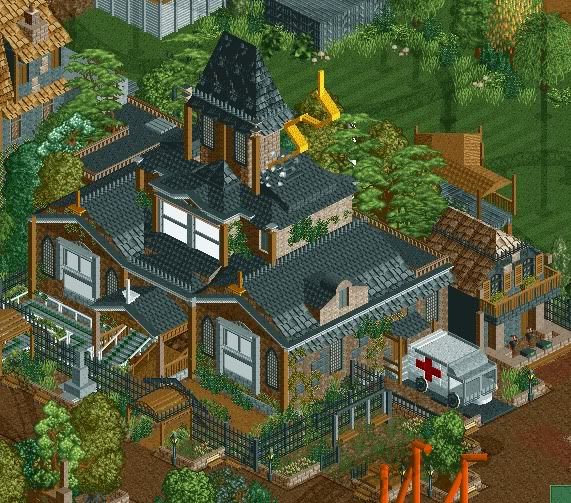
The Haunting of Rose Mansion subjects guests to a mansion dark ride encountering the occupants of the house. Guests have been known to come out in utter silence so feedback is limited for the experience of the ride.
In this screen you can see the mansion itself with an ambulance nearby with actors worrying guests around the area. This gets guests on the edge of their seats before they even enter the ride! Also is a photo shop and video stand so guests can see themselves after this experience. There is also a swing in the mansion garden for the more scared guests to play on.
The windows look wierd at the moment but thats only because they flash. Its much better in game. -

 Cena
Offline
Almost 3 am here and call me crazy, but I do need to reply
You fucker, why did you made the rides invisible? (See trough)
However, the screen looks excellent J K, I really like it, good to see you updated this again We need to talk soon on msn again
Some details I like: The children swings, the ambulance, the little store in the back Nothing to say, that you are doing great with this park.
-

 J K
Offline
The invisable ride is because it features in another area and its not yet themed. It would just be an eye sore so I've covered it up. Also I kinda didn't wanna confuse people with the different coloured coaster because it was bright blue so it wouldn't help the dark theme I'm trying to get across.
 -

FullMetal Offline
You didn't happen to base the mansion off the one in Twilight Town, did you? Call me a KH nerd, but those large windows on the front look awefully familiar...
Either way, it looks great! Love the ambulance. It takes us a little bit away from realism, but it still has a realistic feel. I love that! -

 rK_
Offline
that mansion is ridiculous, amazing work.
are those little mushrooms in the grass near the tree line? -

 J K
Offline
Yeah the mushrooms were a small detail I added with the foliage but i may get rid of them as they don't reflect the theme so well.
Thanks for all the comments so far guys. -

 robbie92
Offline
Like I told you on AIM, OMG! Looks even better with the foliage and swings, but that ambulance is still total ownage.
 -
 zodiac
Offline
Yeah the mushrooms were a small detail I added with the foliage but i may get rid of them as they don't reflect the theme so well.
no, leave them! they're so good there. -

 Louis!
Offline
I dont like the 2x1 tower. It just looks weird imo. But great screen and great idea. Love the ambulance.
 -

 BelgianGuy
Offline
I say the bottom invisible coaster is a flyer with a pretzel loop in the bottom left corner if you look closely
BelgianGuy
Offline
I say the bottom invisible coaster is a flyer with a pretzel loop in the bottom left corner if you look closelyEdited by BelgianGuy, 22 November 2009 - 04:18 AM.
 Tags
Tags
- No Tags


