(Archive) Advertising District / Dreamport!
-
 31-January 08
-

 J K
Offline
Reply Time 2!
Cena- Now why would I be offended by such great crit? I've done a few things here and there and the screen does look a bit better now so thankyou.
Sey - Yeah that spire needs to be changed. I'll mess with that tonight. Thanks for your comments.
Howl - Don't know if you have but check the very first page as i always put my screens I've released in there. Glad your enjoying this.
Xcoaster - That is the best thing I could hear right especially from you. Hope I don't dissapoint.
Inversed - Wow thanks a lot again. (NE is suspiciously too nice lately.) I really don't enjoy looking at spellbrook whatsoever but I wouldnt be better with my game if it wasnt for that park.
Sulakke - Again thanks a lot. That is pretty huge.
Nokia - Not too sure but hopefully you like it.
----------------------------------------------------------
mmmmm I'm debating whether to post a teaser??? -

 misterthom
Offline
awesome screen! I like the idea and theme and you pulled it of perfectly.
I like the fact, you actually ride a broom in the ride. That's just one of those many details
you put in this screen. like many others said. well done on the guillotine and the rack of skulls.
oh 1 thing, i think it might look even better with some lantarns. I think its amazing to be there at dark, with some spooky lantarns in a spooky town. once again: Great screen! -

 J K
Offline
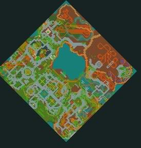
Its coming!
Misterthom - Lanterns! Good shout! I'll be sure to add them soon. Thanks a lot for your comment, glad you notice all the details I'm putting in the park.
Robbie92 - Good shit?
Not sure if anyone can get much from that screen. I'm quite secretive about my work.
Grand Central - 85%
The Enchanted Valley - 90%
Agrabah - 80% (New area announced!!!!!)
Deep Sea Legends - 40%
Old Town Mexico - 40%
Twisted Acres - 20%
Park progress 70% -

 Stoksy
Offline
Looks AWESOME so far, my favourite part is the custom skull. Really cool use of 1/4 tile scenery.Just bringing this over.
It would be nice to see some more pics of the coasters though... -

 Stoksy
Offline
Looks GREAT J K.
Excellent use of 1/4 tile scenery, as well as small things like fire, smoke, and trees.
Personal Favourite=Skull! -

 Gwazi
Offline
why, it'll look no different than the southern U.S.Awesome, a Mexican area. Can't wait for that.
bazing! -

FullMetal Offline
Agrabah! Sweeeeeet. *does KH dance*
Oh, and Guillotine = The shit. Period. Best detail I've ever seen. This is going to trump SS in every possible way. -

 turbin3
Offline

Its coming!
Misterthom - Lanterns! Good shout! I'll be sure to add them soon. Thanks a lot for your comment, glad you notice all the details I'm putting in the park.
Robbie92 - Good shit?
Not sure if anyone can get much from that screen. I'm quite secretive about my work.
Grand Central - 85%
The Enchanted Valley - 90%
Agrabah - 80% (New area announced!!!!!)
Deep Sea Legends - 40%
Old Town Mexico - 40%
Twisted Acres - 20%
Park progress 70%
Bringing it over.
Can't wait to see it ingame.
-

 Cena
Offline
^ How can you build slow in J K his park?
Well J K, it looks fantastic And if you want to have a tester when you are done ... You have my msn.
-

 J K
Offline
Reply Time 3!
Nin - Yeah its proving very tough at the moment as I feel the other areas have more impact. Don't worry though I have a guestspot up my sleeve that will make sure this area is very special.
Stoksy - I agree. I have been holding out on a coaster for you guys for a while. Next update!
Gwazi - You never know. Let him get excited and stop spoiling the fun! haha
haha
FullMetal - You guessed it! Ten points for you! I was meant to build Kingdom hearts for my protour entry but when I lost the file I was very annoyed and vowed I'd do the theme again. This version is so much better.
See a trend by any chance? Spellbrook - Traverse Town, Worlds of Tim Burton - Nightmare before Christmas and Dreamport - Agrabah. Also just noticed your DP. . . . Nice! Oh btw is full metal inspired by full metal alchemist?
Howl - I guess it will be next month sometime but work is going really good. Thanks for the support and awesome display picture!
Fisch - Thanks mate. Hurry up and come on aim so we can talk one day.
Turbin3 - Why thankyou that is might helpful Soon dude! very soon!
Cocoa - But your work has quality which is the main thing imo!
Cena - I'm not too sure either. lol Mmmmm my other tester lined up may have a problem with that lol
---------
Seriously guys all the comments are overwhelming and the past months have been amazing for such effective crit from such awesome players. I'm feeling good about the park hence the kind words.
Keep watching this please. -

 Louis!
Offline
OMG DUDE!! That screen is superb!! You seem to have progressed so much as well. Fantastic, can't wait to see more brillaint screens
-
 Timothy Cross
Offline
I don't know about the layout... might be a little confusing? Just seems most parks are much simpler with the path system.
No worries though, great freaking park... looking forward to the spotlight. -

 J K
Offline
No worries though, great freaking park... looking forward to the spotlight.
Don't jinx me
I guess I can see your point but I redid the entrance area so it would be less confusing for guests. I don't see any problems with any of the areas after that so the main thing is your gonna open this park, see some great ideas, some great rides, hopefully see how much effort I've put into this and hopefully your'll love it just as much as I do.
This is no Zippos in the conventional theme park sense, more of a collection of ideas that I'd love to see in a real theme park. A park that is fun and that is interesting and that hopefully you can imagine being built.
Louis- thanks a lot mate.
Fantastico - Thanks a lot for the comment.
JDP - Lol its not tim busy. Promise. -

 Timothy Cross
Offline
I guess I can see your point but I redid the entrance area so it would be less confusing for guests. I don't see any problems with any of the areas after that so the main thing is your gonna open this park, see some great ideas, some great rides, hopefully see how much effort I've put into this and hopefully your'll love it just as much as I do.
lol, that's pretty much what I was saying. Just feel there's a slight error in layout but man, this park is amazing and no park will ever be perfect.JDP - Lol its not tim busy. Promise.
huh? *confused* hope my idiocy isn't showing.Edited by FantastiCo, 14 October 2009 - 03:55 PM.
 Tags
Tags
- No Tags


