(Archive) Advertising District / Dreamport!
-
 31-January 08
-

 J K
Offline
New Update
21/09/09
Work is progressing just near to the 70% mark. It's going slow for now but I hope to pick it up if I have any spare time at the weekends.
As you know I'm aiming for an end of year release so fingers crossed you’ll be seeing this in a few months. And now introducing a new area!
Twisted Acres
Rumour has it there are monsters around. It's a scary thought but thankfully they only exist in the Twisted Acres section of Dreamport. If guests are brave enough, you can Fight Frankenstein, Whollop the Werewolf and zap some zombies. Thrill seekers can ride the areas B&M flyer; HEX, while also taking on a lot of blood curdling rides.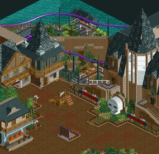
In this screen you can see one of the parks adventure rides. Monster Museum asks guests to escape from the haunted museum by boarding witches brooms to fly away from danger. Guests will battle through the tombs of the mummies, soar through the swamps of the Swamp Thing amongst others, and all while swinging through tight turns and taking on small launched sections.
Around the area is a photo opportunity with the Twisted Acres Guillotine. Rumour has it the stand nearby is for the singing heads taken by the guillotine. Also nearby is the Smashing Pumpkins stand, were guests can win prizes by defacing some spooky orange heads.
Hope your guys enjoy. I know this park is reaching its full potential now.
Just bringing this over. -
 Splitvision
Offline
I have to agree with In:Cities, that guillotine is incredibly well done. I like everything in the screen except for the glass part of the tower, which I don't really feel fits with the rest. Rest is nice as said, keep up the good work!
 -

 robbie92
Offline
Jonny, this is great! You captured the theme way better than I imagined it when you told me. It's like Tim, but better. Keep up the good work...
 -

 Steve
Offline
Great job here, J K. I'll point out some things I personally really like:
a. That tower is fantastic. Great ideas using the scenery you did for pulling it off.
b. Guillotine is a great touch, as well as the rack of heads. Neat storyline for a sweet detail. Those make parks special.
c. The custom fence in front of the queue is a small but welcomed little touch.
d. Great idea with the smashing pumpkins game!
e. Usually I find custom skulls like that to be cheesy, but you made it work.
Some things I might touch up if I were you:
a. First thing that caught my eye was the diagonal wall you used there. It sticks out in a bad way, particularly because I think of it's texture. Good idea using the bricks to break it up, I just think something more could be done to help it out. Not sure what, though. Maybe try and use more foliage to disguise it?
b. Not sure about the colors of the coaster, unless it's purple to fit with some sort of storyline you left out.
c. I'd throw some full tile trees in front of the station, but make it so as to not detract from the tower, which is the focal point of this screenshot I find. Also concerning architecture, maybe you'd want to support that balcony on the left a bit more? I think in reality it might be fine but in the game it just seems a little too heavy to stand the way it is.
Overall, a fine update here, J K, and I look forward to the next one.
-

 JDP
Offline
Looks fabulous J K, just love how you pulled off the theme. Now I just can't wait to see what you do with
-JDP -

 Liampie
Offline
Best screen so far. I love it! The details and atmosphere are great.
Things I like less:
- The tower. The idea is good, but the execution is a bit sloppy.
- The empty tile in front of the skull.
- Windows on the top left building. I just dislike those objects...
As for the coaster, purple looks good but I think dark orange might look even better! Have you tried that already? -

 Six Frags
Offline
Yeah, nice update man! You seem to have progressed from pretty random type architecture to more atmospheric and theme relevant architecture.. It also seems more detailed and aesthetically pleasing.. I agree with liampie and steve on those things they mentioned that could be improved upon, but overall it looks great.. One thing that is starting to get a pet peeve of mine though, are those sides of the paths if you use just regular paths and no path blocks.. But then again, maybe it's because I'm kinda addicted to them, lol
And near 70%?! That's awesome to hear! Especially for a 140x140 park..
Keep it up man, just gotta remember that building on the park sometimes can seem slow, but some aspects of creating a park take more time than others (like architecture>landscaping)..
Looking forward to the next update,
SF -

 J K
Offline
Reply time!
In:Cities - Why thank you very much! Theres some things I could tweak but I'm glad how some of the things turned out.
Comet - Where about is Gwazis? I've looked for it but I can't find it. Can't wait to see yours as well.
Cocoa - I'll mess with it but I like this version as well. The other roof is very tall as I don't have much room left on my bench. I always hate massive surfaces of just one texture so I always try to break it up.
J K- Thanks! Wow do the skulls eyes really flash?
Nin - I thought you were still playing? Hope to see some stuff from you soon.
Splitvision - I think the glass tower suits the screen quite well imo. Perhaps something in side or some more texture would make it a bit more believable. Thanks for your comment.
Robbie92 - Don't I always? Its taken a while to develop this theme as firstly I was going for a different theme which just wasn't working. You know all this anyway. Hurry up and get some time for this park! hahaha.
Steve - Now thats what I call feedback. Thanks so much. I'm worried that I've only shown a little bit so people will miss the little things that I should perhaps explain. I want people to realise there is a deeper meaning behind most of my ideas.
Good shout with that balcony, I'll fix that because it does look wierd. And more foliage will be going near that diagonal wall. Thanks a lot for your comment, its awesome you could leave such detailed crit.
JDP - Yeah this will be a fun ride to theme the rest of it. I've already started on a bit of it but I can't wait to do the rest. Glad to see you following this with every update
Liampie - I have tried dark orange but it was too dark. Tried light orange but it features a lot in the coaster next to it so I want to give identity to the different rides in the area.
Six Frags - Yeah I agree. my games developed a lot over this past year. What do you mean about the paths? The full tile that covers the whole tile instead of the small border?
Yeah 140 argh I'm nearly there and its took a while but I don't regret anything.
SSSammy - Ilysfm2. Cheers for your constant feedback mate!
-

 Cena
Offline
Well, my opinion on the latest screen:
It sure looks like a monster museum, but it seems some things can be better
(the towers, on the diagonal part: You have the sides of the normal 7 roofs brown, if you make them black, it flows better with the objects you have now there (3x diagonal quarter roof + 2x quarter dome)
On the two huts from entrance/exit, on the exit one, you have a bush there plus the brick stones (decorative wall corner is the in-game name). But on the other hut (from the entrance) you don't have this. (I think it is because of rushing things / restarting game after a time?) On the exit hut, you have the arch wall facing outwards on the entrance it is facing inwards. (it looks odd on the exit hut)
At the tower, you have white glass + white glass frames, I think it puts too many attention on it, in my opinion. I think that I would have go for white glass + black glass frames. (just an idea).
At the buildings you have in the top left. It would be so perfect to place 2 benches in that corner between the two. You already have a bit of shelter there from the roof above you. So when it rains, it would be perfect to sit there .
.
The guillotine itself looks pretty good. Really, not too big, and it is a nice piece of theming. But if you look at the screen, that corner is pretty busy already. Myself I would have put it on the lighter brown path in front of the "Museum" sign. There you have a bit more space, and that way it does not look as crammed as it looks now.
Another idea that I think fits this area is a some sort of fire, where Monsters that are caught are being burned on, same as in the middle ages with witches.
Well, sorry if I offend you J K. But I know you love good criticism, even when it is bad. And sorry for typing so many little things. But I think it would be make it even greater like this.
None the less, this is one of the best screens showed last month here on NE in my opinion. Goodluck on the park and when you need help/advice, you can find me hopefully? (AIM / MSN / PM) etc
-
 Sey
Offline
You pulled this theme fairly well off!
I like it so much, especially the guillotine and the skull - kinda authentic! As some may have mentioned, the spire isn't on a par with the other buildings in the negative sense. You know you can do better!
-

 Howl
Offline
Hey- I really love this park! Monster Museum coaster looks so fun to ride. I'd love to see the rest of this park on further updates.
 -

inVersed Offline
Very nice screen JK... what I love a lot is seeing how much you have improved from Spellbrook which is already a great park. -

 Sulakke
Offline
Fix the glitches on the roof of the Monster Museum and you have one of the best screens ever showed.
 Tags
Tags
- No Tags


