(Archive) Advertising District / Dreamport!
-
 31-January 08
-

 J K
Offline

Hey so i took a break from large scale parks to build on other things and get better before I jumped into a massive project again. I felt like i was ready so here it is.
The park map size is 140 x 140 again.
The park will feature 6 areas and 5 have been planned already to great detail.
--------------------------------------------------------------------------------------------------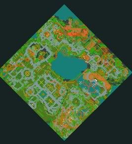
Grand Central - 100%
The Enchanted Valley - 100%
Agrabah - 100%
Deep Sea Legends - 80%
Old Town Mexico - 100%
Twisted Acres - 85%
Park progress - 94%
-------------------------------------------------------------------------------------------------
Grand Central
02/02/08
So welcome to Grand Central ! The grand entrance to the park which features a large monorail system travelling round the map. It's based mainly on architecture and will feature alot of other ideas.
With this solo i want to add alot more clarity and identity to each building. Hopefully i've pulled it off.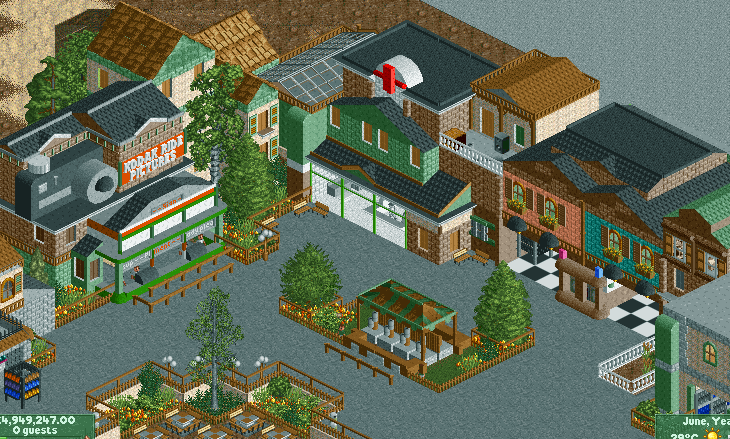
After
11/2/09
Ok so it's been a while. Mainly because I've really wanted to concentrate on university as there is a hell of a lot of work. Lately I've found alot of time for the game and I'm loving it. It's really good to see so many new up and coming players releasing some awesome stuff.
Grand Central - Fly-bye!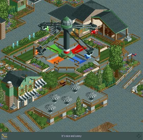
Here you can see the park entrance's Zamperla Aeromax. Fly-bye is a hit for the younger generation and nicely situated next to Diamond's, the parks most formal eatery. It feature's a sitting area near-by so parents can take a break or maybe choose to watch the kids. A nice addition to the park is the statues around the area. These interactive characters can be activated to tell guest's directions or some general knowledge about the area.
22/8/2009
Grand Central Balloon Race
New update! Work is going really well and I'm building a few really cool ideas at the minute. Just thought I'd share this last update for the entrance area and the next time you’ll see a screen I'll have a completely new area for you guys to see.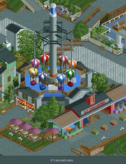
The Grand Central Balloon Race whips kids into the sky to experience soaring through the clouds while viewing the rest of their surroundings. You can also see the Grand Central balloon stand amongst a chance to win some prizes with the local amusements.
11/7/2010
Yet again it's been a while and the park has slipped under the radar. I can assure you now that I have graduated with honours in Graphic Design this park is full steam ahead and I'm hoping to release it in the next 4 months.
Grand Central Copters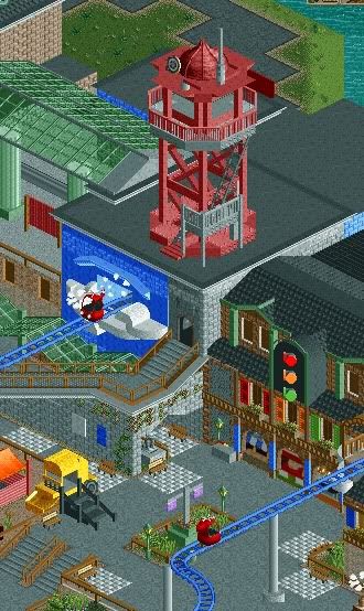
Here you can see another transport themed attraction at Dreamport. The Grand Central Copters take guests through the area moving past cloud machines whilst admiring the busy main street of the park. Nearby is a display stand with flags displaying the current shows at the park. There is also a traffic light eatery near by holding Stop dogs, Ambercrust and Go-go Fries. After that we can see a bulldozer attraction for children to sit in and get they're picture taken as a memento of the day.
-------------------------------------------------------------------------------------------------------
The enchanted Valley is a concept I've wanted to try from Day 1 of playing the game. In my opinion it's my best work to date and the ideas throughout the area are some of my best. The concept is an area based on fairytales and nursery rhymes and is one of the favourite areas in the park for the family to visit due to it's robust themes and characters scattered throughout the area.
1/3/09
Humpty Dumpty
Work is moving at a rapid rate and nearly a month into starting this park from the 5% that it was, a lot of time has moved it up to a massive 25% in completion. Anyway here is a new screen showing a new area that I'm really proud to show.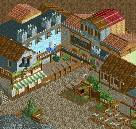
Here we can see one of the area's local eateries as well as the Puss in Boot's fast-track department. We can also see one of the parks family orientated games with the chance to win awesome prizes by knocking Humpty Dumpty off the wall. These shops feature near the outskirts of the area which lead into a mystery region yet to be released.
11/4/09
The Three Pigs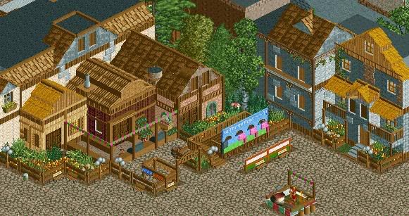
Here you can see one of the valley's shops. The Three Pigs gift shop sells crafts made out of straw, log and bricks. Straw hats, musical pipes and engraved bricks are sure favourites for a memory of the day.
This area also has a fantastic open grill for special hotdogs and ribs that the local chef cooks right in front of the guest's. You can also have your picture taken with Mr Wolf if you’re brave enough.
24/7/09
The Old Lady that lived in a shoe
There was an old woman who lived in a shoe.
She had so many children, she didn't know what to do;
She gave them some broth without any bread;
Then whipped them all soundly and put them to bed.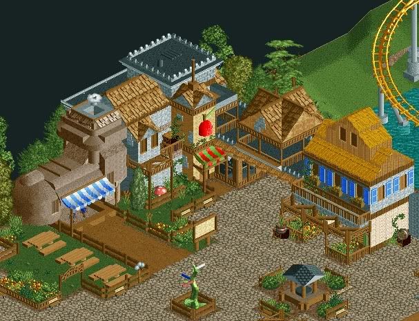
Here you can see left to right;
The Old Ladies broth shop, Snow Whites apple stand and some general architecture.
Near the shops are a seating area as well as a park map, directional sign to guide guests to their destination and Merlins Well.
Rumor has it,to make a wish or cast a spell, you toss a coin in Merlins well.
22/7/10
Griffin and Jack and the Beanstalk
Since it's my birthday and I've had a few here I just thought I'd surprise you all with an update. As you can see the park is moving pretty quickly as I have my mojo back.
Here we have the first coaster advertised for the park. Griffin is an Arrow custom multi-looper with 6 inversions. In this screen we can see the lift hill in the background with the coaster racing over an airtime hill into the loop passing under the Billy goat-gruff Bridge. The dense scenery around the coaster transports guests to the days of mystical beasts and honourable heroes. We can also see the Jack in the Beanstalk observation tower which gives a great sight for guests not wanting to ride Griffin. After that we can see Daisy the cow around Jacks farm; a scenic piece to support the observation tower.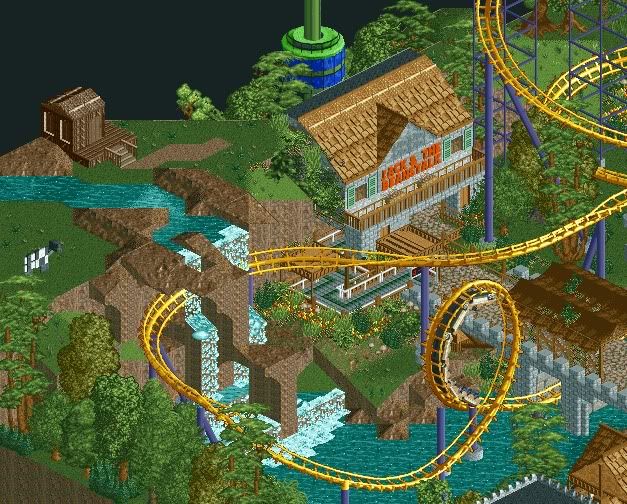
Seriously guys its close.
Please comment as always and show some love.
-------------------------------------------------------------------------------
Twisted Acres
21/09/09
Work is progressing just near to the 70% mark. It's going slow for now but I hope to pick it up if I have any spare time at the weekends.
As you know I'm aiming for an end of year release so fingers crossed you’ll be seeing this in a few months. And now introducing a new area!
Rumour has it there are monsters around. It's a scary thought but thankfully they only exist in the Twisted Acres section of Dreamport. If guests are brave enough, you can Fight Frankenstein, Whollop the Werewolf and zap some zombies. Thrill seekers can ride the areas B&M flyer; HEX, while also taking on a lot of blood curdling rides.
The Monster Museum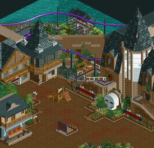
In this screen you can see one of the parks adventure rides. Monster Museum asks guests to escape from the haunted museum by boarding witches brooms to fly away from danger. Guests will battle through the tombs of the mummies, soar through the swamps of the Swamp Thing amongst others, and all while swinging through tight turns and taking on small launched sections.
Around the area is a photo opportunity with the Twisted Acres Guillotine. Rumour has it the stand nearby is for the singing heads taken by the guillotine. Also nearby is the Smashing Pumpkins stand, were guests can win prizes by defacing some spooky orange heads.
Hope your guys enjoy. I know this park is reaching its full potential now.
22/11/09
The Haunting of Rose Mansion
The mansion has been quiet for a while. We once thought no one lived there. It did receive a call for a doctor to visit a lady there. Nothing has been discovered concerning her illness but I'm sure the doctors will get back to us soon.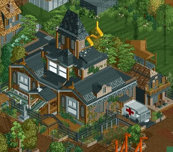
The Haunting of Rose Mansion subjects guests to a mansion dark ride encountering the occupants of the house. Guests have been known to come out in utter silence so feedback is limited for the experience of the ride.
In this screen you can see the mansion itself with an ambulance nearby with actors worrying guests around the area. This gets guests on the edge of their seats before they even enter the ride! Also is a photo shop and video stand so guests can see themselves after this experience. There is also a swing in the mansion garden for the more scared guests to play on.
16/12/10
Wow this thread hasn't been updated for a while. Possibly the last update of this, I'm not sure.
The Little Shop of Horrors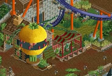
Here we can see a shop based off the common story in the Twisted Acres section of the park. The Little Shop of Horrors sells fake plants that look real scary! Buy one, at a sensible price to scare your parents, or for a true memento of your days experience. Towards the back we see the terrifying B&M flyer Lycan!
04/01/11
It's pretty scary saying this but
Final Update
Banshee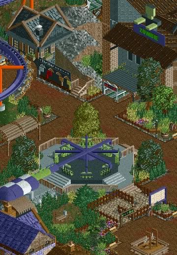
The scariest section of the park certainly holds the most blood curdling attractions. Here you can see one of the parks finest thrill rides cleverly named by what the ride does to it's guests. Guest's have be known to scream at the top of their lungs to try and survive the onslaught of twists, turns and loops. Near-by is a roto-drop named Zombie with a desolate feeling to the ride, guests queue in silence anticipating the huge thrill. After that we can see a few more attractions around the area like graves that were never cleared when the park was built, a chance to get your picture taken dancing to thriller with the man himself, Michael Jackson at the front.
-----------------------------------------------------------------------
Old Town Mexico
The party rages on throughout the night!
Although this will be the last teaser you may be seeing a shot of a coaster sooner than you think.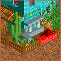
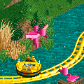
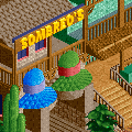
So far we have
-a sombrero stand to buy a great memory of the day.
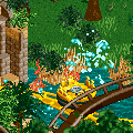
- a splash point where Flamingos shoot water at the guests.
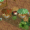
- Also added is a seating area were huge bowls of Mexican Gazpacho are kept. Mexican waiters walk around the seating area serving the guests when they want more.
- Also a splash section which is one of the highlights of the ride. You cannot see any details as I'm saving that for the release but all this screen is Robbie's work. The dense foliage and use of detail really adds to this section imo.
- And last we have a smash the tequila bottle game where the chance is there to claim your prize!
----------------------------------------------------------------------------------------------------------
JK
Enjoy the screen's. -

 StormRunnerFan
Offline
I love the camera. If you could just work on the area where the tables are, it looks to bland. The blue brick wall is also kind of random.
-NoobEdited by StormRunnerFan, 31 January 2008 - 07:31 PM.
-
 zodiac
Offline
Atmospheric, detailed, and a wholesome amusement park feeling. Love it. Especially those little bathrooms with the pink and blue for women and men. Great idea.
Now keep going. -

 zburns999
Offline
I love everything about this screen. Something about your style just works J K. It's so detailed yet so clean looking at the same time.
 -

 FK+Coastermind
Offline
WOW!! awesome work J K!! the identity you talked about defintly is noticable here, and i think is a brilliant idea. with so much detail coming up its such a great idea to go back to the original buildings based completly on whats in them, which i think we loose alot in detail. the buildings on the left are great, i love the camera. the buildings on the right are nice, alittle blocky in that, they have lots of sharp edges, and not alot of windows and other details to smudge that out. im loving the insides to the buildings. this looks like its going to be a great project. can't wait to see some rides!
FK -

 Ge-Ride
Offline
My opinions are pretty mixed. There are some nice details, but the basic architectural shapes seem pretty thrown together and the colors don't harmonize. I may become interested later, but I don't think this screen fully demonstrates your talent.
 -

 Carl
Offline
Good that you are giving each bldg a purpose, I like that. The level of detail, or "LoD", if you will, lol, is just right IMO, but the color scheme seems to be all over the place, a little more consistency in that dept would go a long way to making this screen the shizzle, for rizzle.
 -
 Camcorder22
Offline
All the little details and stuff are nice, but I think the brick wall and tile roof are used way too much. Personally, I think it looks strange if the same wall in a different color is used right next to each other. Same for the roofs I think. After looking at the screen for a while though, the building details make me enjoy the screen a little more.
 -

 Comet
Offline
That seating area is very nice!
Maybe make a different type of path down there though.
The buildings are great, please keep them how they are. -

 Milo
Offline
There are good and bad things in the screen. I love the details and what you're doing with each building.... the camera, counters, racks, doors, etc. all add a great deal to the overall atmosphere and you're doing well in giving each building a purpose. I'm just not real sure about the colors and some of the texture uses. Nothing flows well and there really isn't any harmony or balance from building to building. Also, some textures shouldn't be used with certain colors and I think you need to take that into account. Things like different colored flower planters on a single building don't really help either. I'd say work on that (and get some different flower colors plz) and you'll have something very nice.
 -

 J K
Offline
I did some rethinking and i have changed the colour scheme of some of the rooves. The Bright gold was too bright so I've changed it to brown. It works alot nicer now.
I'll get round to replying soon. -

 ekimmel
Offline
We talked in AIM but I'll reiterate my comments here. I didn't like the roofs and I thought the buildings were too similar in height. Loved the camera.
 -

 Six Frags
Offline
Steve, you contradict your point made in the MM Kumba vs Zodiac topic.
This looks like a themepark how you want them, isn't it??
I really like it J K, it looks a bit like how I'm building my solo currently.. But then, it's way different also..
Nice use of the realistic details, like the shop interiors, map rack etc..
I'm following this!
SF -

 Steve
Offline
That's not why I don't like it.Steve, you contradict your point made in the MM Kumba vs Zodiac topic.
This looks like a themepark how you want them, isn't it?? -

 Cocoa
Offline
Then why don't you give him some constructive criticism, instead of just saying that you hate it.
 -

 Steve
Offline
I don't know, why don't you give him some instead of coming in here and telling me what to do?Then why don't you give him some constructive criticism, instead of just saying that you hate it.
 Tags
Tags
- No Tags


