(Archive) Advertising District / Cedar Fair's El Dorado Peaks
-
 07-November 07
-

 Steve
Offline
Hardly. Apparently you've never heard of Fooz:There is a thing called over-detailing, and your flirting with it.


-

 sixflagsfreak56
Offline
I have heard of him, and love his work, but it fits the theme he was going for. The "over-detailing" work is not what I would consider to be realistic. Realistic is detail, but I think he's over doing it.
 -

 A2nxpimp
Offline
Iknew someone was going to notice the big differenceWow, BIG improvement since Idlewood. Everything looks great, and the woodie looks interesting.
-Funny thing, today I was planning to make a Spanish-themed Six Flags park!
Ok, thanks.i'm loving it.
good work.
Yeah, I don't know though. I usually can't find other ways of trying to make the buildings look more interesting than just blocks of nothing. I'll definately try to cut down on the detail, and make it more realistic from on forth.Hate it to be very "negative", and am only doing that when I think something does have so much potential that it is worth doing that....
This park is a very good start I think, but in my so critical eyes it is turning out messy: you used good/interesting forms, and loads of details... only those details don't seem to have any coherence or real logic.
Difficult to express for me in English as well as because it is so much...
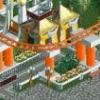
Take the 5th screen as an example ("that's sky transport"): loaded with RCTIP-blocks and the like to make it "detailed", but in form and colour they don't have any cohesion, even not on the same building....: one (on the same building) ends in a curved piece in light brown, another one stops just in dark brown in square, .... on buildings there are those things in two colours in brick, and also in another colour in stone... , etc. etc. etc....
If it is "fantasy" I personally find that ugly (hurts my eyes, these amateurish clashing of styles), if it is supposed to be "realistic" I think even the most-cheaply -themed parks do better on that..
And sometimes less is more....
Now layout and interaction of buildings, paths and rides, as well as forms of buildings all seem great here, so I think it's more than worth it to not just "use details" for the sake of using them and throwing them on, but also paying attention to them, so that they can add instead of just being distracting....
Apart from that...good start!
Emergo
Yeah, I really enjoy the rapids the way they have come out.I am really liking the way that rapids is turning out so far. One of the most promising projects in recent memory, here.
Haha, yeah I tried to include most brandnames that I enjoy myself, even though most of them aren't even sponsored by Cedar FairIt looks like a great park! I agree with Kumba; it deserves an NE release when it's finished! (But I'm not the admin, so... I can't help you there.) One thing I don't like though, are the palm tree planters in the last few screens. The red base just doesn't seem to go well with the trees, IMO.
I do enjoy A&W Rootbeer, though, and the mug on the side of the stand looks neat (it needs a handle, though, unless we can't see it ). I also enjoy Coldstone (which happens to be right next door), so if this park ever actually exists, I would probably spend a good 25% of my time there.
For the woodie station I was going for something like a Cyclone-ish station. Here's a good example of what I'm trying to imitate:better start than most 'zomg look i made a park entrance' AD topics by a good bit. architecture looks solid and well-detailed. the entrance / ticket area would look so much better surrounded by green stuffs rather than dirt.. make it happen.

i love the little touches with the mug and ice cream signs, and if you can hold up this level of detail throughout the park it'll be a winner, alright. The hurricane station building looks like Gemini's, sort of.. i think it is maybe to much white, though it might just be the texture.
http://rcdb.com/ig211.htm?picture=2
Oh, darn. The giga coaster wasn't supposed to be visible.Awesome, the entrace looks great.
The wooden roller coaster is awesome, I want more screens, and the blue accents were really a jump out on a limb. They work great.
The new ride looks cool too.
Also the teaser of the giga coaster is nice.
Yeah, working on the happy-detail issue.I totally agree with Emergo: It's extremely overdetailed and messy, and not realistic.
I never saw buildings like this ones...
The colors should vary throughtout the park. For the main entry I wanted to keep a color that I could use as an accent. Like I said the over-detailing will be worked on. Uhh and, thanks.Wow, I love this! But I do agree with Emergo and Liampie, too overdetailed. Another thing I really don't like is the amount of red, just use some more colors and this project will turn out great! The start of the new attraction with the hack looks quite cool already.
Nice start, can't wait for new updates!
Luigi
I agree that from the current screens I've showed, you can't really distinguish it as a Cedar Fair park. Most of the park should change your mind once it's done. I'm also on the fence with the Cedar Fair brand, I want to drop it but then again I don't. I don't know though.I say drop the Cedar Fair part and make the name just El Dorado Peaks.
This park doesn't scream Cedar Fair at all to me, and they don't really use McDonald's. But if you have some planned attractions that would need the Cedar Fair name then I understand.
I'll include an update ASAP. Right now I'm in the process of moving houses, I'm also working on a project, I have tons of homework due Tuseday, and I have plans to go to the movies tomorrow so yep. Otherwise, hopefully I'll find sometime to update -

 Emergo
Offline
Yeah, I don't know though. I usually can't find other ways of trying to make the buildings look more interesting than just blocks of nothing. I'll definately try to cut down on the detail, and make it more realistic from on forth.
^no, no, I did not mean you necessarily have to cut down on the details, (I love over-using them myself ) just make the details more coherent and flowing and fitting together.....was what I was trying to say....in colour and form.
I don't care either if it's fantasy or realism, even if I am not a great fan of realism I can appreciate it very much if executed well: both can be great, but also both do need some "logic" in their own execution.
And to @ Steve: are you colour-and-form-blind?
If not, you cannot convince me that you seriously can compare Foozie's screens with these ones, Lol! (though these ones also have great potential).
Emergo
 Tags
Tags
- No Tags
