(Archive) Advertising District / New Park
-
 23-September 07
-

 Untitled-44
Offline
Heres a park im wokring on.
the bench is pretty small so it wont take me forever to finsh it.
its about 20% done.
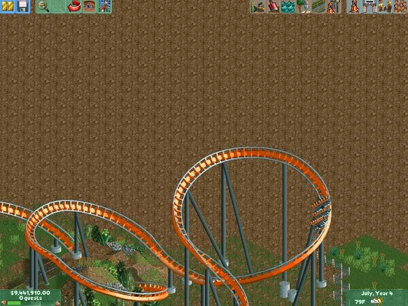
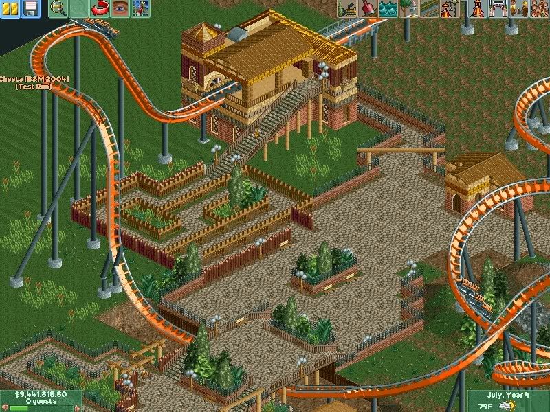
Here are some Screens of the b&m Vertical Drop Coaster Chetaa

Edited by Untitled-44, 23 September 2007 - 04:11 PM.
-

 Comet
Offline
The queue is WAY too short, and the supports at the bottom of the drop need to go.
Other then that though, the station and layout seem nice, much better then I expected. -

 Domino
Offline
I agree with Comet on everything mentioned. The station is nice, but I would make it bigger.
This looks like it could be cool once finished. -

 Grand Admiral
Offline
This is quiet a bit incomplete. You should start adding much more foliage to the area. As Comet said, the queue area is much to short to be realistic. Add more around it and theme it to capacity. I like your track very much so. So far most of what you have built is very realistic. I wish to see more!
 -

 SenZ
Offline
OMFG Oblivion. Griffon.
Im telling!
No way! ChillerHockey33 and 1933.
Seriously!
Ontopic:
The screens looks kinda empty. It doesn't look (and probably isn't) finished, the layout is kinda boring, the station is too small and the queue is too short. And btw: What is the purpose of these poles above the paths? Here's an idea: Define your theme better. I see several different styles in the screens, maybe you should focus on one theme, the Savanne theme or something like that
-

 Untitled-44
Offline
coasteranne-no its not like a sherika clone are w.e. theres no loops.
just a simple coaster.
as for the park:
made the queue longer.
fixed the supports.
and built a new coaster.
 Tags
Tags
- No Tags

