(Archive) Advertising District / W.O.A.H
-
 23-September 07
-

 Louis!
Offline
BEFORE POST EDIT:
W.O.A.H -- 23%
Olde Towne -- 50%
Lost Kingdom -- 20%
Unshown -- 10%
Unshown -- 1%
Unshown -- 1%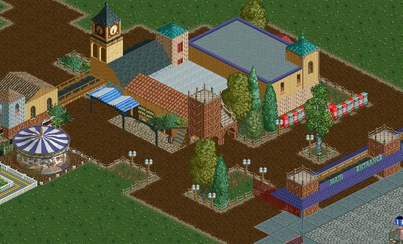
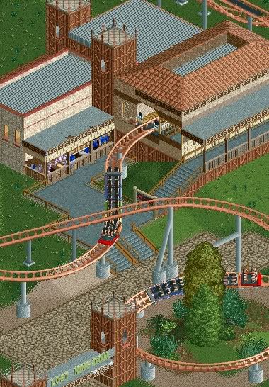
Area names subject to change. Nice and/or constructive comments/criticisms please.
-----------------------------------------------------------------------------------------------------------
AFTER POST EDIT:
I have changed W.O.A.H for the better. After Levis' comment I saw sense and realised that this wasn't my usual building style. None of it felt right during building it so I scrapped it.
Thanks for the comments regarding the pictures above, I didn't delete it so that you could see what the comments below actually refer to.
Anyways...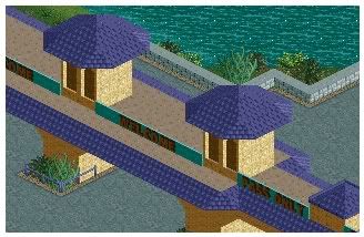
Teaser.Edited by Pineapple, 26 September 2007 - 10:05 AM.
-

 Grand Admiral
Offline
If this is the Oldtown section you mentioned, then I feel really bad for you. Lost Kingdom as well. You need to definently include much more to all these areas.
 -

 zodiac
Offline
I'm gonna guess this is very unfinished? VERY unfinished?
Well, what's there isn't bad, but it could use some refinement. -

 Comet
Offline
There is something about the first screen I really like, do get rid of some of the vending machines though.
 -

 Domino
Offline
^It's reminiscent of RCT1?
Like others have said, it could use more work. Even though it would look good in RCT1, doesn't necessarily mean that the same applies in RCT2. I mean, we have a whole slew of objects to work with now, so don't let them go to waste. Vary things a little, such as adding different textured walls and roofs to the buildings. Shape them differently too.
Otherwise, you have a nice atmosphere going, very nostalgic.
-

 Louis!
Offline
Also posted in first post.
I have changed W.O.A.H for the better. After Levis' comment I saw sense and realised that this wasn't my usual building style. None of it felt right during building it so I scrapped it.
Thanks for the comments regarding the pictures above, I didn't delete it so that you could see what the comments below actually refer to.
Anyways...
Teaser. -

 Comet
Offline
Get some turn-styles in there, but I like the simplicity of it all.
The interaction with the water is a fairly nice touch too. -

 Grand Admiral
Offline
There's nothing much to show for the teaser you have at all. That structure could use a lot more detail to it. As Comet mentioned, turn-styles would work much better with it. Change up the rooves a bit too, there's too much unison which makes it very bland. Actually showing more than a park gate would work too...
 -

 RCTNW
Offline
Not sure what you are going for here as it appears to be unfinished (along with most of your other SS’s). I would change a few things
1 – Get rid of the white roof. Black or gray but never white (unless it can be seen by the peeps and even then only to serve a purpose)
2 – Replace the dirt tunnels with brick or something. The dirt land face is very tacky in this application.
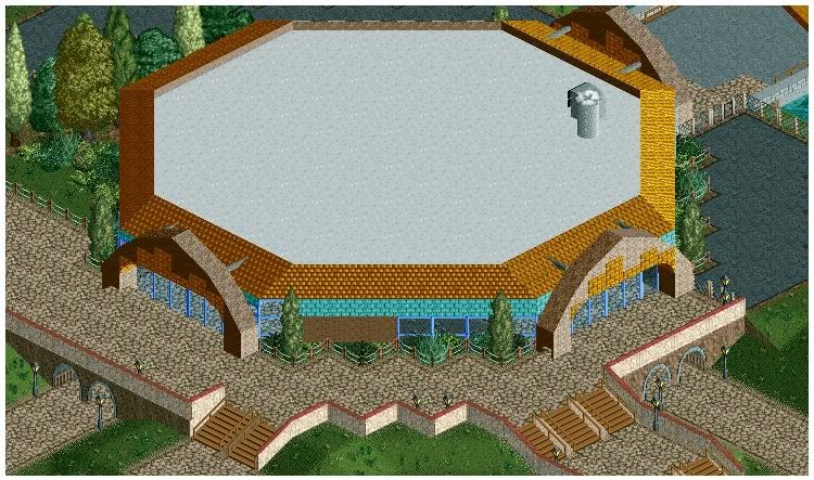
3 – what is the dome for (also, how is it a dome with a flat roof?)
In short, if we don’t understand the concept, we can’t help you with advice on unfinished SS’s.
James - rctnw -

 Louis!
Offline
Sorry. To clarify it isn't a dome, more of a circular building which the peeps enter after the entrance. It holds various shops/cafe's.
Yes the screen is unfinished, I was just after advice on the building mainly. -

 Comet
Offline
Oh, so it's kinda like the thing at Thorpe Park?
I think it'd look better if you got rid of the brown wall and made the sides all glass.
It's a good idea though, and the roof would look better from a peeps perspective.
 Tags
Tags
- No Tags
![][ntamin22%s's Photo](https://www.nedesigns.com/uploads/profile/photo-thumb-221.png?_r=1520300638)
