(Archive) Advertising District / Six Flags Franklin Square
-
 12-August 07
-

 Paul Z
Offline
Well this is my first park and I decided to make a Six Flags park. Give your honest opinions please.
Entry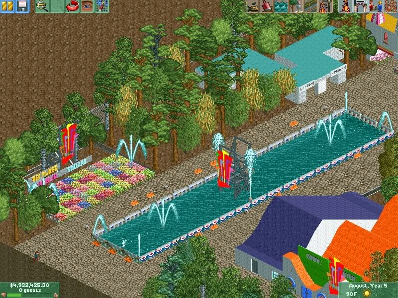
Tickets and Entry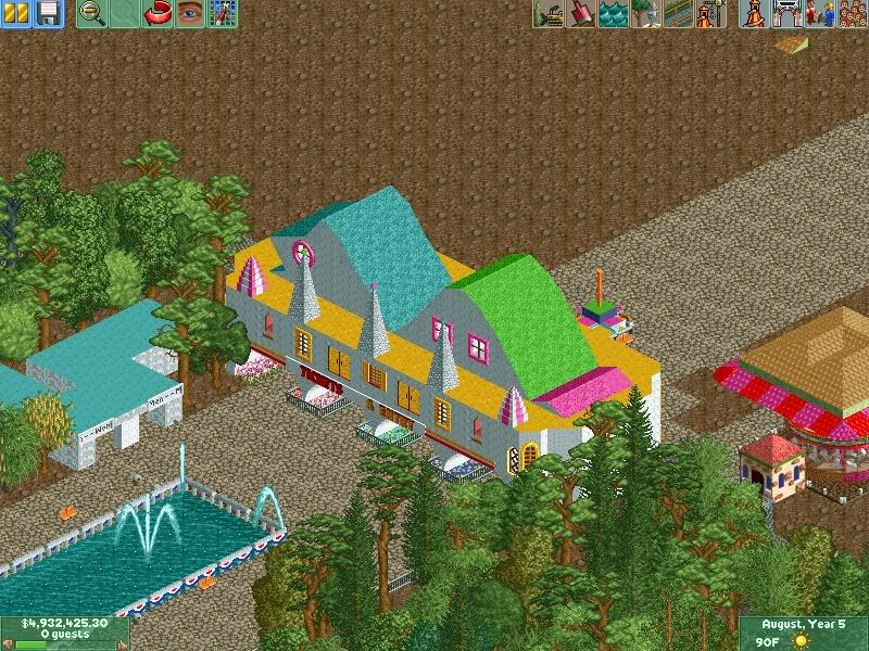
Dunkin' Donuts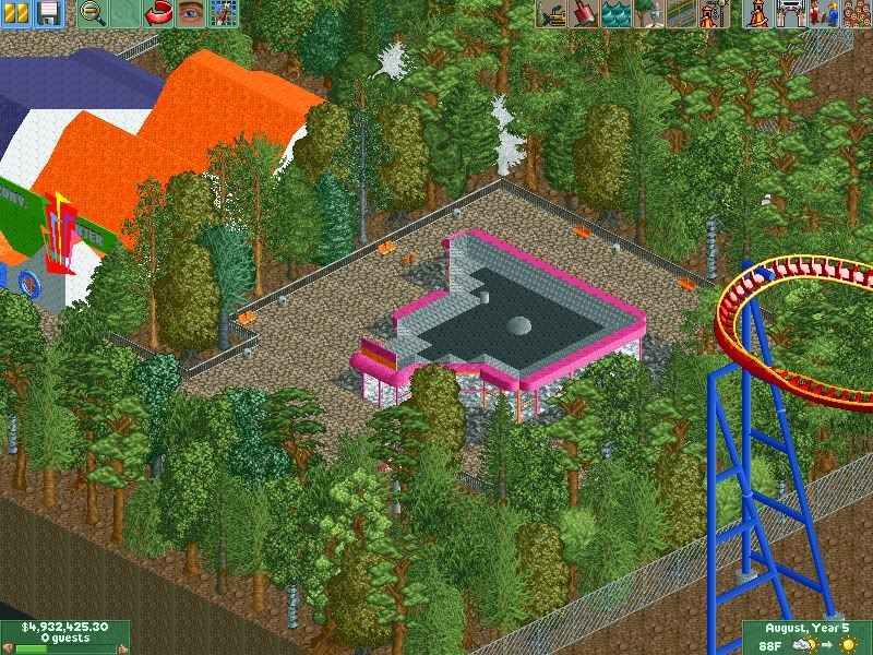
Employee Station and Conv. Center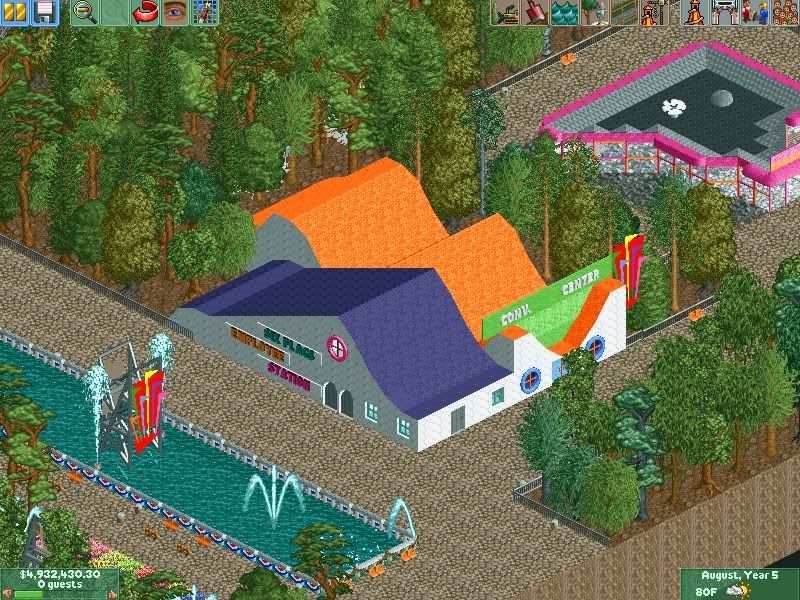
Merry-Go Round No where near done.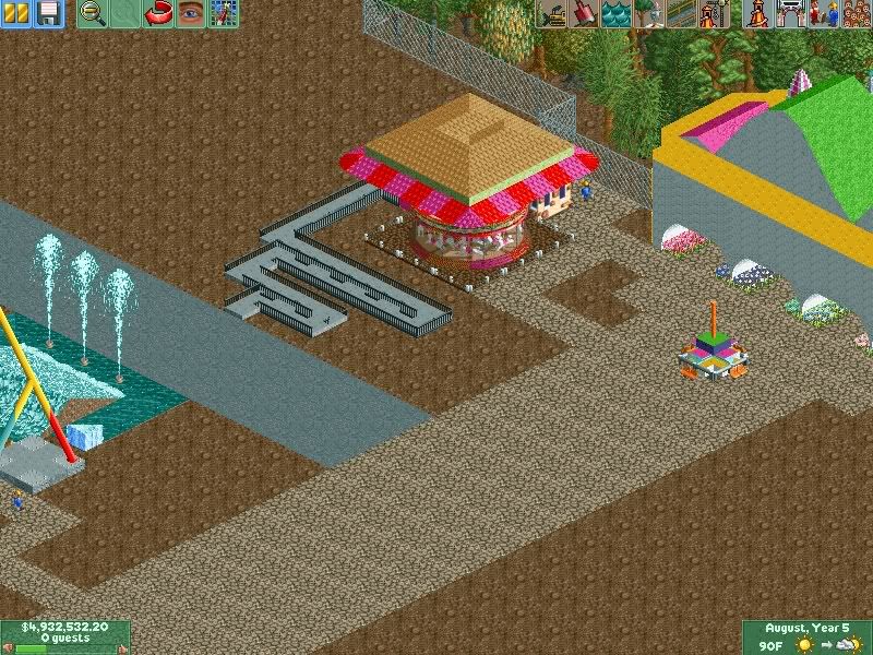
Giant Frisbee (Tidal Wave)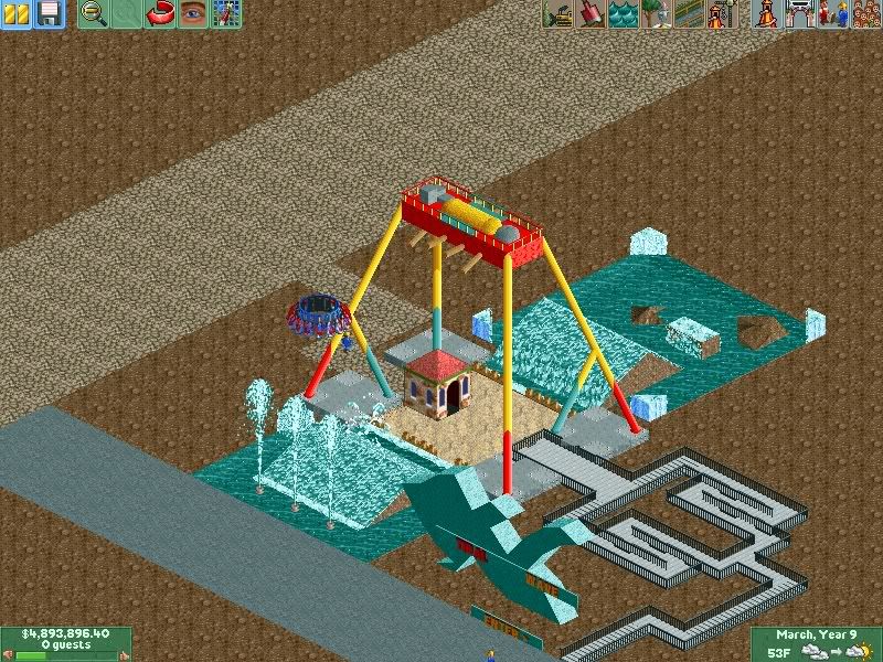
And Superman Krypton Coaster.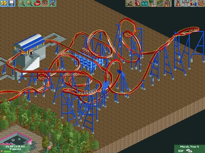
-
 Loopy
Offline
This actually looks quite good. The layout of the Superman coaster looks quite sweet along with Tidal Wave.
Architecture looks alright not overly detailed but its still quite nice. I think you could do something more with that toilet block as it looks like it is, a block. Throw in some roofing or a trim around the edge to make it look more interesting.
I noticed you have a couple of ghost trees in some of the screens so they could do with sorting out along with throwing in some small quarter tile bushes aswell and fences by the sides of the pathing. The tree selection seems a little strange but its your park at the end of the day.
Some landscaping may also be a good idea as it looks a little flat at the moment. Make small hills and stuff to make some height difference and have the path go up and down levels. It adds more to a park since most parks arnt totally flat.
Other than that I think this is quite promising. Good job and keep us updated. Also if you want help with making a Six Flags park, check out Phatages Six Flags Worlds of Excitement for a really good example of one. -

 Ride6
Offline
The land is too flat. Even Six Flags parks aren't built on perfectly level fields (aside from the expansions into parking lots).
Superman coaster looks quite excellent actually... The frisbee looks good as well, though I prefer non-moving variants thanks to the fact that you can add a center support column to the whole mix.
The architecture is quite good for a beginner; and while it's not particularly "Six Flags" it's not bad overall either. But just for that solid coaster layout I *really* hope you make something of yourself here.
Ride6 -
![][ntamin22%s's Photo](https://www.nedesigns.com/uploads/profile/photo-thumb-221.png?_r=1520300638)
 ][ntamin22
Offline
looks six-flagsy.
the fact that most bathrooms are in fact constructed of blocks does not mean yours need to be entirely blocks.
Edited by ][ntamin22, 12 August 2007 - 11:34 PM.
-

 lucas92
Offline
It's quite good actually. Work on your architecture and foliage though. But it's a very, very nice start.
-

 rct2123
Offline
The colors are a bit much. There are not too many building out there with such bright colors. Also, you need to change up the land, it is too flat like ride6 said. It is a good start though, nice work...
-Rct2123
-

 Grand Admiral
Offline
It has the old Six Flags look with the colors. This park has the potential, it just needs more scenery to fill in the big gaps I see in your screens. So far its a good for a start.
 -

 tracidEdge
Offline
good? seriously? i wouldn't call this good at all. it's not terrible, but it's not good. work on laying stuff out, kid. that's a terrible place for a dunkin donuts. also, landscaping and foliage. nothing but trees on flat ground does not look good.
i could nitpick about a lot of other shut, but i don't feel like it. i'll let other people do it. -

 Paul Z
Offline
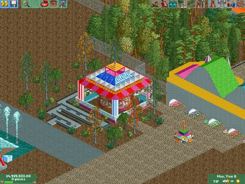
Ok well I will take all your guy's advice and work on the lands and I fixed those ghost trees. I should have another update after this in the next couple of days before my BGE trip. Well I have finished the Merry-Go-Round building and I went in the other direction that I was originally going for. What do you think? Oh and are there any suggestions on what I should put between SKC and the merry go round?
-

 Paul Z
Offline
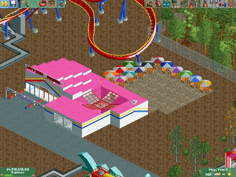
^I might just make a second one on top but not sure. Well I had some spare time and made Joes Best Burger in the middle of the coaster and carosel. It is like 70% I amd going to add more stuff to it and give me some hint 's to. This is kind of like my first resturant.
-

 Lloyd
Offline
Those tables/chairs look awfully close together.
And i'd suggest trying something else with the roof to, it looks very unorthadox right now. Of course, building something unorthadox can be good, very good. But in this case, it's not working for me
Edited by Lloyd, 14 August 2007 - 05:14 PM.
-

 cabbagefro13
Offline
It's not the best I've ever seen and hears why: First of all it looks like some kind of a candyland thing with all of the bright neon colors. I like you entrance( other than the colors) but I think you should put all of the detail you have on the front of it on the back to, you don't want all the people to leave your park wondering what happened to the rest of the entrance because it does look extremely unfinished. Your carousel building is a nice idea but once again the colors destroy it along with that glass thing on top and those pyramid pieces. As has been said before the placement of your buildings is terrible, nobody is going to go past a couple of employee only buildings thinking there is something good back there. Some of your buildings architecture varies too, in some spots like you entrance it is good, but in others, like your restroom, it is ugly. Your queue lines are terrible too. Either make them a peepable line or lower the ground some, put the block in, then put the fence on top of that. That way you don't have any glitches. One last thing to end my extremely long rant it, your coaster. The layout is extremely unrealistic. Look at some layouts by googling different things or go to rcdb.com. I hope this helps and I hope your able to understand it all so that I didn't just waste all my time typing something you not going to understand or even read!
 -

 ivo
Offline
Very good fore your first park! The restaurant looks OK but the colours are hurting me. You don't have any tables!
 Tags
Tags
- No Tags
