(Archive) Advertising District / Marriott's Universal Studios
-
 17-June 07
-

 Metropole
Offline
James, great to see this park progressing so much! Backdraft looks stunning, love the whole outdoor/indoor feeling it gives. It all looks extemely well thought out, great work!
 -

 Carl
Offline
James, I just wanted to let you know Im watching this thread with great anticipation, I just havent had any constructive posts cause I simply dont know what to suggest for improvement

-

 Six Frags
Offline
The T2 stadium looks perfect, but what I like most about this park is the scale it's build upon..
That is why I love your style and (for example) Iceman's style so much.. It's a style you rarely see anymore nowadays, unfortunately.. I also like to build in a larger scale than most around here do, yet still try to get those details in to make it look pretty.. That's probably why I like your style so much..
Keep going James!
SF -

 Dantheman
Offline
wow I like what I see so far, In terms of detail it's second to none always liked the idea of show type elements in parks. Keep up the good work
 -

Fatha' Offline
Just a quick response to all the images since i dont have much time....
I appreciate your efforts of interior design for the rides and such, but I think your exterior's are a bit weak for a Universal Park. You seem to be doing a good job at creating the "studio set" aspect of the Universal Studios parks, but your losing the "theme park" aspect of it which makes the atmosphere and park itself magical. Ill show a couple of examples.

More examples include the Jaws entry at USF (With the shark hanging and such). Capture these little things and I think youll have a winner, and remember to create a magical atmosphere. You did it in your entrance, but your straying away as you progress into the meat of the park. Remember, Universal Studios is not only a theme park with movie set rides, but more importantly, its a theme park. -

 Ling
Offline
Hmm... I wouldn't say there's anything to improve, but Fatha' did touch on something I hadn't remembered about Universal's parks. The outsides of the buildings are rather plain... One could call them realistic, but if the detail shown in those^ pics could be recreated in RCT, it would be fantastic. The interiors of the buildings are absolutely perfect and shouldn't be changed at all.
 -

 RCTNW
Offline
Mark – Thanks. Glad you liked it
r_e – Thanks. I’m sure they will be some suggestions soon enough.
SF – I agree and one I wish I saw more of personally.
Dantheman – Long time no see. Thanks
Fatha’ – Thanks for the images and you are correct and I do hope I capture that feeling. There is a reason for my madness on what I’m building right now. We are actually planning a SOCAL visit in mid August with trips to Disneyland/California Adventure (3 days), Knotts Berry Farm (haven’t been there in 30 years or so) and Universal Studios. With that in mind, I’m only working on the actual studio portion of the park right now as I want to take some photos of the “Theme” park aspect for reference when I get back home. I know there is a certain look for this but It’s been awhile and I don’t remember to many details other than what I have built so far. Right now, I have the back lot studio tour sound stages finished (include “Earthquake”) and am working on the Studio Tour que and plaza. I’m also hoping this trip will help spark some ideas to get through the block I have with the MMW map. Again thanks for the reminder and feedback.
Ling – I will indeed have building like the ones Fatha’ has provided however there is some aspects of the park that need to be followed IMHO and that is the sound stages as they add to the “Studio” aspect. Besides there are only two buildings on the Movie Park Map that will look like sound stages (Backdraft and the Special Effects Studio).
Again, thanks everyone for the info.
James - rctnw -

 Gwazi
Offline
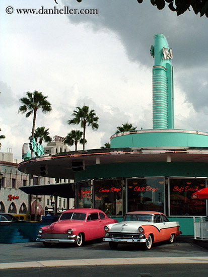
Oh man I wanna see a diner like that in RCT.
I like your work so far, RCTNW. Very detailed. -

 RCTNW
Offline
Update: Backlot Studio Tour - Entrance
Here is the finished screen from the last fiesta. First time I've really played with using track for supports. I'm pretty happy with it.
Thanks.
James - rctnw -

 Geoff
Offline
I think everything looks good. I love this park, don't get me wrong, but it just seems so lifeless.
 -

 RCTNW
Offline
er.. wait, what?
what are they supporting?I think they're holding the roofs up. Interesting way of supporting. I like it.
Correct. Here is a close up of the high tension cable holding up the overhangs
Thanks
James - rctnw -

 John
Offline
I think the supports would look better all white (or tan, depending on what looks best) instead of tan and white.
 -

 eman
Offline
It looks ok...this is a pretty mediocre screen IMO though, not as good as some of your earlier ones. It looks generally uninspired and lifeless.
 -

 Carl
Offline
^ Well, I dont think it was meant to impress anyone, I think it was only meant to clarify something.
Inventive way of holding up the roofs, James
Edited by ride_exchanger, 16 July 2007 - 07:09 AM.
-

 JDP
Offline
Now if someone like CP6 or Geewhzz posted a screen that size; people will enjoy it and have something to comment on. That reason is because they work on a small scale. However, you work on a large scale. So bigger screens would actually be better to tease you fans than smaller ones (even though most teasers are small screens).
Get what I mean James?
-JDP -

 ACEfanatic02
Offline
It's a closeup to show how the support is holding up the roof.Now if someone like CP6 or Geewhzz posted a screen that size; people will enjoy it and have something to comment on. That reason is because they work on a small scale. However, you work on a large scale. So bigger screens would actually be better to tease you fans than smaller ones (even though most teasers are small screens).
Get what I mean James?
-JDP
Seriously, dude. Shut the fuck up if you aren't paying attention.
-ACE -

 JDP
Offline
Do you know what ace? Your right. Holy fucking shit. Dude you are soooo on key with that post. I mean damn. I didn't see it untill you actually said something. Your great at what you do ace, you really are...
...Seriously ace. What you said, and what I was talking about were two different subjects. So what I suggest doing, is going to the dollar store. Get one of those small plastic shovles and dig that sand out of your vagina.

-JDP
 Tags
Tags
- No Tags
![][ntamin22%s's Photo](https://www.nedesigns.com/uploads/profile/photo-thumb-221.png?_r=1520300638)
