(Archive) Advertising District / Fatha's super duper get you shit faced Scenario!
-
 13-June 07
-

 Carl
Offline
Great work on Ryu, and the colorable trees. One question though, if the N is 9.10, what are the E and I?
 -

Fatha' Offline
Can't remember the exact numbers off the top of my head, but the intensity is somewhere between 9.8 and 9.9, and the excitement rating is in the low 9's, like around 9.1o. Its nausea rating is probably so high because it has lots of intense turns and twists, including a 270 and 540 degree helix all taken at very high speeds. Also, the batwing adds to the nausea rating as well, seeing as its the most intense two inversion element on an invert. -

 lucas92
Offline
The supports don't look right to me, the foother is way too tall (third screen). Maybe you should try to mimic that style of support work for all your coaster.
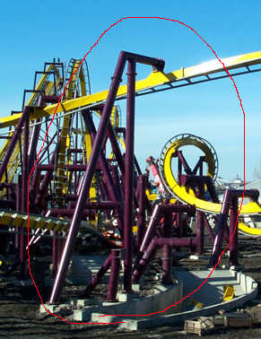
Beside that, I love the colorable trees, you found a nice way to use them.Edited by lucas92, 19 June 2007 - 02:32 PM.
-

 Steve
Offline
Rivals Turtle's area in Isole. Very nicely done. I especially like what you did with the benches/paths in the last shot.
 -

 tracidEdge
Offline
sweet jesus, that looks amazing. the colors are so perfect.
tracidEdge
Offline
sweet jesus, that looks amazing. the colors are so perfect.Edited by tracidEdge, 19 June 2007 - 03:57 PM.
-

 Turtle
Offline
Yeah, that's very nice indeed. The only thing i'm not 100% sure on is the transition from the normal RCT tree colours to the pink ones, I think it could be handled better. I'm not sure what the problem is exactly, it just doesn't look right to me at the moment.
The garden bit of it is lovely though, great use of colours there, and the coaster looks really amazing. I love it when people find new ways to use the game, and you're constantly doing it with this. It's just little things but they all add up and people like me notice them at least... thankyou so much. -

Fatha' Offline
>Lucas92
I agree, that does look awkward, however there is a reason for them looking like that. The pieces dont always allow for single footers, and when they do sometimes things get in the way like:
- paths
- queues
- terrain
- other rides
So when things like that get in the way, ill go ahead and take the tall footers. You have to remember im in the business of making money for this park, so Im not going to spend my time arranging my park layout and the terrain just for the sake of placing only one footer for realism. -

 ChillerHockey33
Offline
Amazing. However, is there any way you could get a side railing on the catwalk for the lift? Right now it seems very unsafe.
 -

 jon
Offline
Ooh just noticed this park.
I've been experimenting with the coloured trees in my current park, and it took awhile to put them to good use but they realy add so much verstaility if you do use them right. But, I gotta agree with turtle and say that in the last screen, the red and pink trees just seem really out of place and look more cartoonish than RCT, and really affect the aesthetics of the area which looks very nice. I never would have thought of using them in an asian area though, so at least its original I guess. Other than that, the coaster layout and buildings are simply perfect.
Now for my closing comment, this might not go down too well lol. Although, I think the park is looking fantastic. It's not what I expected when I saw it was made by Fatha'. IMO, it's not up to the standards that I was expecting from you but its still great. All the screens have a nice atmosphere, but it's what I'd expect from a lower down parkmaker than you.
I'm not sure if this comment was negative or positive lol
EDIT : also I just noticed the catwalk under the lift. Is there anything else you could use for that cos it looks kinda weird and flimsy to me. -

 Midnight Aurora
Offline
The colours all blend together. I can't tell where one objet begins and the coaster ends. While skillful, you can't look at as a whole without it being a hot mess.
 -

Fatha' Offline
>Turtle
Yes, looking back that is tacky. What I might end up doing is just separating the color trees from the rct color ones, that would probably end up helping the area as a whole stand out better anyway....that screen is really just me experimenting, and in the end the trees there will prolly just end up being rct color trees.
>jon
Well, thats good, because its being built from a different perspective than all of my other parks. Since im taking into account the spatial qualities from a person's point of view and not your point of view from the comp screen, its gonna look drastically different then say BGSS. In my opinion, it outshines anything else ive done because in-game the atmosphere in this park is better than most of the other atmospheres ive created. Plus, the coasters in this park are my best also.
>MA
I have to disagree with you unfortunately, though i wont argue with your opinion. I feel ive taken great care in choosing and separating the colors in this area, despite their being lots of colors from the red family (pink, dark red, etc). The buildings might need some work, and im still trying to figure out appropriate color schemes for them...hard to do when your building to make money. Perhaps when all is said and done, and all four areas are complete, ill do an overhaul and fix things that were rushed for the sake of pleasing the peeps.
And with this post, comes another screen.
This is Ryu's middle portion of its layout...This portion of Ryu is probably the most intense coaster experience ive created, as the train rips through this area and roars through the intense boomerang, only do continue its dive downward into a 540 degree helix...this area is probably why the nausea rating is so high. Also shown is the queue, which still has a bit of structure theming to be added....only the gardens are in place. Look for some little "detail" themings like shrines and whatnot....nothing too fancy, just nice touches.
Oh, and sorry about the missing support. -

 Kumba
Offline
I dislike the white supports, try a gray or brown please. Otherwise, damn thats awesome...
 -
Xcoaster Offline
Wow, that's stunning. I think the white supports help contribute to that, so I don't know that I agree about changing them.
Great work! -

 Ge-Ride
Offline
Personally, I like the white supports because they stand out a little from the surrounding environment and are an excellent contrast to Ryu's deep red paint. The coaster looks fun to ride, asthetically pleasing, and realistic. On top of all that, you've made it with finances to keep in mind and with peeps to please.
 -

 Fr3ak
Offline
Supports are ok.
The rest is amazing!
But I think, you should try some yellow or yellow/brown trees. -

 jon
Offline
The supports are good, but the trees still seem weird. Mainly the white and red ones. Red ones look weird against the coaster and the white ones seem a bit out of place. And if your building from a peep's perspective and therefore aiming for realism from what I gather, shouldn't you just stick with the normal coloured trees? The red and white make it seem more fantasy than realistic, cos I have personaly never seen a red or white tree before in real life. So, if your going for realism, then you should just stick to the green and pinks. But, its your park, and if your not going for complete realism, then ignore my rants lol.
Also, the wooden land sides in the bottom of the screen stick out and the red flowers blend in too much. And instead of the green flowers under the trees, would it work if you used the hedge maze in little 1x1 squares. It would have the same effect as the green flowers, but would add some excitement and further depth into the screen IMO.
But too be more positive, I love the queue line. Seems very clean. -

 posix
Offline
i think it is believable and artistic at once. very hard to achieve.
your parkmaking just does not lose its magic.
 Tags
Tags
- No Tags
