(Archive) Advertising District / Cedar Creek
-
 09-June 07
-

 CF
Offline

Cedar Creek was earlyer Attractiepark De Kempse Bossen butt Cedar Fair Buyed it over.
1990
Renewed Turbelence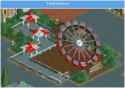
Diablo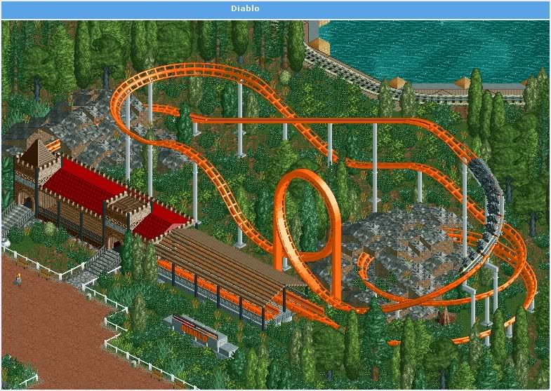
We build a new coaster a woody "Timber Wolf"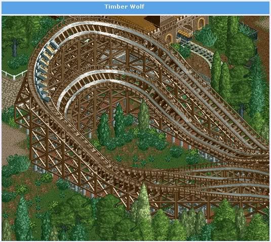
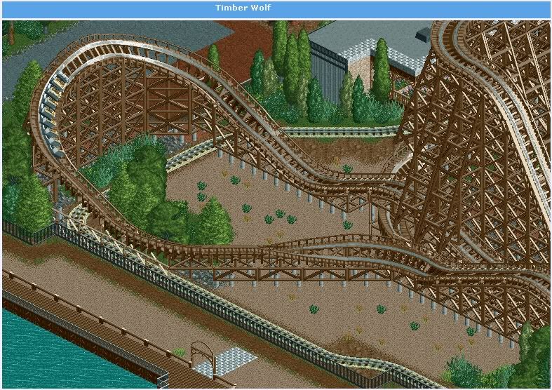
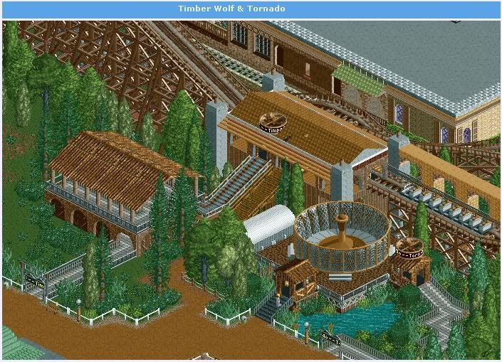
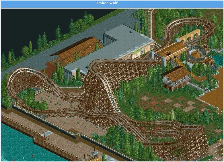
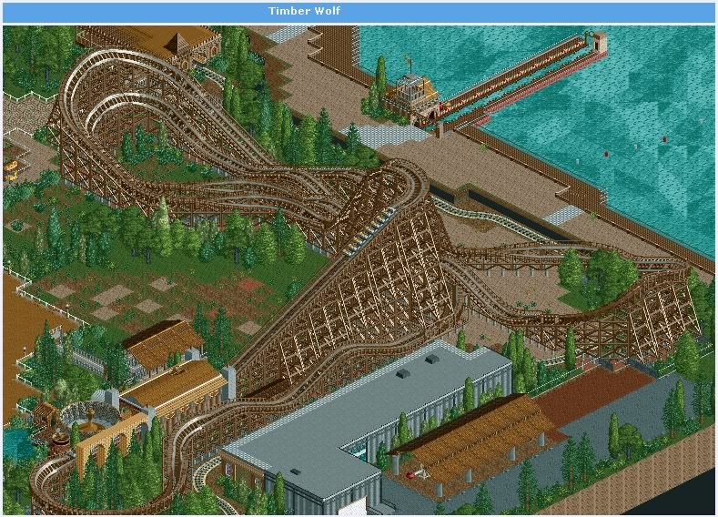
Parkmap
Future
- Show
- ThemingEdited by CF, 24 October 2007 - 12:55 PM.
-

 CF
Offline
1991
New
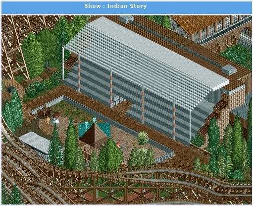
Indian Story a western show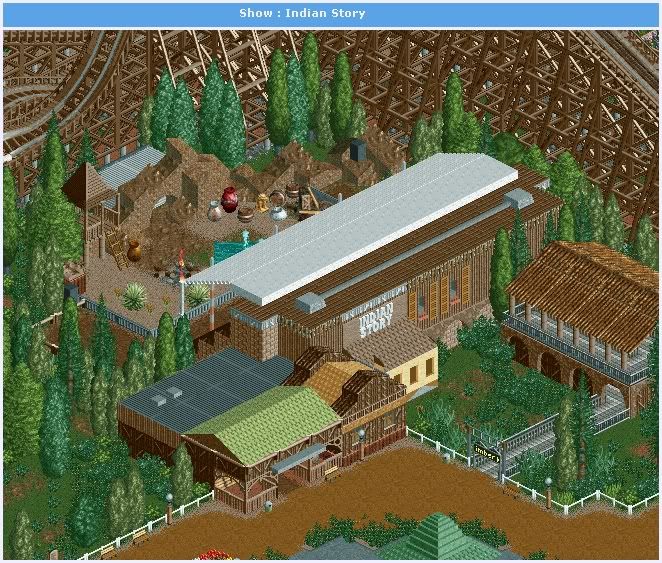
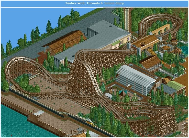
Future
- Games
-----------------------------------------------------------------
1992
New
Games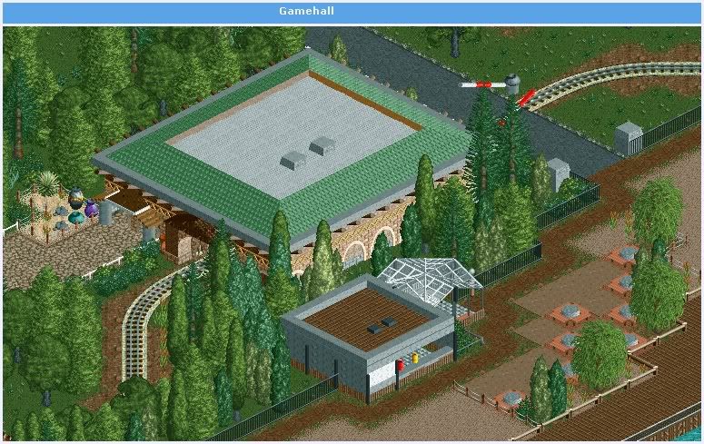
Mambo Renewed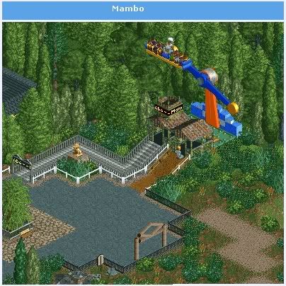
Future
- Great project -

 CF
Offline
1995
New
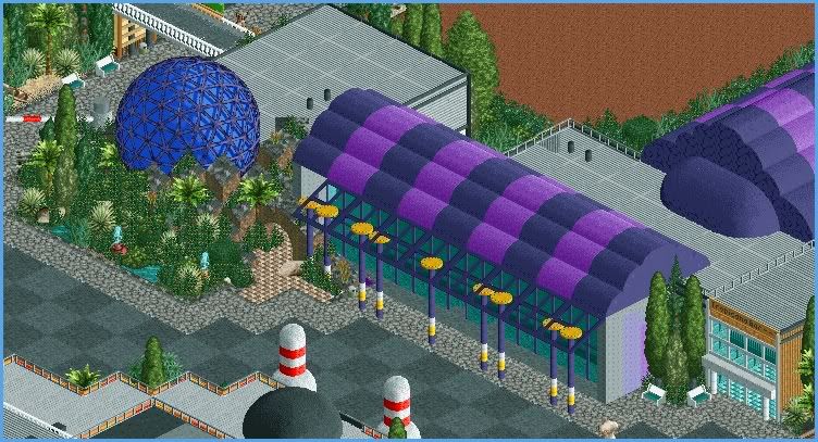
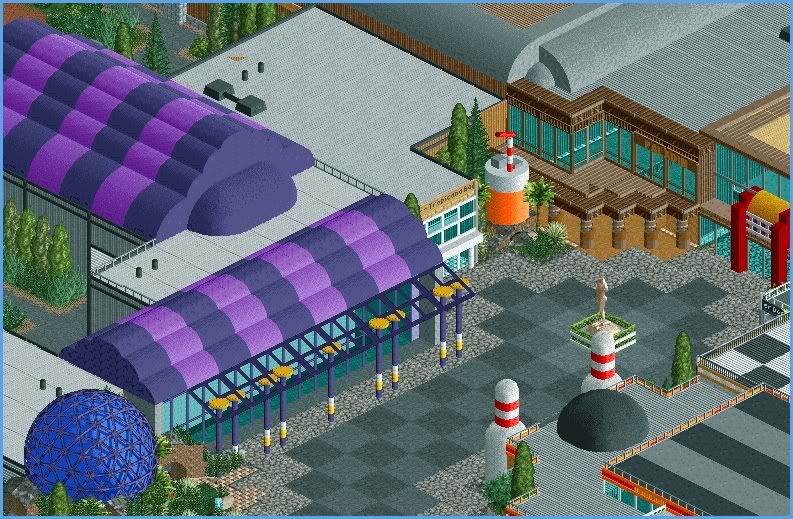
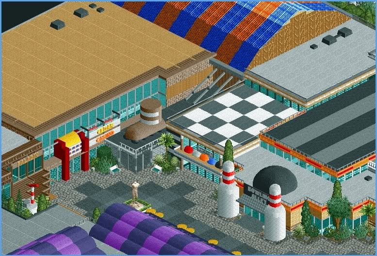
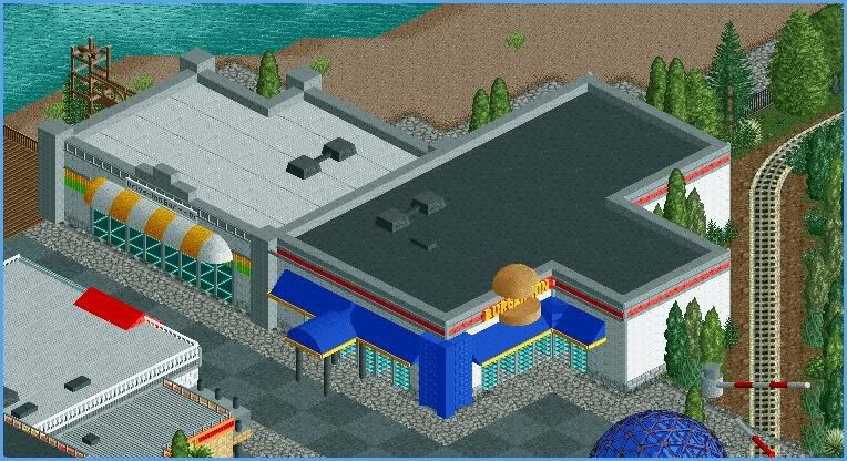
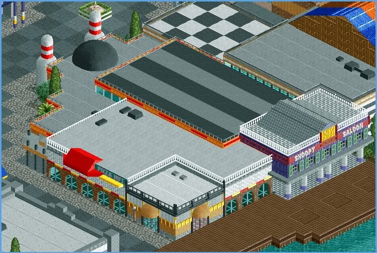
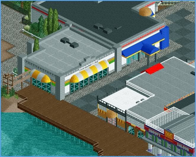
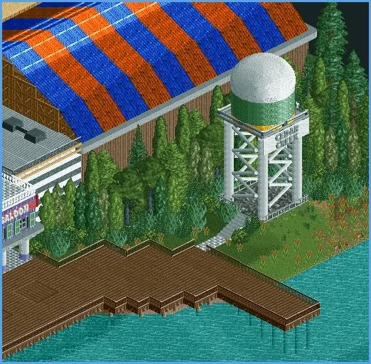
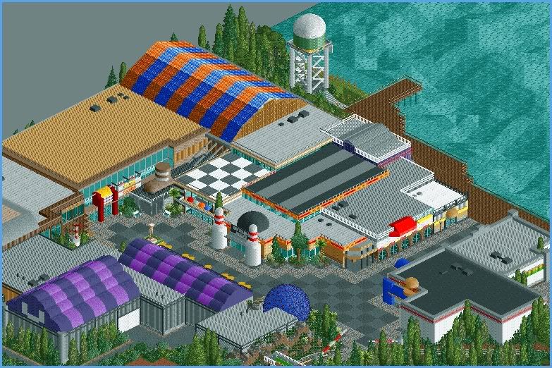
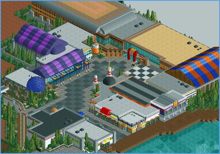
Folder
Here the map & Folder for more news of Cedar Village (download)
(It's Dutch )
)
http://putstuff.putf...85983/5903124/3
Future
- Hotel
- Renewed
Cedar Creek a park off
Greats CF
Edited by ~CF~, 09 June 2007 - 03:58 AM.
-

 Lloyd
Offline
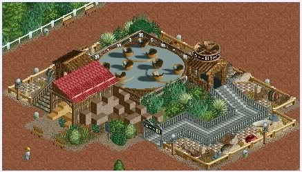
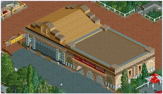
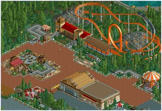
Those bowling alley pins are very cool. I think the park looks really good, especially diablo.
Keep it up man. -

 deanosrs
Offline
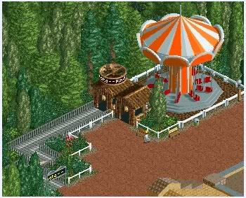
I love it. One thing though - don't show the whole park in screens before the release, it ruins it a bit. 2nd screen is fantastic though, reminds me of the stuff corkscrew used to build.
 -

 JJ
Offline
^ I think it's more he's been posting it on another site. And just posted all his updates into one post on here...
 -

 Ling
Offline
it looks very nice and realistic... the buildings fit nicely, unfortunately almost entirely contiguously, which makes it look congested. Maybe if the buildings were broken up a bit they would flow better? Otherwise it looks really cool.
 -
 Coaster Ed
Offline
okay wow. i love this.
ed, here's some competition for you
I do see some style comparisons from my early work (aside from the obvious name association) -- the naturalistic placement of trees and bushes in particular and the use of terrain textures and theming "scenes". The architecture style is similar too in form, though obviously a lot more detailed given the tools available now. It's not hard to imagine my own Cedar Creek park turning out something like this if it had originally been built in RCT2 instead of LL. I abandoned the realistic style long before I ever started playing RCT2 so there's really no way to know. And certainly it's flattering (to me) to think so since this is very well done. In your other park topic too it's clear that you (~CF~) use various techniques together very well to create a visually pleasing style that isn't derivative or cliche. You've got some clever ideas there and the skill to pull them off convincingly. Your coasters are nicely done too, though very simple. I wouldn't really say there's any competition here though. I'd have to actually be producing work for there to be any kind of competition.
Nice work ~CF~. I would question whether you really need that many trees and if you could maybe encorporate some hills as well so it doesn't look like we're just seeing a 2D parkmap brought to life, but I've been guilty of both of those flaws myself -- most especially when making realistic parks like this. Other than that I think your style is great and you should stick around because you're certain to win many more fans. -

 Gwazi
Offline
My only suggestion is with the train in your last post. In most train crossings, the red/white bars that come down block the peeps from crossing so the train can come through, but you have the bars so that they will block the train.
Otherwise its beautiful, though simplistic. -
 Camcorder22
Offline
This park looks pretty good overall. There is a lot of screens so I cant really pick out anything in particular but I like how it starts out kind of old style, but as time goes on it gets a little more modern.
 -

 CF
Offline

1996
This Year
Very good year for the park, Cedar Village was very popular this year many people stayed for this place
New
Buccaneer got a renovation, new color & theming

Port Royal
We needed a new hotel, now we build it.
The hotel got 284 rooms whit 20 Luxe rooms
also 2 restautants & 4 shops.
The entrace whit the 2 restaurants, en a view of the first tower.
(Logo coms later)
The total views

We have improved the parkingspace en now you can see the horses from the Paladin show on the field.
Future
- Gravity Attraction
- Restaurant
- a next station for Xpress
Cedar Creek a park off
Greats CF
Edited by ~CF~, 14 June 2007 - 11:03 AM.
-

 Fr3ak
Offline
You are building to quick man!!
But ... It's just great.
That's my favorite screen. It looks so real! Incredible.
f3k
 Tags
Tags
- No Tags
