(Archive) Advertising District / Music Masters
-
 25-May 07
-
![][ntamin22%s's Photo](https://www.nedesigns.com/uploads/profile/photo-thumb-221.png?_r=1520300638)
 ][ntamin22
Offline
love the architectural detail here. the entrance gate is awesome, and your instrument sculptures continue to astound me. I'm not sure this looks much like New Orleans, though.
 -

 Kumba
Offline
Wow, your pulling this off so well. I love those gates and these sculptures you do are fantastic.
 -

 postit
Offline
Yeah, it looks really great.
I just want to throw out the idea that maybe you could make the New Orleans area a little dirtier, and more urban. Right now it looks lovely, but it doesn't capture the theme well. I would direct you to New Orleans Square in Disneyland and try to recreate it in a more realistic, big-picture manner. Also, Phatage pulled it off extremely well in a park that I'm sure you've seen. It is possible that you are not going exactly for a New Orleans urban recreation, but I would highly recommend you attempt it because otherwise the theme does not hold up as well.
I know there are manors and all sorts of lovely architecture like that in Louisiana that may pass for what you're doing now, but in that case I would suggest expanding the size of those buildings, and placing them on more dramatic hills. -

 CedarPoint6
Offline
That looks wonderful.
I really like the curved portico on the left hand building. The gate is excellent as well, very nicely constructed. And as always, the instruments are well-made and are very accurate with the blocks you have to work with.
I do have 1 suggestion and 1 comment:
With the benches and tables, I would put some sort of artificial surface under that, whether it be a block or path. Imagine having to cut that grass under the stuff. I also think it will look more refined if there's something to anchor that stuff to.
The question is the enterprise building. What is that for? It seems that the queue is very straightforward as it seems, so is the rest of the building just dead space? The reason I ask is that you rarely see a building with large amounts of dead space, so if it is empty, maybe you could figure out something to put there (or just say it's storage or something, haha).
A nice update and a park I'm really looking forward to. How far along do you think you are? -

 RCTNW
Offline
Aside from what was stated above, this is classic emergo style of work and one that just keeps getting better and better. One thing I did notice is that I see a lot of Mama Bear influence in this most recent work which is a very good think IMO!
The trumpet is particularly nice and one that really helps the feel for the concept of the park. There only a handful of people that have the imagination and vision to create itmes like this with the tools we have with the game. Xcoaster, and Kumba come to mind and you seem to take it to the next level. Great work!
James - rctnw -

 JDP
Offline
I really haven't seen anything eye grabbing on New Element until now. That looks so classy and elegant. Everything in your park seems to be purely perfected. Very nice work. If you turn this in when done, I can't see why it will not be a Spot Light.
-JDP -

 Emergo
Offline
@ Lucas92: Thank you!
I guess the Toon-Palms will stay though, as I don't hate them and could not find anything better up till now...but who knows....?
Kumba and ][ntamin22: Thank you :biggrin: Nice to hear you like it.
][ntamin22: for if it looks like New Orleans, see my answers below please..Postit: Yeah, it looks really great.
I just want to throw out the idea that maybe you could make the New Orleans area a little dirtier, and more urban. Right now it looks lovely, but it doesn't capture the theme well. I would direct you to New Orleans Square in Disneyland and try to recreate it in a more realistic, big-picture manner. Also, Phatage pulled it off extremely well in a park that I'm sure you've seen. It is possible that you are not going exactly for a New Orleans urban recreation, but I would highly recommend you attempt it because otherwise the theme does not hold up as well.
I know there are manors and all sorts of lovely architecture like that in Louisiana that may pass for what you're doing now, but in that case I would suggest expanding the size of those buildings, and placing them on more dramatic hills.
^In answer to Postit's post and anyone else who thinks it does not look like New Orleans (yet :tongue: ):
The "Armstrong Park" (of which the screens are), just is the "opmaat" (a musical term I cannot find the translation for), but something like a little "ouverture" to the actual New Orleans part that is situated behind the Armstrong park. So the park is more a kind of a transition.
Now, I have never been to New Orleans (at least not since I was 3 years old, and I don't remember anything of that anymore...), so I am completely dependent on Googling the net for my information - of which I always make a serious task, Lol!- and what friends and you all guys tell me.
Armstrong Park is "based on" the exisisting Armstrong Park in New Orleans.
Here are some screens of it: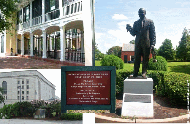
In that real park there are some bigger buildings also, and the white one in my park is loosely based on that one, though not at all a "recreation".
The other building is based on houses you can find in the -upper class- "Garden District" of New Orleans, and no, they seemed not to be on hills....and many of them seem not extraordinary huge, although all are situated in lovely green surroundings.
Screen: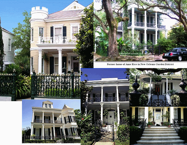
Now to the N.O.town-part I am still working on and which is not in the screens:
I don't intend to go for the extreme "urban feel", like with skyscrapers along the Missisippy. I want to go for the kind of archy and feel of the old "French Quarter": all those houses with balconies and their famous lattice-work.
For sure that is not "all" of N.O., but I think it's really pretty and so do they think themselves I guess.... (seeing the amount of N.O. sites in which it is advertised...)
Some screens of what I mean: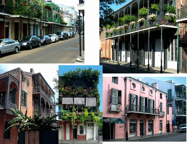
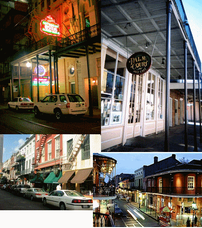
Sooo, untill you all convince me otherwise, I have no intention yet to make it much more "dirty" and "urban" than that French Quarter..., although I hope to find some space for a few bigger buildings like below: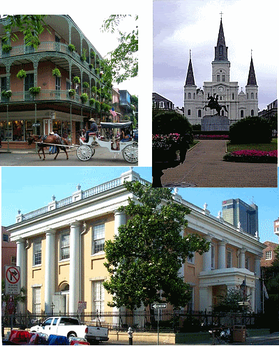
I also think, that the New Orleans Disney Square you mentioned, is based on that "French Quarter" part ?: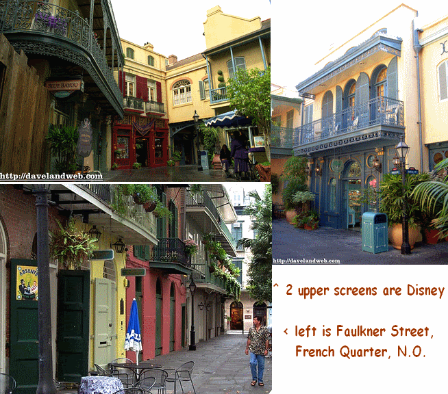
Thanks a lot, Postit, for an elaborate reply with many good suggestions.
Once I can place screens from the actual New Orleans-town part as described above, I hope you - and others- will comment again to say if it's "believable" and "recognisable" , for I do know my European architecture, as well as some Asian, but for a more"American feel" I will be hugely dependant on your input.....hope I can pull it off.....
@CedarPoint6:
Thanks!
On your suggestion to place blocks or path under the benches and tables: no one will have to cut the grass under that ones: if it is a popular place to sit, the grass will turn into dirt in a natural way by the shuffling of feet and benches....if it is impopular nobody will care anyway... :tongue:
Kidding of course: very good suggestion, absolutely more refined, I will do that! (Thanks!)
On the enterprise building:
Part of the queue is also inside.
Like in the real park, it's a cultural center, with inside also drinks and dinner, which however will only be accessible from the backside of the building (so I still have to test if the RCT-peeps can handle that...) Behind the building I now just put some random trees for the screen, but later - I hope...- there will be a small waterfront which people can access and where they can eat something leisurely..
How far along?
well....ehhh....hmmm... the mapsize is 160x160, and at the best guess ( I am very bad in estimating that...) I am around 20% (?).
But I already used 35 % of the available map data.
And as I did not choose 160x160 to just fill it in with uneccessary water,- I chose it as I have so many ideas for this one - I still have to think about a few things....
@RCTNW: Thanks (again).
@JDP and CF: Thank you. Happy with what you say and that you enjoy it!
Emergo :biggrin: -

 sixflagsfreak56
Offline
I've always loved New Orlean's architecuture. Your park looks awsome. I think you should make a whole section in your park devoted to Pink Floyd.
sixflagsfreak56
Offline
I've always loved New Orlean's architecuture. Your park looks awsome. I think you should make a whole section in your park devoted to Pink Floyd.Edited by sixflagsfreak56, 18 October 2007 - 04:05 PM.
-

 J K
Offline
Amazing screens and yet again pulled off to perfection. I really can't wait for this one.
 -

 Evil WME
Offline
Wow, this park looks so amazing. Captures the theme so well, so intricate, just so lovely!
 -

 Carl
Offline
Emergo, your latest screens are beautiful, as usual. But I have one question, how do you know how much of the map data youve used? Is there a way to check that?
 -

 Ge-Ride
Offline
That's a great screen and I love the model trumpet. I wish I were that good with building blocks. Everything shown so far has been excellent and this is the park that everybody in the community's waiting for.
& RE
Open up 8cars and select 'count objects' under the park tab. -

 Emergo
Offline
Thanks again all for the reactions (much appreciated!)
@ sixflagsfreak56: I love Pink Floyd, but might not have enough room and/or especially not enough sprites to still do them.
@ride_exchanger: what Ge-Ride ^ said, that's what I also use for it....
Coming weeks will be too busy for me to build, and if there are some moments, I should think about still making a Road Rally for the finals.
So in the meantime here's a small random screen: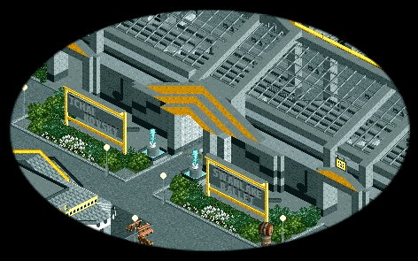
^ entrance to the Swanlake Theatre.
Front is looking out over the water, with a ballet-stage and a swan-ride to represent Tchaikovsy's ballet Swanlake. (restrooms and snacks inside)
(The music-notes on the wall are made for me by Rick -Havingfun- who made a few more vey nice ones that I by no means can puzzle together from existing scenery.....thanks a lot again Rick!)
Emergo
-

 JJ
Offline
It's great
I just prefer screens with more colour, but the detail and care you've put in to this is spectacular
-

 Emergo
Offline
Thanks^,^^ and don't worry....front and surroundings are that colourfull that this side needed something more neutral (but you need to see the whole screen for that, and I just don't want to give that away yet
 )
)
Emergo
 Tags
Tags
- No Tags
