(Archive) Advertising District / 'Phoenix' ~ Vekoma SLC
-
 29-April 07
-

 Louis!
Offline
w00ps I now have three things on the go, yes I haven't finished my park, although it is now in it's final stages, and of course I have my PT3 Bridge entry. And now this.
I hate making new topics but as this is a different game I thought it'll be ok to. I recently got LL and this is just a sort of trial design. I thought I would post it here to gain a few comments about what I can do to improve.
Anyway, first screeny: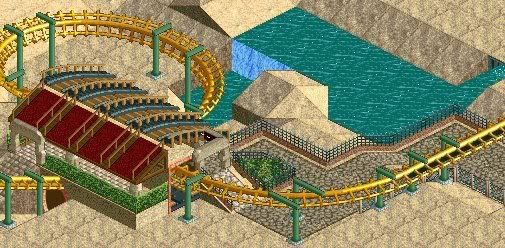
^BTW it's unfinished. Oh and I know the landscaping is a tad dodgy.
NPEdited by NeutralPineapple, 02 May 2007 - 09:43 AM.
-

 PyroPenguin
Offline
It's really hard to see what you are going for it that screen, but you should probably consider redoing the station. Its a little on the too small side, and beyond that it just doesn't look like a station. Plus, I don't like the half path roof half coaster roof look, make it more cohesive, make it look like it is supposed to have a certain form, not just be covered. Also, if you are going to do the roof over the station like that there is no reason to bury the station underground, just let the coaster track cover it.
 -

 RCFanB&M
Offline
Yeah, that's unfinished, but I think that you can achieve some nice results. I think that you should replace the regular path, because it doesn't look good when it's going up IMO.
Anyway, I'm interested on this, and I'd like to see a little bit more of the layout of the coaster. Keep going mate. -
 Loopy
Offline
Waaaaaaaay too much sand. You need some foliage thrown in there, some more archy (and a little more detailed) and a change of land type for the foliage to go on and you may be on to something.
It's nice to see people playing LL again. -

 Louis!
Offline
I took all of your comments. I think it's looking a lot better.
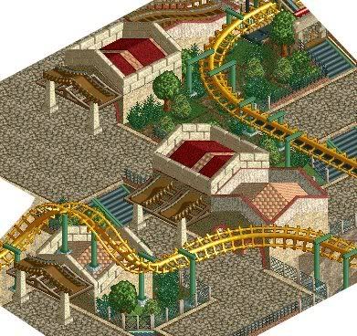
A couple of new screens.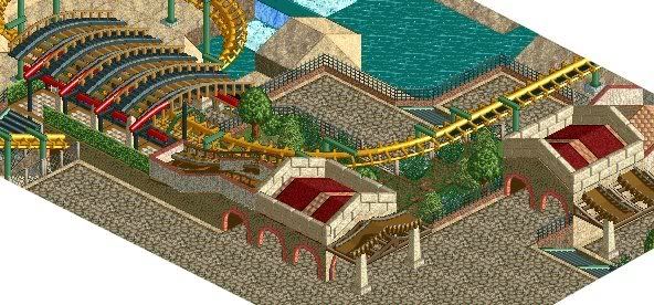
NP -

 JDP
Offline
There ya go. Now that is better. However, even though im not a big ll buff, i think that the black in the coaster track (aka the roof) really over powers the station. Maybe another color will help like orange or red or something along those lines. I think you second screen is pretty good. Well done.
-JDP -

 Louis!
Offline
^Thanks for the comments people.
~Background Story~
Captain Pete LeChenko and his crew patrolled the mediteranian sea. His crew of 20 lost souls and himself embarked on Pirating Southern Europe, controlling as much of the seas as possible, smuggling as many goods along the way. Their adventures often took them to undiscovered islands, some inhabited by humans, others not, however one island they were yet to discover would be their last. Surrounded by water, this island seemed to be completely deserted, and when they arrived they lowered the anchor and made off, to explore. What they found unusual for an island with no inhabitants was the strange houses dotted in a Village-like way. As they continued their journey around the island a sudden screech was heard. There was nothing left they could do apart from realise why this island had been lived in but no longer was. For they were about to be swept upon by 'The Phoenix'.
~Screenies~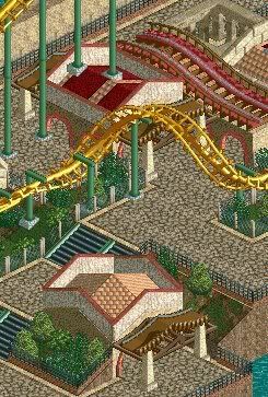
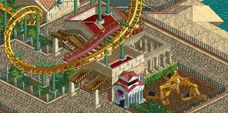
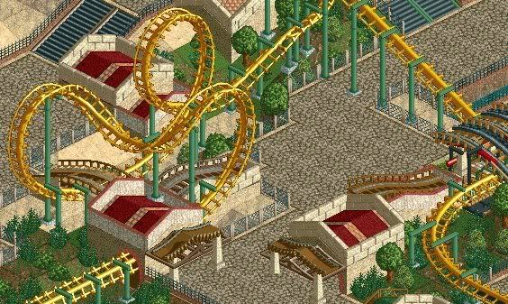
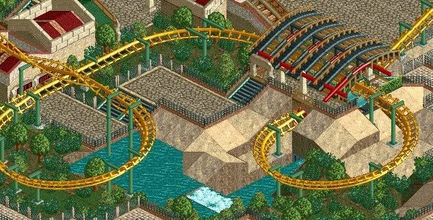
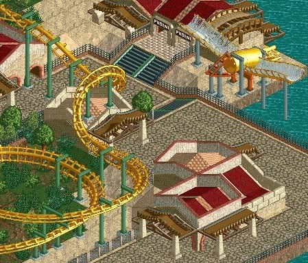
The screens are all 99% complete. Much like the design. The only things left to do is to add benches, lamps etc. and change anything not liked.
NP -

 Lloyd
Offline
It looks nice, no doubt about that. But i just find it all too bland, too 'run of the mill'. It doesn't seem to have anything about it in particular that grabs my attention, and i think that's the key to LL.
But yeah, nice stuff for sure. -

 ChillerHockey33
Offline
In this screen, is the striaght banked track after/before the sea serpent inversion necessary? I would try to stay away from using alot of straight track, makes the layout seem un-organized, rushed, and uninspired..
-

 Louis!
Offline
^Thats because it goes straight into a giant helix. There was no other way around it, I tried and tried many other options, this was the best.
Lloyd - I know what you mean, but it is my first attempt at LL. As time goes on, hopefully i'll improve to the attention grabbing style. -

 gir
Offline
^ The lead-in for the helix still doesn't need to be that big. What you have now just looks painful. :O
 -

 Gwazi
Offline
All I see is boring 2X2 buildings with red path and Virginia Reel awnings. Make it more varied. You are not off to a bad start, other than with archy.
-

 BigFoot
Offline
I like that bird in the last screen. Not bad overall, keep at it.
+1. Get rid of the supports though on it.
Glad to see LL work.
 Tags
Tags
- No Tags
