(Archive) Advertising District / Dump-Place
-
 19-April 07
-

 Dr_Dude
Offline
Ver-co, you used to be on here as Sure right? You were my favorite player who never released anything, change that please!
 -
 hulkpower25
Offline
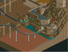
should i leave the crazy paving, also i need to make a water-ride and dont know how to make the track invisible on a popeye ride style.
 -

 Ruben
Offline
I think the paving contrasts the rest of the castle pretty well, so leave it.
 Don't listen to Liam, what does he know. (A)
-
 Luketh
Offline
Old structure

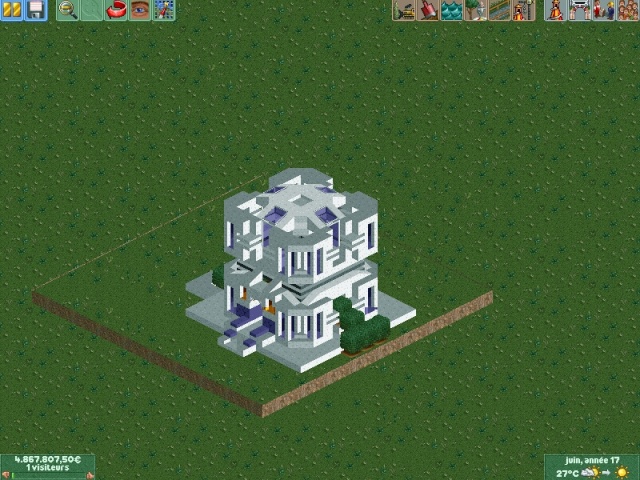
I SWEAR I've seen that on RCTspace.. can't remember for the life of me the name of the user that posted it.. Your style looks similar to theirs, though. Have you posted that screen before? -

 Ling
Offline
BROOOOWWWWWWNNNNNNNNNNNNNN
I really question the long flat bits on the coaster. Just seems unrealistic and unnecessary. -

 BC(rct2)
Offline
it seems like is adrupt, but the MCBR make it not adrupt.^Not bad, the ending is very abrupt though.
-
 Xtreme97
Offline
Extend the final brake run and raise the station 10-15ft and the layout will be better already. Also take some time to think through the elements. The start is good but the upwards banked U-turn and drop near the end kills the flow in my opinion.
 -

 BC(rct2)
Offline
ok, I will fix the last part, but I will not raise the station cuz I already supported the coaster
 but thanks for the suggestion!
-

 Xeccah
Offline
BROOOOWWWWWWNNNNNNNNNNNNNN
lol, If I used grey, it would look bad. Screen is unfinished and more color will be added then.
but is the archy OK?
Bcrct2: This is pretty good, you can space out the beginning a little.
 Tags
Tags
- No Tags
