(Archive) Advertising District / Dump-Place
-
 19-April 07
-
 Lloyd
Offline
Definitely recolour the roof tiles black, and the screen needs another accent colour in there somewhere. Even if it's only from a grass texture or some foliage, but that screen looks very promising.
Lloyd
Offline
Definitely recolour the roof tiles black, and the screen needs another accent colour in there somewhere. Even if it's only from a grass texture or some foliage, but that screen looks very promising.
And if you really want to force perspective on the castle, narrow the bridge
-
 hulkpower25
Offline
Thanks guys, I have make the changes on the bridge, once I finish the section I will post another screen and see what you guys think.
hulkpower25
Offline
Thanks guys, I have make the changes on the bridge, once I finish the section I will post another screen and see what you guys think. -
 tdub96
Offline
Reminds me of the old "play-rct-and-build-as-many-fucking-coasters-as-the-land-can-hold" days. Those days were fun as hell.
tdub96
Offline
Reminds me of the old "play-rct-and-build-as-many-fucking-coasters-as-the-land-can-hold" days. Those days were fun as hell. -
 Fizzix
Offline
It looks to me like you're layouts could use work. Foliage and archy seem sparse as well, but I see a lot of potential.
Fizzix
Offline
It looks to me like you're layouts could use work. Foliage and archy seem sparse as well, but I see a lot of potential.
-
 Xtreme97
Offline
Xtreme97
Offline
New Screen on B&M Wing-Rider

The tunnel looks way too tight after the first turnaround. Widen that up a bit. But the rest is amazing. I adore the castle. -
 Pacificoaster
Offline
I agree. Just simply lower the ground below the track to get rid of the automatic tunnel done by the land tool, and widen the opening 1/4 of a unit. Also, wide then exit from the station 1/4 unit.
Pacificoaster
Offline
I agree. Just simply lower the ground below the track to get rid of the automatic tunnel done by the land tool, and widen the opening 1/4 of a unit. Also, wide then exit from the station 1/4 unit. -
 Ling
Offline
Use [IMG] tags.
Ling
Offline
Use [IMG] tags.
EDIT: That's quite good. I'm not a huge fan of the pre-drop or the custom ship, but the foliage looks solid, the layout is nice (as long as the pacing is good - it seems a bit long), and what little architecture is there looks refined. -
 K0NG
Offline
To be honest, you need more than just a logo for this right now. Not that it looks bad...just far from finished. Besides...we tried that logo thing before. All it did was take up space in my Objdat folder.
K0NG
Offline
To be honest, you need more than just a logo for this right now. Not that it looks bad...just far from finished. Besides...we tried that logo thing before. All it did was take up space in my Objdat folder.
Edit: fuck...I have the 1st post on page 666. Not sure I'm happy about that.
3:06 -
hulkpower25
Offline
sorry kong for the space, by the time i put the object, i had already submitted the design. it was the kraken failed recreation.that is why i am asking now.
-
K0NG
Offline
Well...get this finished enough to actually need a logo and I'll help you out.
The logo took up one slot out of many thousands...I was joking about that.
3:06 -
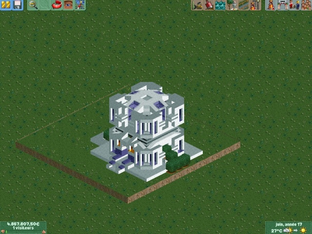
Ling
Offline
@Ver-co: I like the colors and the atmosphere (what little there is), but I think the scale needs some work. That's like 1/2 peep scale, and peep scale is small. Also I'm not sure how you did the arches thing on the top right (new quarter tile object I don't know about I'm assuming) but it looks good. Could go well on a larger structure done in the style of the building on the bottom left. I could see this as a newer take on Steve's Arabian style from Musette.
-
 trav
Offline
Hulk if it gets design, the graphics team here at NE will make a logo for it anyway, so just let them take it.
trav
Offline
Hulk if it gets design, the graphics team here at NE will make a logo for it anyway, so just let them take it. -
 Liampie
Offline
Liampie
Offline

Those last few screens are quite cool actually, looks like miniature architecture. Would be cool if you made a whole city on this scale. Here's a secret: I plan to do the same. I want to design cities. -
 In:Cities
Offline
Verco thats awesome! Really one of my favorite things I've seen on this site recently. Reminds me of legos haha
In:Cities
Offline
Verco thats awesome! Really one of my favorite things I've seen on this site recently. Reminds me of legos haha -
 Timothy Cross
Offline
the other day this stoneman in the rock i built started talking. look,
Timothy Cross
Offline
the other day this stoneman in the rock i built started talking. look,
green= top of head
red= eyes
blue= mouth
seriously, the dude would not shut up.


Tags
- No Tags