(Archive) Advertising District / Dump-Place
-
 19-April 07
-
Airtime Offline
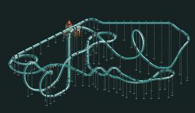
I really like that layout Bennyboy. The only thing I'm thinking is does it extended beyond that screen? As in is that turn going straight into the brake run or more layout? I think it should just go into the brakes because the pacing seems fine but if there was anymore it would be getting pretty slow. Also I think the launch is a little short, maybe 3 or even 4 tiles longer? Make sure the station and brake run are also of decent length. Really nice job though man
-
 MorganFan
Offline
Shit, if Airtime gives you advice, TAKE IT. I don't think I've seen anyone vote lower on any accolades.
MorganFan
Offline
Shit, if Airtime gives you advice, TAKE IT. I don't think I've seen anyone vote lower on any accolades.
I love the layout. It's like Storm runner meets Skyrush.
I agree that the launch should be longer and that the bit after the airtime should be taken out.
I say that the on-rid photo section should be removed, as there is much more of an opportunity for doing that with scenery. -

RMM Offline
Shit, if Airtime gives you advice, TAKE IT. I don't think I've seen anyone vote lower on any accolades.
look closer...
EDIT: nevermind, hahaha. airtime's votes are pretty low. -
 Xeccah
Offline
Xeccah
Offline
look closer...
EDIT: nevermind, hahaha. airtime's votes are pretty low.
JDP's are usually the lowest. -
 hulkpower25
Offline
What do you guy thinks, there going to be in a (dragon theme) Coaster Design i am working on, what should i do?
hulkpower25
Offline
What do you guy thinks, there going to be in a (dragon theme) Coaster Design i am working on, what should i do?
What should i add and remove to make it into the dragon theme? -
 Dr_Dude
Offline
Dr_Dude
Offline
Well his scores are usually based upon coaster-accuracy.JDP's are usually the lowest.
-
 trav
Offline
They're pretty good Hulk, but I hate the new style of Screamin' Swing, it just doesn't seem bulky enough.
trav
Offline
They're pretty good Hulk, but I hate the new style of Screamin' Swing, it just doesn't seem bulky enough. -
 Ling
Offline
I think it's in dire need of some MCBR action, but other than that I really like it. Nice finale.
Ling
Offline
I think it's in dire need of some MCBR action, but other than that I really like it. Nice finale. -
 Liampie
Offline
The part between the corkscrews is, I'm sorry, terrible. Bad flow and even worse aesthetics. You can do better, as is evident from the rest of the layout!
Liampie
Offline
The part between the corkscrews is, I'm sorry, terrible. Bad flow and even worse aesthetics. You can do better, as is evident from the rest of the layout! -
 Lloyd
Offline
Yeah the bit between the corks is so forced, but i love that dive into the cobra roll, flows so well.
Lloyd
Offline
Yeah the bit between the corks is so forced, but i love that dive into the cobra roll, flows so well. -
RMM Offline
pretty cool. i think some kind of variation could spice up the castle. i think you can do more with it. -
Liampie
Offline
I still think the bridge is too wide, but the castle itself is looking seriously cool now. Your best architecture by far.
-
 BelgianGuy
Offline
nice use of texture there as I suggested, it wasn't a colour thing for sure and this screen proves it!
BelgianGuy
Offline
nice use of texture there as I suggested, it wasn't a colour thing for sure and this screen proves it!
but I agree with liam and I think the bridge should be max 2tiles wide... -
trav
Offline
I think it'd be better if you changed the brown to black, but apart from that, I'm impressed.
Make sure your foliage adds a bit of colours though, yellow flowers and purple flowers would work well here I think. -
hulkpower25
Offline
thanks,how about the flat rides in the screen before what should i do to make it look good with the dragon like enviroment.
I also need help with a ride logo for this design, something like the dragon drawing in the screen -
trav
Offline
Well, I think you should recolour them so that they stand out from the coaster. But all I can suggest placing wise is maybe have one of them overhanging a cliff so it's like the dragons perch, ready to dive down into the valley below?
-
 Ruben
Offline
Other than the bridge being too wide that's some réálly good stuff. Maybe replacing the current 4-wide stone bridge into a 2-wide wooden bridge would make it more dynamic? Would really make the castle stand out from it's environment.
Ruben
Offline
Other than the bridge being too wide that's some réálly good stuff. Maybe replacing the current 4-wide stone bridge into a 2-wide wooden bridge would make it more dynamic? Would really make the castle stand out from it's environment.


Tags
- No Tags