(Archive) Advertising District / Dump-Place
-
 19-April 07
-

 pierrot
Offline
hahahaha, I love you K0NG.I agree with this and I have the same problem with posting incomplete screens.
This often happens when you can't complete anything. -

 gijssie1234
Offline
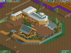
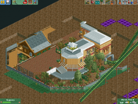
Pinehills is by far comparable to this project, this park has clearly larger buildings, theme zones, split level landscapes and even more details.
I have still no name for this park but the style is clear, as there is in the picture below there will come a ice themed area.
Also there will be themed areas like Wild West, arabia etc.
Also there will be a lot more color, foilage and other details than in Pinehills and there will be a real sense of amusement.
-

 trav
Offline
It's all fine saying that, but we've yet to see it so you can't blame us for saying it looks like your previous work.
 -

 Louis!
Offline
I think it looks different. There's a definate element of 'theme park' rather than 'amusement park'. I think your skill is incredible.
 -

 trav
Offline
I'm sorry but if I went to somewhere like Alton Towers, PhantasiaLand, Disney, Busch Gardens, all these 'theme parks' and saw the level of actual theming he's done so far I would be very very very disappointed. Unless grey is a theme.
Again, I'm not saying you're not skilled, you obviously are. I just really really want to see you tackle a proper theme because I think it could be mindblowing. -

 posix
Offline
I agree it's like PineHills2. If you enjoy doing that then nothing is wrong about it. I agree with this sentiment that you could do a lot more which would be rather interesting to see. Ever considered a NCSO project perhaps?
 -

 trav
Offline
No not yet, give it time haha. I'll be as loving of grey and tarmac as you at some point I'm sure
-

 MorganFan
Offline
At least he's building full and proper layouts now.
The coasters in PineHills made me cringe. -

 Ling
Offline
I think one of your B&M supports on that lift doesn't quite line up, and I think the rest is pretty... empty at the moment.
 -

 trav
Offline
You're pretty good, just keep on doing what you're doing and you'll refine your own style.
 -

 bennyboy17
Offline
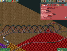
this is a new coaster where i working on for my new theme park (Seven Wonders Theme Park)
it is an coaster in the new area (Arabia) but i havn`t a good name for it, please help me
=http://www.freebits.nl/view.php?filename=951new_coaster.jpg]
-

 Xeccah
Offline
@Trav & Liampie: Thank you.
@RMM: Yes, I will.
@Bennyboy17: Looks like a solid layout, maybe make it longer? -

 Dimi
Offline
Gijssie: there's not much to see yet, but I cannot wait to see more of the themes. I don't like how people look down on Pinehills btw. Sure, it had its flaws, but it was also pretty mindblowing and original in its execution. I see it more as a first draft of your unique style to prove that despite the heavy detailling you can finish your parks, rather than a finished park that shows all your different skills. One thing I don't like in the screen is the way you're doing the supports. I can see the double/overlaying supports are supposed to add detail, but it just makes the coaster unnecessary messy.
Posix: why should he do ncso? His strength is to use small pieces of custom scenery to create highly detailled realism with a unique, subtle atmosphere. I don't think that would be possible with the big, prefab ncso objects.
Shotguns?: huge improvement! Although I cannot see what theme you're going for I really like the buildings and the tought you've put in the composition. -

 trav
Offline
I don't like how people look down on Pinehills btw.
I think you've misunderstood what people are talking about here. Noone is looking down on Pinehills, it was a good park there's no denying that. I just want him to branch into actual themes rather than sticking to the formula he used in Pinehills because I think it will get very boring very quickly.
 Tags
Tags
- No Tags


