(Archive) Advertising District / Dump-Place
-
 19-April 07
-

 Fizzix
Offline
Yeah, gjissie, lose thebad foliage and add more theme and color, please. SRF, looking nice, but I have the same argument as Phatage.
 -

 Liampie
Offline
Consider yourselves teased...
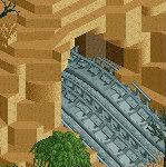
You're back! Is this a new project? How's the Disney park doing? -

RMM Offline
gijssie is like the lebron james of NE. amazing work, but everybody loves to hate what he does.
don't stop building, gijssie. it looks stunning so far. -

 Ruben
Offline
gijssie is like the lebron james of NE. amazing work, but everybody loves to hate what he does.
don't stop building, gijssie. it looks stunning so far.
Nonsense. At the moment gijssie is becoming more & more like that 50-yr'old guy at the office that's known as mister nice guy, and who is really good at what he's doing, but who never got to the top and was stuck at mediocracy because he never took a risk showing what he's réálly capable of. (which is, in fact, a lot in gijssie's case i reckon.)
Really gijssie, it looks very good, but the same. Again. Try to follow Trav's advice.
-

 Pacificoaster
Offline
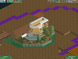
In:Cites: It's pretty dominated by white. I'd consider using zero clearance to continue the supports for the roof through the water so it doesn't looks like they're floating. That shuffleboard is cool, nice job.
StormRunnerFan: It seems to be Cars Land? It looks nice but I would consider trying to use ruin rocks as well to add more texture.
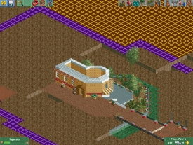
gijssie1234: Not entirely sure "what kind of park it will be" but from that second screen I would have to say Busch Gardens Africa? That inverted boomerang looks great, you now just need to compliment it with a nice interactive queue. I'd consider having the entrance on the opposite side of the station and have the queue wind down underneath the cobra roll's supports. -

 In:Cities
Offline
Looks good so far man. You're improving fast. However, I'd like to see you complete a bit more before posting. It doesn't give us much to comment on!
 -
 rct2isboss
Offline
Looks good so far man. You're improving fast. However, I'd like to see you complete a bit more before posting. It doesn't give us much to comment on!
I agree with this and I have the same problem with posting incomplete screens. -

 Fizzix
Offline
Great advice right there. I've been building a park for 30 years already, and I just haven't felt anything is ready for a screen yet. Remember to build for you, not for posting's sake. Otherwise, looks good. I see why the water would be that color, but it doesn't do it for me. Maybe in more complete surroundings I could see it, but not now.
 -

RMM Offline
Nonsense. At the moment gijssie is becoming more & more like that 50-yr'old guy at the office that's known as mister nice guy, and who is really good at what he's doing, but who never got to the top and was stuck at mediocracy because he never took a risk showing what he's réálly capable of. (which is, in fact, a lot in gijssie's case i reckon.)
Really gijssie, it looks very good, but the same. Again. Try to follow Trav's advice.
his work hasn't brought anything new yet, no, but to call his work mediocre is just nuts. -

 Ruben
Offline
his work hasn't brought anything new yet, no, but to call his work mediocre is just nuts.
His building style is extrémely good, agreed, but the work he delivers is (remember, imo) mediocre because it just doesn't bring anything interesting/refreshing. The archy and park planning gijssie shows are some of the best this site knows, but the choice of themes/concept is just really holding him back.
So yeah, gijssie, what I'm trying to say (though doing so in a somewhat negative manner I fear) is this: You are one heck of an amazing builder! So now it's time to use that skill and make something mindblowing instead of your average Drievliet/slagharen, which you'd be able to do if you'd do something more daring. -

 Liampie
Offline
I enjoy your work Gijs but I do agree with Ruben too. You can do more amazing things. I don't mean more things, but more amazing. Do a theme park.
 -

 Ling
Offline
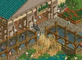
At first I REALLY liked that. But something about the colors just doesn't sit well, and the brown columns look a little messy. I like the crowning on them though, and the sitting areas look good.
 -

 Hex
Offline
I love that screen except for the brown wall going against the teal roof if that makes any sense. What I mean is the base blocks covering up the against the teal roof. (The side opposite the teal roof, but on the building).
 -

 K0NG
Offline
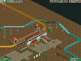
here another picture to show you guys what kind of park it will be


Like others have said, this does seem really familiar. But, that's not my personal issue with it. As much as a couple of people have nutted over the scale you use....it's just not right. While it might accommodate the peeps, the scale of the peeps themselves is off. So, building to them just fucks things all up in my opinion. Look at the white building there with the black roof....and compare it to the coaster. The very small coaster looks GIANT in comparison.
I'm not saying that you should change your style....it is rather 'refreshing'...but consider how everything relates to everything as a whole.
This often happens when you can't complete anything.I agree with this and I have the same problem with posting incomplete screens.
On the contrary... I think his planning is terrible. His archy is ok...IF you like that small scale. He has the talent to do great things once he ties everything together though.The archy and park planning gijssie shows are some of the best this site knows...
3:06
 Tags
Tags
- No Tags


