(Archive) Advertising District / Dump-Place
-
 19-April 07
-
 Corkscrewy
Offline
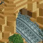
^ if your talking about the base one you can see it's just glitched. its just hiding in there.
Corkscrewy
Offline
^ if your talking about the base one you can see it's just glitched. its just hiding in there. -
 Xeccah
Offline
Looks nice, but the ticket booths feel bare. More detail and maybe change the red will help.
Xeccah
Offline
Looks nice, but the ticket booths feel bare. More detail and maybe change the red will help.
Also, here's another screen
-
 Nitrous Oxide
Offline
Nitrous Oxide
Offline
How is his coaster design poor? Nevis did the cobra roll exactly like this in his Kraken rec that was considered holy for ages, and 10 years later someone does it to get told "follow conventions, bastard!".
Shotguns, the screen is good. Nice early focus on ride interactions and again good colours and atmosphere. I'm so happy there's finally someone who thinks about composition and organisation. The tube is a bit strange in my opinion. Does it need to be covered? Wouldn't it be nicer if riders can have a look at the cobra roll? It's also really really long.
Personally I always thought when people made Cobra-Rolls outside the V shape to be ugly as hell. But if that's the way he likes it most then keep it. I believe it was just constructive critism to be "more realistic" it would be more correct to be in a V shape (which not only is more realistic, but looks alot better). -
 Ling
Offline
@ Shotguns: The buildings are over-detailed, and the colors clash. But the structures look fine. How well that holds up will depend on how they fit into the other buildings and foliage in the surrounding area.
Ling
Offline
@ Shotguns: The buildings are over-detailed, and the colors clash. But the structures look fine. How well that holds up will depend on how they fit into the other buildings and foliage in the surrounding area. -
 Dark_Horse
Offline
That's decent Shotguns?. But as Ling, it's over-detailed, and not in a good way. Make sure the details you add make sense and aren't there just for the sake of detailing. Also, it's seem very flat-faced right now.
Dark_Horse
Offline
That's decent Shotguns?. But as Ling, it's over-detailed, and not in a good way. Make sure the details you add make sense and aren't there just for the sake of detailing. Also, it's seem very flat-faced right now. -
 posix
Offline
posix
Offline
Adding to this: what qualifies as good or bad detailing in my opinion is detail clarity. Details are clear when they make it easy for the viewer to fluently process and understand the function of an object he is looking at. Thus details need to serve identification. To achieve clear details you will have to question and scrutinise whatever it is you're building to understand its function and hence get ideas what details may give it away. Then, it is a question of your creativity how you use the means of the game to adequately communicate those cues.That's decent Shotguns?. But as Ling, it's over-detailed, and not in a good way. Make sure the details you add make sense and aren't there just for the sake of detailing.
Detail clarity also has to do with the right amount of details: detail balance. Over-detailing, as in your case, will blur the impression the viewer has and over-complicate things. This creates disharmony. But so far in your screens you're doing it better than most people around here, so this recent one has me worrying you might fall prey to the over-detailing conventions that although thankfully weakening as of late are still the dominant style trend. -
 Fisch
Offline
Fisch
Offline
Adding to this: what qualifies as good or bad detailing in my opinion is detail clarity. Details are clear when they make it easy for the viewer to fluently process and understand the function of an object he is looking at. Thus details need to serve identification. To achieve clear details you will have to question and scrutinise whatever it is you're building to understand its function and hence get ideas what details may give it away. Then, it is a question of your creativity how you use the means of the game to adequately communicate those cues.
wanted to post my thoughts to the screen and then I read that. Exactly my thoughts, just that you worded them better than I would have anyway haha.
Generally I like it shotguns, just when you use details like those, think of their purpose. Sometimes they work for just designing really but mostly the details that you used their (the wooden framework specifically) are actual parts of the support structure of buildings (hence they're called framework ). Here they just seem random though. But as I said, generally it's quite good! You're getting there man, keep it up!
-
 trav
Offline
It looks very clean, but that's about it. There's nothing that jumps out and holds my attention really, but I'm guessing there's nothing that's really meant to.
trav
Offline
It looks very clean, but that's about it. There's nothing that jumps out and holds my attention really, but I'm guessing there's nothing that's really meant to. -
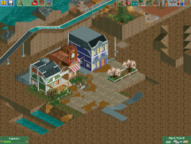
 In:Cities
Offline
You're right in a sense. Its more of an exercise for me to improve my rct skills, as well as my realistic layout skills.
In:Cities
Offline
You're right in a sense. Its more of an exercise for me to improve my rct skills, as well as my realistic layout skills.
I'm challenging myself to build an entire resort in a Disney format, which means also providing space for recreation activities, backstage buildings, villas, cottages, etc.
So its not meant to be a huge 'wow' thing honestly. Just hope some of you can appreciate:] -
trav
Offline
The only thing I would suggest is changing the colours of the roof to the sky-blue colour (The last one on the top line of the colour grid). They look a little too bright at the moment I think.
-
posix
Offline
I understand that, and I do appreciate, yet I'm afraid you won't get much improvement out of this if you don't go for the huge 'wow' thing.its not meant to be a huge 'wow' thing honestly. Just hope some of you can appreciate:]
-
Ling
Offline
I like it. Very resort-ish atmosphere. Some of the deco pieces on the roofs don't seem complete, maybe that's part of it being unfinished. I do like the colors. I think the flat white parts on the tops of the roofs could be turned to glass for greater effect, though.
-
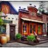 gijssie1234
Offline
Carsland !!??
gijssie1234
Offline
Carsland !!??

Here a new created kiddie ride that i really like to share with you guys

-
 SupraSix
Offline
Haha I love that little ride. Add a little more color though its just so bland with white and red.
SupraSix
Offline
Haha I love that little ride. Add a little more color though its just so bland with white and red.


Tags
- No Tags