(Archive) Advertising District / Dump-Place
-
 19-April 07
-
 Xeccah
Offline
The funny thing is is that the focus was the surrounding of the cobra roll and what's getting the most attention is the roll itself.
Xeccah
Offline
The funny thing is is that the focus was the surrounding of the cobra roll and what's getting the most attention is the roll itself. -
 Top Gun
Offline
I think the tunnel on the log flume is too long. Its a cool idea though. Interested to see where this goes.
Top Gun
Offline
I think the tunnel on the log flume is too long. Its a cool idea though. Interested to see where this goes. -
 Gwazi
Offline
Gwazi
Offline
Welcome to RollerCoaster Tycoon.The funny thing is is that the focus was the surrounding of the cobra roll and what's getting the most attention is the roll itself.
 haha
haha
-
 Ling
Offline
It's because your coaster design is rather poor Shotguns, so it gets focused. There simply isn't much else going on in the screenshot to comment on The water is... well, water, and the foliage is fine but there's just not enough of it to talk about composition, colors, integration, or flow. It's just stuff right now.
Ling
Offline
It's because your coaster design is rather poor Shotguns, so it gets focused. There simply isn't much else going on in the screenshot to comment on The water is... well, water, and the foliage is fine but there's just not enough of it to talk about composition, colors, integration, or flow. It's just stuff right now. -
 posix
Offline
How is his coaster design poor? Nevis did the cobra roll exactly like this in his Kraken rec that was considered holy for ages, and 10 years later someone does it to get told "follow conventions, bastard!".
posix
Offline
How is his coaster design poor? Nevis did the cobra roll exactly like this in his Kraken rec that was considered holy for ages, and 10 years later someone does it to get told "follow conventions, bastard!".
Shotguns, the screen is good. Nice early focus on ride interactions and again good colours and atmosphere. I'm so happy there's finally someone who thinks about composition and organisation. The tube is a bit strange in my opinion. Does it need to be covered? Wouldn't it be nicer if riders can have a look at the cobra roll? It's also really really long. -
 BC(rct2)
Offline
BC(rct2)
Offline
Exactly what I was thinkingThe tube is a bit strange in my opinion. Does it need to be covered? Wouldn't it be nicer if riders can have a look at the cobra roll? It's also really really long.
-
Ling
Offline
I'm not basing it on just the cobra roll posix, the layout of his rides was the main thing in his last topic, and since there isn't much else to comment on in the current screens, it's become the main thing here. I just see no reason for the cobra roll to be shaped that way unless there is a purpose somewhere in the space beneath the ride, and here there is not.
-
 Fizzix
Offline
I like the cobra roll and it's placement. I don't like the turn in the first screen. It is just so awkward and ugly. It's probably uncomfortable for the riders as well. I would make the height change happen during the diagonal track section, then have it straighten out and swoop downward. Just me though.
Fizzix
Offline
I like the cobra roll and it's placement. I don't like the turn in the first screen. It is just so awkward and ugly. It's probably uncomfortable for the riders as well. I would make the height change happen during the diagonal track section, then have it straighten out and swoop downward. Just me though. -
 JJayMForce
Offline
^ I like how 'cramped' it is and the atmosphere it gives off. Also looks like you are having lots of fun.
JJayMForce
Offline
^ I like how 'cramped' it is and the atmosphere it gives off. Also looks like you are having lots of fun. -
Ling
Offline
I like it but there's something off about it. I think you should try to cover the entrance/exit buildings though, like you did for the helicopter ride.
-
 chorkiel
Offline
chorkiel
Offline
Y'know, I'm seeing this comment all over the place. But only on lower quality parks, I've noticed. This honestly makes it seem like the people who comment it, though I never thougt about it as much, that you guys only build to produce quality work. RCT is a hobby, people should have fun building these parks or else they're doing something wrong..Also looks like you are having lots of fun.
-
JJayMForce
Offline
Y'know, I'm seeing this comment all over the place. But only on lower quality parks, I've noticed. This honestly makes it seem like the people who comment it, though I never thougt about it as much, that you guys only build to produce quality work. RCT is a hobby, people should have fun building these parks or else they're doing something wrong..
For me, I have fun trying to reach my desired 'look' and result when building something. The fun comes at the end, when looking at it. But it is very difficult and tedious to achieve sometimes, which makes it less fun when 'playing' occasionally. I just build what I would like to see I guess and I what I think looks good for me. -
Ling
Offline
Needs rails. For the ticket offices at least. Also I think you can squeeze one more texture into those booths... maybe a castle or mud base. Also I would extend the tower a level or two.
-
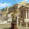
 Chocotopian
Offline
Sometimes I wish there was a 3-tile wide banner
Chocotopian
Offline
Sometimes I wish there was a 3-tile wide banner Nice work, very classy and clean. I might suggest adding a simple railing/boarder around the flat roof bits, but I think the uncluttered look works here too. There’s a bit missing off one of the pillars btw.
-
Fizzix
Offline
Yeah, I agree with both Ling and Chocotopian. I also think the paths could use some sprucing up. Maybe some gardens, with a flower of a new color.


Tags
- No Tags