(Archive) Advertising District / Dump-Place
-
 19-April 07
-
 JJayMForce
Offline
Thanks everyone for the feedback. I will fix those issues and post an updated screen once I open a topic.
JJayMForce
Offline
Thanks everyone for the feedback. I will fix those issues and post an updated screen once I open a topic.JJay, I think it looks too messy but quite good. Do you perhaps have a reference picture as you're rebuilding it?
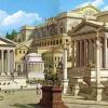
I couldn't find a good picture, but this aerial will give you a good idea of what going on.
http://www.bing.com/...Dk0NzY5MzIzOTg0
Near the top of the map, where is say's "birds eye" find the arrow next to it and then click birds eye view, and that will give you the view you need. -
 Dimi
Offline
Yeah it's the best frisbee ride I've seen. These hyper detailled rides are awesome but I really want to see more of your theming skills. The Shrek castle you showed some months ago was incredible.
Dimi
Offline
Yeah it's the best frisbee ride I've seen. These hyper detailled rides are awesome but I really want to see more of your theming skills. The Shrek castle you showed some months ago was incredible. -
 Arjan v l
Offline
Better add some brown too the green building and some gray or white.
Arjan v l
Offline
Better add some brown too the green building and some gray or white.
The water ornament doesn't appeal to me. Less path more trees/flowers or something else that fits. -
 MCI
Offline
I dont know why you´re showing this pic...
MCI
Offline
I dont know why you´re showing this pic...
You can do way better on this and you know that!
I like those trees and the barrels around them, but the water, the huge path and this green house are not that nice at all... -
 Faas
Offline
Use the double coloured flowers for the blue part of the flag and make it blue and yellow.
Faas
Offline
Use the double coloured flowers for the blue part of the flag and make it blue and yellow. -
 Ling
Offline
It's very red white and blue. BigB, the inward facing walls on the entrance should have some kind of detail that implies the purpose. Which, I assume, would be buying tickets.
Ling
Offline
It's very red white and blue. BigB, the inward facing walls on the entrance should have some kind of detail that implies the purpose. Which, I assume, would be buying tickets. -

BigB Offline
Thanks for your replies, stuff is fixed, buildings are optimized, there are"inward details" (park info, cash machine, typical entrace stuff), and de big place is divided in two parts by a row of cass-houses ( 2nd birch-tree line).
The water ornament is also changed.


Tags
- No Tags