(Archive) Advertising District / Dump-Place
-
 19-April 07
-

TwistedHelix Offline
Just a little non cs rct2 park I'm working on when I'm bored or need inspiration for my rct3 parks. Bear in mind this is my first real go at realistic parks in rct 2 so dont expect to much lol.
Anyway some interior shots of the resort hotel themed to greece (hence the white walls and blue bits):
Shot showing everything on the ground floor including reception, resturant wings, Kitchen, customer and staff toilets, grand staircase and dance hall/club.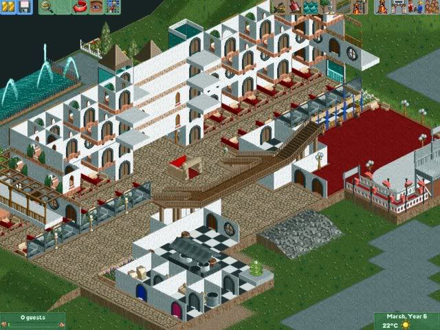
Now for a lcose up of the dance hall/club stage: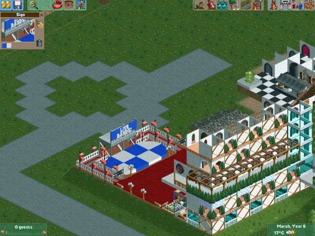
I know thier very unfinished but I wanted your guys opinions before I start adding the roof (not Im only doing the ground floor not the rest).
Cheers
TwistedHelix -

 Nokia
Offline
well...
heres a park thats going REALLY slowly.
there might have been a screen showed from teh park. [thanks supa-x]
well anywase.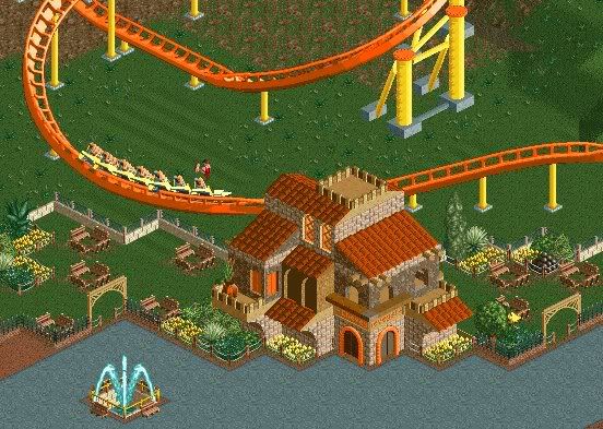
comment?
=nokia :] -

 Comet
Offline
It's really cool the way the coaster flies by the seating area.
The building is a little crazy though... -

 Cocoa
Offline
It's nice, except I'm not too fond of the dirt roof. Maybe use sand or something else...
 -

 Drew
Offline
hahahaha...
umm, for that screen. im not too fond of the banners. why are they there? that, and like someone said above, dirt on the building looks weird. either change the land type or put dark brown pathing there. and what's the point of having those windows there if you're gonna cover em up with the maze stuff???
and maybe change the color of the ghost train track... and add bushes... and make it better. yeah. -

 CedarPoint6
Offline
I'd say it's one of the best LL buildings I've seen in awhile. Usually they don't appeal to me. There's like 4 or 5 LL parks that I find aesthetically pleasing. This building is pleasing and looks rather nice.
 -

 Nokia
Offline
i dont like the fact it's at the end of the map.
but yeah i dont know much about LL,
but i do know what a good screen is.
and thats it. -
![][ntamin22%s's Photo](https://www.nedesigns.com/uploads/profile/photo-thumb-221.png?_r=1520300638)
 ][ntamin22
Offline
It is a very classy looking building- it screams 'Italian Villa' at me so much it hurts. Symmetry and map-edgedness kind of detract; while the maze roof works here I'm not sure it could for an entire area. Perhaps try wooden path over the maze to vary roof textures while maintaining the maze walls?
Banners are just glitchy, that's the way they are. -

 zodiac
Offline
The fact that it's just one building surrounded by a couple of trees and flowers is what's making me not like it. Everything about the building is nice, but without the surroundings, it just doesn't have the magic I know it can.
 -

 Steve
Offline
too much black, especially since you're using the facade technique. using the awnings as accents is good, but i'd throw in a few more.
 Tags
Tags
- No Tags

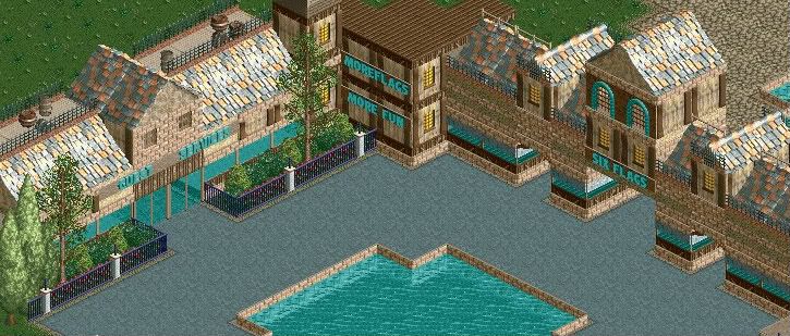 updated.


