(Archive) Advertising District / Dump-Place
-
 19-April 07
-
 JJayMForce
Offline
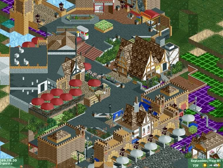
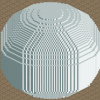
what y'all think, and can you guess what park this is a recreation of? Not finished though, foliage is not done.. -

 JJayMForce
Offline
YES! Haha, I knew you would know, seeing as how you are drawing inspiration from it. It will be a 256x256 map 'replica', with my own personal scale of it I guess.. I will show more later, I just couldn't wait to post somethin lol.
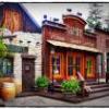
The pic above is the entrance. -
 ScOtLaNdS_FiNeSt
Offline
I don't have a clue, But i will comment on the work, I like the area especially the building on the centre right and the entrance, When i first looked at it i nearly had a fit, with the weird shapes on the left of the screen lol. my brain just didn't make sense of it until i looked at it for about a minute
-

 Liampie
Offline
I more and more regret that I didn't draft you. Not syaing my current team is bad, not at all, but I just want to give you a stage.
-

 BelgianGuy
Offline
while a bit cluttered and crammed, I like it somehow, try not to put too much on too little space though, give it some room...
 -

 JJayMForce
Offline
Nah, I understand why I wasn't drafted. I need to work on my creativity and imagination a bit more, and refine my skill. I am recreating this to work on realism more, because honestly I haven't been to many amusement parks, and hershey is a great 'learning experience'.
Its rather cool how it worked out though, seeing the park as a whole. I practically copy/pasted the layout of the park from google earth, thats cheating I know, but im anal like that lol.
Also try and just look towards the center of the screen, the green and purple grid are just markers for later, remember its not finished. -

 Hex
Offline
^Hell no. That looks REALLY good. I love love LOVE Hershey Park and that looks as about as good as it can get. You better include Skyrush. I can't wait to see more!
 -

 tyandor
Offline
JJay, a tip if you are gonna post a screen of an already cluttered area, atleast take the time to black it out or just temporarely use normal ground textures because it's seriously hurting my eyes here. Which is a waste because I think I see some quality stuff in there.
 -

 Fizzix
Offline
That left building looks like it's still zero-clearanced lol. Love Hershey Park, would ba awesome to get a full rec. I think the roof needs to change color to avoid confusion with it and the path.
 -

Airtime Offline
I'm really impressed with that screen! Far better than anything you've posted before. It's got a sort of PT2 feel about it which I absolutely adore. However the diagonal roofing on the building on the left isn't great, looks like path almost. Also the buildings roof shouldn't be nearly as low as the path (near the umbrellas towards the far bottom left of the building. I'm not a fan of the green flowers either tbh. I thought Hershey straight away though and I adore that screen, well done. -

 Dimi
Offline
I agree that the combination of diagonal roofs and pathing make the screen look quite confusing. The foliages could need some improvement, but the architecture looks very promising.
 -

 chorkiel
Offline
JJay, I think it looks too messy but quite good. Do you perhaps have a reference picture as you're rebuilding it?
 Tags
Tags
- No Tags

