(Archive) Advertising District / Dump-Place
-
 19-April 07
-

 Cocoa
Offline
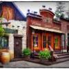
technically its pretty good but for me it really doesn't capture the atmosphere of harry potter and hogsmeade very well. I think it really needs shops underneath, barrels and other scrap lying around, and a lot more detailing to really get that vibe.
 -

 Ruben
Offline
I like it a lot. Accept for the ugly tree in the lower left. The shape of that tree isn't enjoyable for starters, but the colors make it even worse.
(Have to be negative about sómething right? )
)
-

 Hex
Offline
Agree 100% with Ruben. None of those trees look like they belong in this game. think the one is in either the creepy themeing or WW/TT. If you put in better trees/foliage then that will be an amazing screen.
 -

Wicksteed Offline
Why don't you like the trees from the creepy theming. They are the best ones in the game.
-

 FK+Coastermind
Offline
Awesome screen, but I can already see you falling into the same habits of ur last park, sure this is super awesome detail, but what theme? What about this area makes it different from any other theme park? Theming is the next step, don't just make another theme park themed to a theme park...
FK -
 Pacificoaster
Offline
gijssie1234: That looks really nice but like Pine Hills, be careful about how much grey you use. You could change the station's walls and maybe the skyride's supports to liven it up. Maybe a soft blue for the sky ride and a yellow for the station?
 -
 AvanineCommuter
Offline


again, beautiful construction and attention to detail but the color is too muted. Gray supports, gray pavement, gray wall, white fences, gray bases, etc. Use some color, I don't think I'm the only one that feels this way about your work. COLOR.
-

 MikaRCT2
Offline
I kinda like it, except for the blue glass on the left building, and the red flowers at those trees
-
 Fizzix
Offline
I like that. The glass could be toned down with the aqua color beneath gray, but I like it.
 Tags
Tags
- No Tags
