(Archive) Advertising District / Dump-Place
-
 19-April 07
-

RMM Offline
@CCI
i'm pretty sure it'll go over the first hill at about 12 miles an hour max... and that ain't good.
EDIT: nevermind. but it's a rather dull layout. maybe try to have the large hills cross a bit more? some more interaction is always nice for a racer. -

 nin
Offline
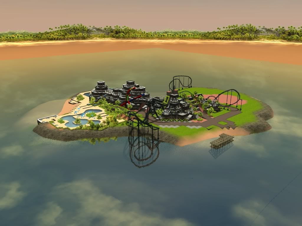
SuicideCarz, that looks cool. Fill the right half of the screen more and possibly try more vibrant colors, but otherwise it's looking good.
 -

 CCI
Offline
To answer the dull layout questions, it's meant to be an early Miller racer (like Kennywood). I'll try to tweak it a little though. Thanks guys.
 -

 Maverix
Offline
The straight section at the top of the lift should be longer, but it looks good otherwise.
 -

 Fizzix
Offline
There should definitely be at least a 10-15 ft pre-drop before the real drop. That would be unnecessarily slow. I would also maybe make the mountain bigger, because as of now, it doesn't look like much of a mountain compared to that ride.
 -
 coasterfreak101
Offline
There should definitely be at least a 10-15 ft pre-drop before the real drop. That would be unnecessarily slow.
The bit after the lift should be a longer straight section, but there doesn't need to be a pre-drop at all.
And in video form to show that they really do move slow:
http://www.youtube.c...h?v=nFtJF_bupn8 -

TwistedHelix Offline
I personally think the wingrider looks fine with the lift like it is. Its not a long distance from the top to the start of the roll.
I'm a bit miffed about it not having the trademark barrel roll supports and the one on the right hand side I would have going the other way if you leave them like that as it looks like it might hit the support otherwise.
Cheers
89James89 -
 gijssie1234
Offline
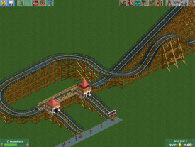
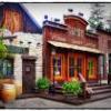
it still doesn't have a name but the progress is going well, this time i don't show every angle of the park
The park will have a kind of Hersey park feeling like the water and the different heights of the land.
-

 gijssie1234
Offline
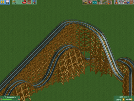
The front of the building is even better and more detailed that the back side like you see here xD
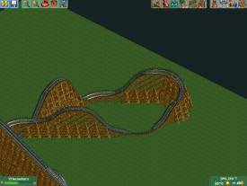
The wooden roller coaster is almost totally diagonal and still looks really awesome and got a good smooth flow. -

 Liampie
Offline
Is anyone going to comment on this or what?
Apparently not, which is probably because the screen are horribly uninspired and unfinished. The wooden coaster as path is pointless and looks bad.
Here is your comment. -

 gijssie1234
Offline
Is anyone going to comment on this or what?
Why roller coaster tracks as paths ? it can be funny but not like that, and when you are asking like that for some comments i pass. -

 Ruben
Offline
gijssie1234 used improved parkmaking skills. It's super effective!
No, really. Looks like you're giving yourself some more space to build, and aren't afraid of using some bigger structures than the stuff you've shown so far. I like it.
@Mika: Thing is, its pretty standard. I don't like the color. The rest is, well, decent enough I guess, but just not very appealing. It has no identity of its own, which is usually the thing that makes woodies so great.
 Tags
Tags
- No Tags
