(Archive) Advertising District / Dump-Place
-
 19-April 07
-

 Fizzix
Offline
I feel like the junk is too much and too randomly placed, especially by the station. I would try to put a little clump of bushes and maybe a flower or two(although these might change that dingy atmosphere) in the corner, then add a barrel here, a few barrels there. Right now, to me, it looks like a cargo plane flew over head and dropped junk everywhere. I realize it's junk, but maybe try a little smarter placement of these objects.
As for the Design/Mini Park question, I would go with mini park. That's a cool little peice of work, you could do well expanding on it. -

 Nitrous Oxide
Offline
SoCalCoasters, that's looking really good. At first glance I didn't even realise the NCSO. I really like the layout of the wooden and love the setting. I've always really liked rides that have a bit of interaction with other rides. Being a bit compressed I guess you could say. The water ride and the coaster really work well together here. Although I'm not sure about the hop after the drop on the water ride, although it would be alot of fun.
As for a bit of update on Worlds of Adventure Season-3 (CHIMERA). I managed to spend a few minutes importing a few useful objects with the Parkdat.. which will help bring more detail to the park in future updates. I'll be making a thread in the upcoming days/week or 2 which will give a few more updates on what other new additions are being added to the park this season. And last but not least, one of the things I'm most happy about. I spent about 2 hours messing with the entrance to the park and the 'Guest Entry Points' and fixed the glitch that was causing peeps to get stuck at the entrace when the park was not open and also not allowing them to leave the map when leaving the park which caused a pile up of hundreds of guest. So the park will be completely peep friendly. -

 CoasterCreator9
Offline
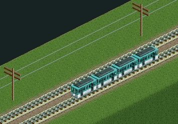
New Elm Tram 1007 passes on the mainline near Sapphire Shores Boardwalk, along the coast.
(Note: Brush and other things have yet to be added. -

 Fizzix
Offline
Never seen that roof piece used as grass before(although it has crossed my mind many times). Not sure if I like it or not yet. I enjoy that you're trying new things though
-

 nin
Offline
It wouldn't have taken that long to add a bit extra to finish the screen. Cool idea, but pointless screen.
 -

 CoasterCreator9
Offline
It wouldn't have taken that long to add a bit extra to finish the screen. Cool idea, but pointless screen.
Actually, for me it would. What's missing is foliage, and that is what I need to spend the most time on. -

 robbie92
Offline
^Still, it would've been nice to wait until you at least had some foliage in. It's not like it's a large screen with a lot of content otherwise in the first place...
 -

 CoasterCreator9
Offline
^Still, it would've been nice to wait until you at least had some foliage in. It's not like it's a large screen with a lot of content otherwise in the first place...
You're probably right, I just wanted to see what people thought,
Apologies.isn't the grass just sloped up? wheres the roof pieces used as grass?
Yeah, just sloped. -
 gijssie1234
Offline
What's the point of that picture, there is nothing new or special about the tram
it's a nice hack, but I can't comment with out any surrounding
-

 Pacificoaster
Offline
gijssie1234, show us something fool. I want to comment on some good non H2H RCT2.
 -

TwistedHelix Offline
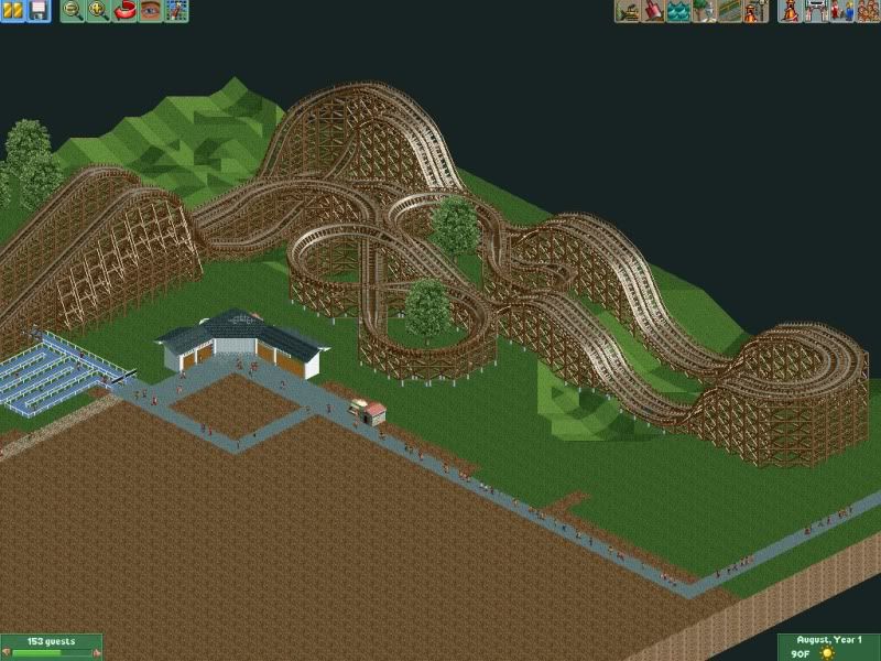
Apart from the right hand sides first turn looking a little akward I like that layout CCI.
Cheers
TwistedHelix -

 Fizzix
Offline
The layout looks a little bit awkward in some of the turns, CCI, like Twisted Helix said.
SuicideCarz, I would HIGHLY suggest replacing some of those shrubs with flowers. Looks very monotonous and frankly, just bad. It contrasts the goodness of the rest of the screen:) -

 Psi
Offline
It's nice CCI, save for maybe the parallel-same-height parts on the right.
edit: Nevermind, it's a racer...why did I not notice that?
 Tags
Tags
- No Tags
