(Archive) Advertising District / Dump-Place
-
 19-April 07
-
 Timothy Cross
Offline
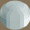
experimenting with futurist architecture (mostly inspired by Eero Saarinen) using the stacked monorail hack in RCT3.


-

 leonidas
Offline
Looks good, while still being very unfinished. I love the shape.
Oh, and +1 for trackitecture in RCT3.
-

 chorkiel
Online
same here^
That stuff remembers me of trackmania

corkscrewy, apart from that screen consisting mostly of supports and track it loks quite good. -
 Chillsons
Offline
Just bought the game again and thought I would have a little play.
I Think I might get rid of the waterfall...
-

 Fizzix
Offline
Yeah, either give that waterfall some natural context(landscaping), or get rid of it. If you decide to keep it, please arrange the rapids in a less sporadic manner. Most of the rapids would be at the base, with a few stragglers. Doesn't look bad besides these things.
 -

 FK+Coastermind
Offline
Besides the waterfall having no purpose there, as it has no context in the landscape, you need to use ice blue color for the waterfall scenery in order to get the full effect of a rushing waterfall.....
FK -

 CoasterCreator9
Offline
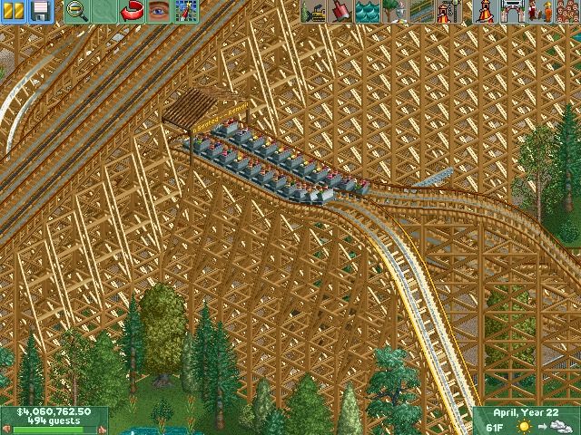
Three potential layouts for a park that I will get around to eventually actually starting, it's only a matter of object selection and I have had no desire to do that recently. Perhaps I'm just a bit lazy.
Everything in the following screenshots has been done in a separate workbench and none of the colors/scenery are final.
Prior and Church woodie, somewhat Giant Dipper-esque: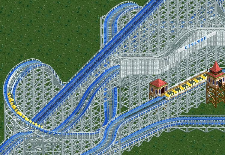
Virginia Reel - Not sure if this could be improved or not, suggestions?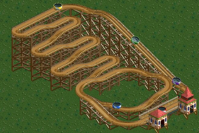
An "I-have-no-idea-what-manufacturer-would-make-a-coaster-like-this" woodie, I just like the layout and style.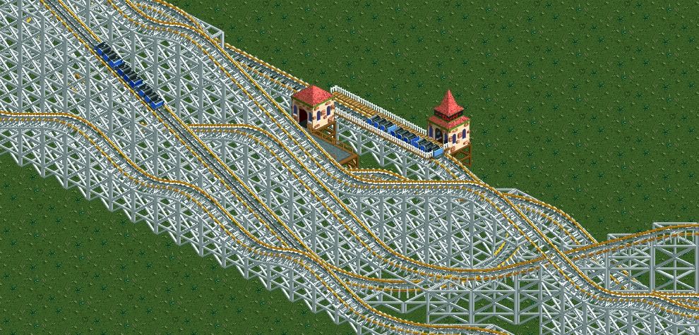
-

 CoasterCreator9
Offline
I love the colors on the first woodie.
Thanks, I like them quite a bit too, light blue/white is my thing I guess.
Ya I really enjoy that first screen.
I'm loving that Virginia Reel!
Thanks! Now I'm more motivated to actually start this thing.
 Tags
Tags
- No Tags


