(Archive) Advertising District / Dump-Place
-
 19-April 07
-

 RCTER2
Offline
Yes its NCSO, just a little experimentMmmmh.. I'm all for NCSO usually, but huge statues without at least 1/4 objects? Doesn't work for me, sorry..

-

 Ling
Offline
The structures look good, but I'm not sold on the textures/colors. Also the giant statue... maybe using track would serve you better (for the arms, at least).
 -

 Fizzix
Offline
I always try to stray from building massive structures in NCSO, because they end up looking so awkward. With limited quarter block options, you can barely show movement effectively. They tend to end up like giant stick figures. If you're going for Naruto throwing the star, you should at least try using trackitecture for the arms, as Ling suggested. Corkscrewy, good to see more work from you, and I'm glad you're trying new things. I like the direction the go kart track is going, but your foliage needs work, try looking at nin's stuff, or possibly my own. Also, your ground textures change way too quickly, try easing them into one another, maybe grass, grass/dirt, dirt, etc. In general though, I like what I see.
 -

 RCTER2
Offline
The structures look good, but I'm not sold on the textures/colors. Also the giant statue... maybe using track would serve you better (for the arms, at least).
Thanks for your suggestions!I always try to stray from building massive structures in NCSO, because they end up looking so awkward. With limited quarter block options, you can barely show movement effectively. They tend to end up like giant stick figures. If you're going for Naruto throwing the star, you should at least try using trackitecture for the arms, as Ling suggested. Corkscrewy, good to see more work from you, and I'm glad you're trying new things. I like the direction the go kart track is going, but your foliage needs work, try looking at nin's stuff, or possibly my own. Also, your ground textures change way too quickly, try easing them into one another, maybe grass, grass/dirt, dirt, etc. In general though, I like what I see.

-

 Cena
Offline
That gigantic birdman can be made better with smaller objects, although I like the idea and enthuastiac color usage.
 -

 leonidas
Offline
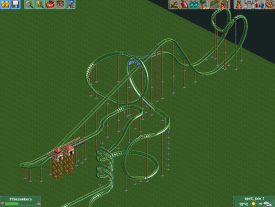
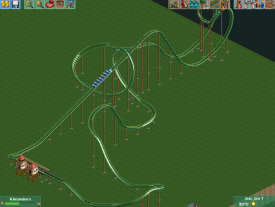
After the second loop it becomes quite painful, especially the part where there's a curve and a small corkscrew after a giant loop with way too much speed. The four corkscrews also look quite unrealistic for my taste. And that station is way too high, there seems to be a 6m drop before the lift, which is quite useless.
I'd look at some real-life coasters and try to get the flow and structure of them. -

 chorkiel
Offline
Short.
You should consider adding a MCBR after the first loop so the train slows down and then go for something that looks more like you had in the end of your first layout but less painfull. -

 MikaRCT2
Offline
So you mean that I should use the first layout but then with a mcbr after the loop around the lift hill?
 -

 chorkiel
Offline
No, I'm suggesting you place an mcbr after the loop around the lift hill and then restart the lats part but make it look more like the first layouts ending rather than the second ones. Though that first layout looks quite painfull.
______________________________________________________________________
Here's a layout I built today. Those last two pictures are parts that I think that I could improve quite a lot but I'm rather stuck on how to finish it.. Can anyone help me? c:
-

 chorkiel
Offline
Yeah, I forgot to repaint the track.
I personally thougt the 2nd picture just wasn't good. and the 3rd picture I just dislike but I can't figure out how to change it.. -
 Xtreme97
Offline
The third picture would look better at a different angle but the rest isn't too shabby.
 -

 nin
Offline
It seems like it's a very "blocky" layout. If you kept all the elements the same yet smoothed every transition to make it one fluid layout, I think it wouldn't look bad at all.
 -

 Hex
Offline
Not sure about the "S" bend before the brakes, but I think it looks nice other than that.
Unfinished. Having a lot of fun building this park.
 Tags
Tags
- No Tags
