(Archive) Advertising District / Dump-Place
-
 19-April 07
-

 ivo
Offline
high detailness is something that should be no objective. But that is a nice try on those supports.
 -
 gijssie1234
Offline
thanks ^^ , i was verry inspired by the same kind of ride at violet gardens, Thanks Prodigy !
 -

 Cena
Offline
Gijssie, the supports are cool, the footers are unrealistic.
[In Dutch:] De betonnen voetstukjes zijn onrealistisch omdat je beton nooit in zo'n vorm gaat gieten. Beton word altijd in simpele vormen gegoten om zodoende het makkelijk te bewerken en de luchtbellen eruit te halen. Dat is met zon lastige vorm niet mogelijk, wat ervoor zorgt dat je luchtbellen krijgt en dat het beton dan onder druk knapt. Je doet er beter aan om de betonnen voetstukjes simpel en realistisch te houden door ze of vierkant te houden of in een ronde/ovaal vorm. Alles anders dan dat is onrealistisch vanwege de technische aspecten van het gieten & uitharden van beton. -

 gijssie1234
Offline
^i understand, at the front of the coaster are some round footers, when i make the other footers more simply it will look a bit weird in the game, i understand that for real the footers can't look like that
-

 AvanineCommuter
Offline
suicidecarz, try changing the mcbr into a zero g roll, maybe that would help?
 -

 Dimi
Offline
high detailness is something that should be no objective. But that is a nice try on those supports.
I don't think that's his objective. His goal is probably to make something beautiful, and coasters with supports become more beautiful when they're highly detailled. If so, Gijssie, you've accomplished your goal. -

 RCTMASTA
Offline
@Mika: You've never read/watched Odyssey Two, have you?
Anyway, gijssie:
I definitely agree with Cena on this. But other than the footers, it looks fantastic. -

 chorkiel
Offline
I wouldn't care so much about the shape of the concrete, but more about it being barely bigger than the supports themself, if the supports would be in there it would mean there's only a thin layer of concrete around the supports. It does look quite good though ;p
 -

 Xtreme97
Offline
I like the footers. They're unique and certainly a step up from rounded ones.
The entrance so far of a mini park i'm working on: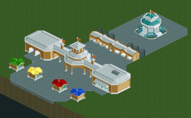
-

 Ruben
Offline
Looks nice. What's the size of a mini park in your opinion if I may ask? (park size/coastercount, whatever). 'Cause it feels pretty big for a mini park entrance, then again, it also feels like my idea of a mini park is different from that at NE.
 -

 Cena
Offline
Cena because his second passion after RCT is concrete.
Or a might be studying Mechanical Engineering and therefore know more about this subject then others around here.
 Tags
Tags
- No Tags

