(Archive) Advertising District / Dump-Place
-
 19-April 07
-

 Cena
Offline
Dude. You and SF shouldn't be posting screens now. Don't let everyone know how good we are!
 -

 RCTER2
Offline
About the stuff of ScOtLaNdS_FiNeSt, can someone tell me what is that tip he used?
 Or is it a secret of your team?
-

 Hex
Offline
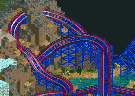
Nokia that looks fantastic. Uh, tips? I would only see make the water fall bump out a little more. it looks too flat. I know waterfalls are kind of flat but put some rocks in there and make it have a bit of a different direction. Other than that it's beautiful.
 -

 AvanineCommuter
Offline
Dude. You and SF shouldn't be posting screens now. Don't let everyone know how good we are!
Who's scared? -
 gijssie1234
Offline

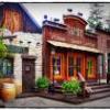
Here is another great detailed buildings out of my new park, it still got no name but that will come
From the tower you can have a great view over the whole park !! -

 Dimi
Offline
Nokia: add some diagonals on the top like did at the bottom, it will look less flat.
Gijssie: I agree with trav, it's beautiful but the supports are very large for such a small building on top. If you'd make the building a few blocks bigger it will be perfect. -

 FK+Coastermind
Offline
Nokia, if ur going with an ice background for the waterfall, turn your water color to the very bright life blue, blends better with the ice to make a more continuous rushing look.
FK -

 Pacificoaster
Offline
gijssie: I really like your style. Although I agree that the observation deck should be a bit wider.
 -

 Dimi
Offline
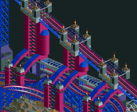
I'm still not sure if the coaster colours are beautiful or hideous, but I really like what you've done with the lift hill.
 -

 gijssie1234
Offline
Even bigger plz.
When i make it more bigger it will be out of scale , it's another realistic park
-

 K0NG
Offline
Nokia, if ur going with an ice background for the waterfall, turn your water color to the very bright life blue, blends better with the ice to make a more continuous rushing look.
OR....don't use the "ice" background for your waterfalls. Ever. When was the last time you looked at a real waterfall and saw that the rock/dirt/algae/whatever behind the falling water was, in any way, shape or form....bright blue?
I know everyone does it...but, the ice background on falls is one of my personal "pet peeves". Layer your falls to give them depth if you must. But, unless the falls are actually flowing off of ice....
 Tags
Tags
- No Tags


