(Archive) Advertising District / Dump-Place
-
 19-April 07
-

 Goliath123
Offline
Maybe by work he means (wûrk). n. 1. Physical or mental effort or activity directed toward the production or accomplishment of something
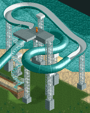
but yes it was a useless comment, i think the slides are nice but the supports are odd, most slides these days just have standard beem supports -

 Nitrous Oxide
Offline
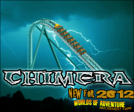
There's something lurking in the forrest of Worlds of Adventure. A beast so furious you'll have no choice but to scream! Next season Worlds of Adventure will be opening it's tallest, fastest, and longest roller coaster to date, CHIMERA! Chimera will stand above the entire park at 245ft. But that's only the beginning! Chimera will drop you approx. 235ft straight down (90-degrees)! The ride will then take you on a journey approx. 5,000 ft before returning you back to the station. You will find no ride experience like this anywhere. Throughout the course you will be taken through 3-high speed turns, a 360-degree helix, sharp-s turn around, and many steep drops. Chimera will open to the public this spring when Worlds of Adventure opens.
Worlds of Adventure is also putting $25,000,000 in renovations for a total of $49,000,000. Making this the single largest investment the park has made. Here is a list of additions that have been confirmed.
-New Picnic Area near the main attrance.
-New Restraunts (Main additions; Coaster's and Pink's
-Inferno (New Paint Scheme)
-Improved gardening and scenary.
-New midway near Chimera.
-Renovation of old Shops/Restraunts.
___________________________________________________________
CHIMERA STATS (approx.)
Type: Steel - Sit Down
Status: Opening 2012
Builder: Bolliger & Mabillard
Cost: $24,000,000 USD
Length: 5000'
Height: 245'
Drop: 235'
Inversions: 0
Speed: 80 mph
Duration: 3:00
Max Vertical Angle: 90 Degrees
Color: Aqua Track & Teal Supports
Trains: 3 (Crimson-Red, Sunset-Gold, Midnight-Blue) Trains with 8 cars per train. Riders are arranged 4 across in a single row for a total of 32 riders per train.
Restrictions: Riders must be 54" or taller to ride.
___________________________________________________________
Like I said in my Fiesta topic, this park was made for ParkWars2 and the bench really has nothing in it. Not to mention, this park was made around 2005. Never really had intentions on coming back to it after PW2... but lately I was curious how well I could improve it with the scenary I have. I know I can import scenary, but it would be a pain and really not worth the time of doing it. -

 CoasterCreator9
Offline
Well how would you suggest he do it? That comment was nearly pointless.
My apologies, I forgot to add that they simply look undersupported.
Also, Chimera looks pretty cool.
-
 SupraSix
Offline
Nitrous that ride looks awesome, especially the description. If the drop is straight down the whole way I think it might look a look a little odd and not flow. But since I can only see the lift crest it's only a guess.
One more pic of the dueler before I start a topic for it. I will add waterfalls and rapids to the stream I just forgot to put it in the bench.
-
 gijssie1234
Offline
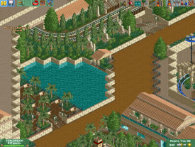
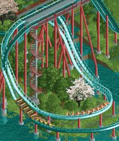
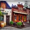
i really like your first screen, this one is oke but not fantastic, the purple tree works at the other screen but the white tree doesn't work here for me , and i think the pole where the staircase leads to is too thick
 -

 Nitrous Oxide
Offline
Nitrous that ride looks awesome, especially the description. If the drop is straight down the whole way I think it might look a look a little odd and not flow. But since I can only see the lift crest it's only a guess.
One more pic or the dueler before I start a topic for it. I will add waterfalls and rapids to the stream I just forgot to put it in the bench.
Thanks guys. As for the main drop, I can see how you would think of the drop being too straight.. but I don't build by RCT's height markers so the lift/drop is smaller than an 'rct height' hyper. So there really isn't much more 90-degree track to the drop. To me this was the best way to simulate a drop like Leviathan's.
I've always built with 'units' and basically go by my own height chart. To me, RCT elements are too small to pull off at the "games scale" and looks terrible to me. I normally stick to smaller designs for this reason. To me, this also helps with flow and makes the coaster look more natural and smooth. -

 CoasterCreator9
Offline
Thanks guys. As for the main drop, I can see how you would think of the drop being too straight.. but I don't build by RCT's height markers so the lift/drop is smaller than an 'rct height' hyper. I've always built with 'units' and basically go by my own height chart. To me, RCT elements are too small to pull off at the "games scale" and looks terrible to me. I normally stick to smaller designs for this reason. To me, this also helps with flow and makes the coaster look more natural and smooth.
Agreed. That's how I made my B&M giga awhile ago. Wouldn't look right otherwise. -

 SupraSix
Offline
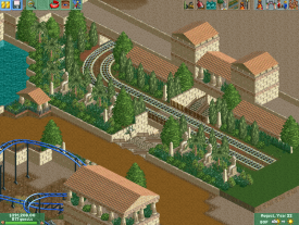
Those are some nice screens whitehawk. My only comment is that the foliage and structures are too symmetrical. It's fine when there's symmetry, but if you don't balance it with some asymmetrical features it can look odd.
 -
Whitehawk Offline
Those are some nice screens whitehawk. My only comment is that the foliage and structures are too symmetrical. It's fine when there's symmetry, but if you don't balance it with so asymmetrical features it can look odd.
This whole area is supposed to have a very planned feel, though I do see your point.
As for LL....Nahhhh. (Love the game, but not for this type of thing!)
-
 MikaRCT2
Offline
Were the trees supposed to look like planted ones then? Trees mostly are symmetrical (in parks) when they're planted.This whole area is supposed to have a very planned feel.
-

 AvanineCommuter
Offline
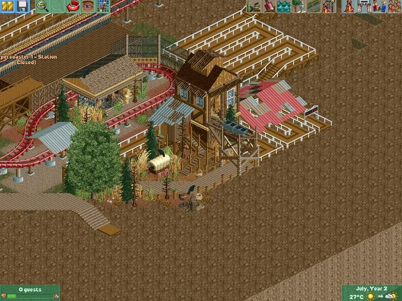
That's looking pretty great! Maybe add more supports to the red roofing as it looks like its floating ATM.
 -

 Hex
Offline
I hate that type of queue line, other than that I love it. Just change the type of path for the queue line.
 Tags
Tags
- No Tags

