(Archive) Advertising District / Dump-Place
-
 19-April 07
-

 posix
Offline
THEME!
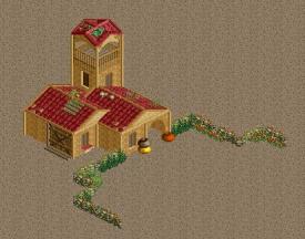
just messing around with the h2h bench..
Very nice. Next thing in your transformation as a player is to stop building planar parks. Good theming makes use of meaningful land elevations and I'd love to see you do that. -

 Coupon
Offline
Thanks guys!
 I appreciate the compliments! They always push me to try to do better stuff..
-

 Liampie
Offline
A step in the right direction. Now learn to make actual buildings instead of blocks with cardboard facades. Multiple stories, real roofs and stuff. Your work will benefit greatly from better architecture!
-

 CoasterCreator9
Offline
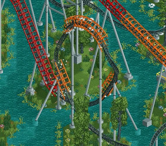
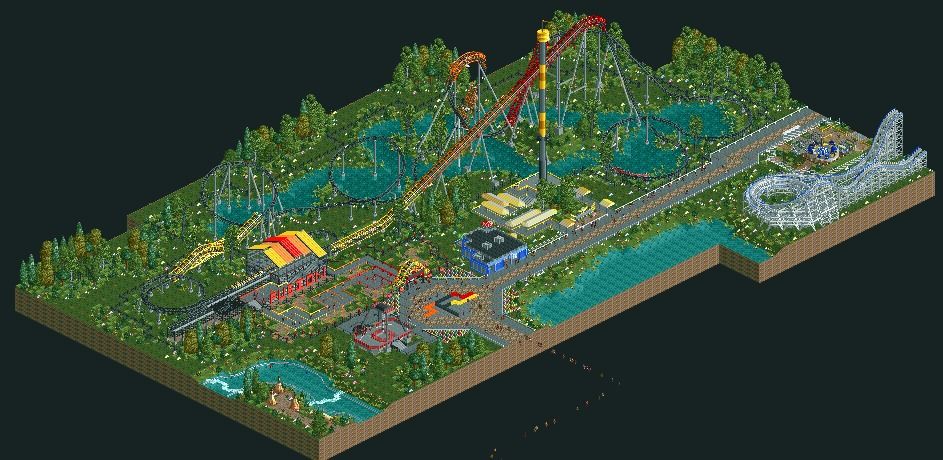
Fusion - I'd say it's about 98% complete, just want some criticism as a final check.
-

 XCars
Offline

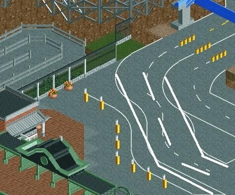
Just messing with the bench, nothing to great, also not happy with the building to the right. Quality okay? -

 Pacificoaster
Offline
Broken yellow road lines means there is traffic in each direction in which you can make a pass. In this case you have two of them? Otherwise, it's a decent start.
 -

 Pacificoaster
Offline
If you want two separate roads. You need a WHITE broken line, not yellow. Technically you have four roads.
 -

 Dark_Horse
Offline
XCars: I like it, just make sure to change the middle lines to yellow to signal two different directions. I love the smiley face at the entrance by the way. Great job on that. Though it's kinda creepy at the same time.
Coupon: I agree with what's been said already. Change the floor of the building and it will be 10 times better.
Just messing around with Louis!' bench
-
 ScOtLaNdS_FiNeSt
Offline
Yeah that would be better, Maybe add like a little island of foliage in the little triangle bit in the centre of the road to break up the gray ?
 Tags
Tags
- No Tags


