(Archive) Advertising District / Dump-Place
-
 19-April 07
-

 MCI
Offline
I think I just confused everybody.^^
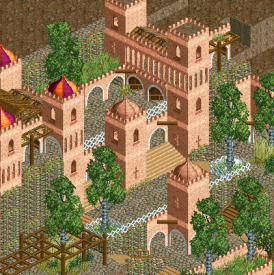
I wanted to say that I thought about St Pancras while building this, but in the end it turned out to be neither St Pancras nor KingsCross... (like you said). I changed the name, but the screen is a bit older and therefore with the old sign.
Forgive me, my brain is too tired to get the translation between thinking in german and writing in englisch
-

 CoasterCreator9
Offline
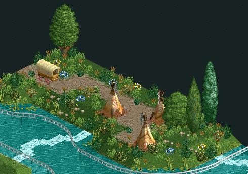
What do you guys think of this foliage? I feel foliage is my weakest point, eager to improve however.
-

 Hex
Offline
It looks OK, but it looks like too much grass objects. I would use some more bushes, but don't over do them. That's just me though. Other than that I think it looks lovely.
 -

 RCTER2
Offline
I agreen with SuicideCarz, Too many types of grass objects.
 Which is impossible in the real life. This is not a garden.
-

 In:Cities
Offline
Just to show that I'm still building.
[No worries, progress is still being made on my other parks. This is just something that hit me with inspiration at the time, so I'm focusing on this for the time being] -

 Comet
Offline
chapelz, I really like where you're going with that
It's nothing special right now but I can imagine it being great if you continued putting the pieces together
Definitely gets me excited to see what you come up with in H2H
PS- spotlights will never reach their full potential in my eyes until you, Turtle, and Steve do a full size park together with today's custom scenery -

 robbie92
Offline
Ur shit, plz leave.
Looks beautiful, although lacking some of the magic you've had with your other work. Landscaping, terraforming, and levels are on-point as always, though. -

 Comet
Offline
The rock wall you used looks way too similar to the crazy path, making it hard to notice the elevation change
I don't know what to recommend, maybe more foliage along the rock walls or just a different kind of path. Not sure
Other than that it's really good tho -

 chapelz
Offline
this stuff is just for shits and giggles on the h2h bench. as such it is missing a couple of pieces that i would like to use to better pull this off. notably the bright green hedge (mix it in with the rockwall to better show off the height). just improvising without and it is not working out well.
 -

 CoasterCreator9
Offline
U talkin to me?
I believe that was sarcasm aimed at chapelz.
___________________________________________________
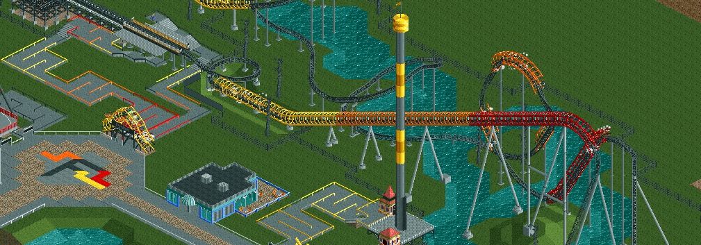
Progress shot on Fusion:
-

 djbrcace1234
Offline
You need to dabble into custom scenery more often. It's so much better than your other work.
 -

RMM Offline
Ur shit, plz leave.
Looks beautiful, although lacking some of the magic you've had with your other work. Landscaping, terraforming, and levels are on-point as always, though.
terraforming huh? was that in the expansion after timetwisters?
-

 FK+Coastermind
Offline
Everybody keeps dumping things cause H2H....i don't wanna be left out, so, PLOP


FK -

Wicksteed Offline
Whaa...I wanted to comment on MCI screen and now theres hundred amazing new screens inbetween. Anyways:
MCI - Great. Your CSO work is much better than your NCSO work, in my opinion.
 Tags
Tags
- No Tags

