(Archive) Advertising District / Dump-Place
-
 19-April 07
-

 CoasterCreator9
Offline
I like the theater, don't really like the checkerboard ground texture inside though.
-------------------------------
Obviously unfinished, but I felt like sharing.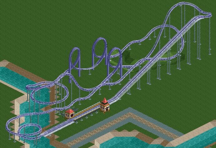
It's called Cloudchaser, the name and the color choice is connected. (If anyone gets the reference, I will be shocked.. The three colors on the trains are the same purple, white and a pastel(y) blue.)
-

 MCI
Offline
I just started my first cso-project.
It´s really the first time I´m seriously dealing with CSO and I think I could need some tipps on that...
You can see a small station. This isn´t a park, it supposed to be a "model railway system" (?(dont know how you call something like that in Englisch^^))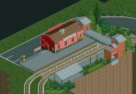
-

 Dimi
Offline
Very nice, MCI, but watch out with the green flowers. They can be a good filler between other foliage, but I don't like them when they're used too much.
 -

Whitehawk Offline
Xtreme97, I love that restaurant, although I feel some gardens between it an the road would help to fill in the empty spaces.
MCI... I absolutely love that concept. I know what my next random RCT adventure will entail... -

 Cocoa
Offline
not bad. a little on the boring side but it reminds me of turtle, which is a good thing. pretty decent foliage, although a bit standard.
 -

 Liampie
Offline
I love the landscaping, really cool. Architecture is not bad, just boring.
Also you should revive that vox thing! -

 Dimi
Offline
Looks like the landscaping is going to be quite spectacular! The architecture is a bit boring indeed, but I love the foliage.
 -

 MCI
Offline
Well, I didn´t expect that much positiv feedback to be honest^^
I have another screen for you, maybe I´ll open a own topic for this the next days...
_______________________________________
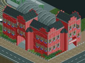
The following screen shows the (not finished) big Mainstation on this map.
It´s a weird mix between St Pancras and my own imaginations even if I named it KingsCross (I´ll change that...)
There will be more details, when the mainbody is finished. I just wanted to finish the mainbody first, to prevent myself from loosing too much progress if my 8cars goes crazy while doing the details...
Gruß
MCI -

 trav
Offline
That looks nothing like Kings Cross or St Pancras.
It's not bad though, just change the name plz
 Tags
Tags
- No Tags

