(Archive) Advertising District / Dump-Place
-
 19-April 07
-

 Ling
Offline
 @ Fort Fry
I really like that screen, woofenskid.Edited by Ling, 04 April 2008 - 11:33 PM.
-
![][ntamin22%s's Photo](https://www.nedesigns.com/uploads/profile/photo-thumb-221.png?_r=1520300638)
 ][ntamin22
Offline
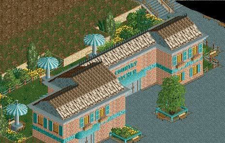
that flat roof segment just looks bad. If you've got qt pieces that can fix that, do it. Otherwise just use a different roof type.
The main problem here is that you've got the same thing going on both levels. Create some visual interest by having a different type of wall or roof on the top level than on the first, but keep the same windows to retain a sense of unity for the entire structure. please, though, change the white windowframes. They're kind of garish when viewed from the wrong angle. -

 Nokia
Offline
well,
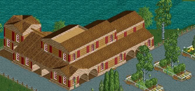
im kinda new here and ive been wokring on this park
its about 50% complete
heres a screen of one of the resturants
-

 robbie92
Offline
This is a test for a Barcelona section of a Mediterranian Disney park. The building based on Gaudi's apartments. Criticism is welcome.
Modernisme Building -

 Comet
Offline
I like that Nokia, it's pretty nice.
Maybe make either the top or lower level of that building a different brick so the textures are at least a little bit varied. Also, maybe put a layer of crown molding where the blue brick is if you have them in the bench.
The tables could also maybe be done differently in the back area there. -

 nin
Offline
This is a test for a Barcelona section of a Mediterranian Disney park. The building based on Gaudi's apartments. Criticism is welcome.
Modernisme Building
by mediterranean you mean, located in/near?or themed around?
screens are nice. I like it, but change the roof. -

 robbie92
Offline
^I mean Mediterranian-themed. For the roof, do you mean the border or the chimney spires?
 Tags
Tags
- No Tags


