(Archive) Advertising District / Dump-Place
-
 19-April 07
-

 Turtle
Offline
Leonidas, i hope you're signed up for H2H... and i hope we end up on the same team. I have an awesome idea that we could definitely make together.
 -

 rct2isboss
Offline
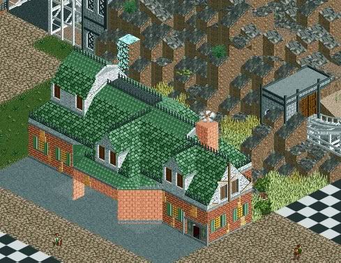
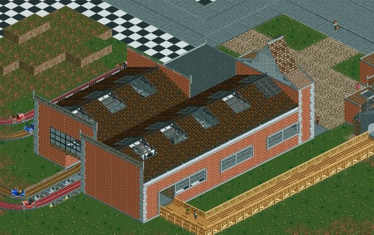
The path in the second screen looks like it would fit into a jungle style theme really well. The first screen looks like a really nice house attempt.
 -

 RCTER2
Offline
@TwistedHelix
That NCSO RCT3 staion is very great.
Haha it suits my taste.
@ivo
Your style is unique here, one can easily find your work.
-

 leonidas
Offline
Jaguar: I really like the first screen. But the station in the second screen seems way too
huge for the kiddie ride it's for. Not very inviting and youth-appealing also.
Nope, I don't even know what that is, but I guess I'm too late now..Leonidas, i hope you're signed up for H2H... and i hope we end up on the same team. I have an awesome idea that we could definitely make together.
-

 ivo
Offline
I drunk quite a few beers so first this...
I want to apologise make a little apoligise. I look at this site forever but almost never react. I got loads of time but I am kinda afraid to react here. I am not good at reacting in words and even worse in english. I have the feeling it seems to be very arrogant to the other members to post a screen but seldomly react on one of them. I hope I still make a contribution to this site although it ain't in a text way.
Sorry for my use of words. It wasn't the best. It still isn'tI would hardly call this decorative, my goal is thematic atmosphere.It's not meant as a theme-park area, it's supposed to be a fictional Tibetan Village..Thanks though!
I can see what you are trying to achieve here. It is not that I think you failed at it. I think you are the one of the best in that section in rct2 and the best in rct3. I just think you can can/should put your boundaries a lot futher. Try it in a not realistic way. Mor on the feeling side.
To get this took me years of learning. Outside rct and not in a acid way.ivo - do you drop acid and just build whatever the fuck comes to mind?
I have to say the composition is not made beforehand and takes shape during the building. The thing I really like about this way of building is that it takes ideas from different moments. It all ended up as a very layered product.^ It doesn't look random. It seems to be very consciously composed and well thought through.Looks great, Ivo. You've captured both a suburban and urban atmosphere.
edit: You can be a very usefull h2h member though your opinions and builing. It ain't to late haha.
Thank you! I still need to PM you one day haha.Ivo, holy fuck! If this park is more coherent that Taboo it might be one of my favorites.Oh, also, that screen is incredibly inspiring, Leonidas.
@ivoYour style is unique here, one can easily find your work.

I never thought about that haha. Never expected that people see it that way you know. -

 Jaguar
Offline
Just out of curiosity, does my work finally have a chance at recieving an accolade? Will I have a chance of being drafted?
 -

 rct2isboss
Offline
Yes and yes. If you finish the whole park and it has cohesion then you could score a bronze or silver. But you also need to worry about the layouts, theming and such. You could be drafted but probably in the last round.
 -

 Dr_Dude
Offline
leonidas, please sign up for H2H! I'm not sure how quickly you build, but you'd propel the quality of any park skyward with only a few structures.
I think you have a pretty good chance of being drafted, and I think that if you could maintain the quality of the first screen you could absolutely get bronze, maybe silver. The second screen's archy is too blocky, and the walls extend above the roof.Just out of curiosity, does my work finally have a chance at recieving an accolade? Will I have a chance of being drafted?
In personal news, my shitty PC won't run RCT2 anymore, or at least couldn't the last two times I tried. Hopefully this will be the catalyst that finally forces me to get Windows running on my laptop. -

 leonidas
Offline
I think I won't join. I'm very new to this game, and the screen I just showed can be quite misleading. It's completely within my comfort zone, and took me days to construct. Hell, even that little gate took me a full day..
Plus I'm a complete noob when it comes to the technical aspects of RCT2, hacking, 8cars and so forth..
Maybe next time.
-
 ScOtLaNdS_FiNeSt
Offline
Leonidas Hell im a noob to and the screens i have posted haven't had the comments you've had, There is no guarantee h2h will happen a next time, Considering most people that viewed your screen nearly had a stroke because it was so good. I mean go for it man
 Plus no doubt without your not so much hacking knowledge you will be in a good team with people that will help you. TEAM - Together Everybody Achieves More. Go for it
-

 Xtreme97
Offline
After getting lots of inspiration from Pacificoaster's screen and google images, I built a restaurant using the Louis! 2012 Bench.
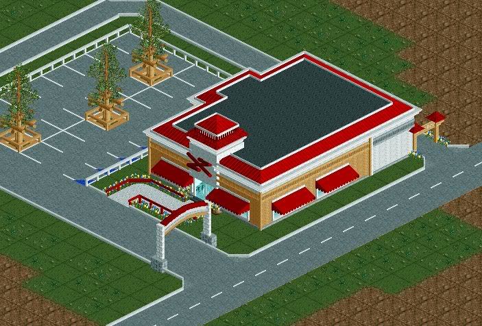
I built an interior too: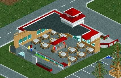
-

 Nitrous Oxide
Offline
Xtreme97 - That looks really good man. In all honesty, "personally" I never understood going to such great detail of things that are hidden by rooves. Something next to a window that can be seen is understandable. Nontheless though, it looks great. The only constructive critism I would have would be the outside of the restraunt is a bit boring and could be spiced up a bit.
 -

 Jaguar
Offline
I just re-did a station:
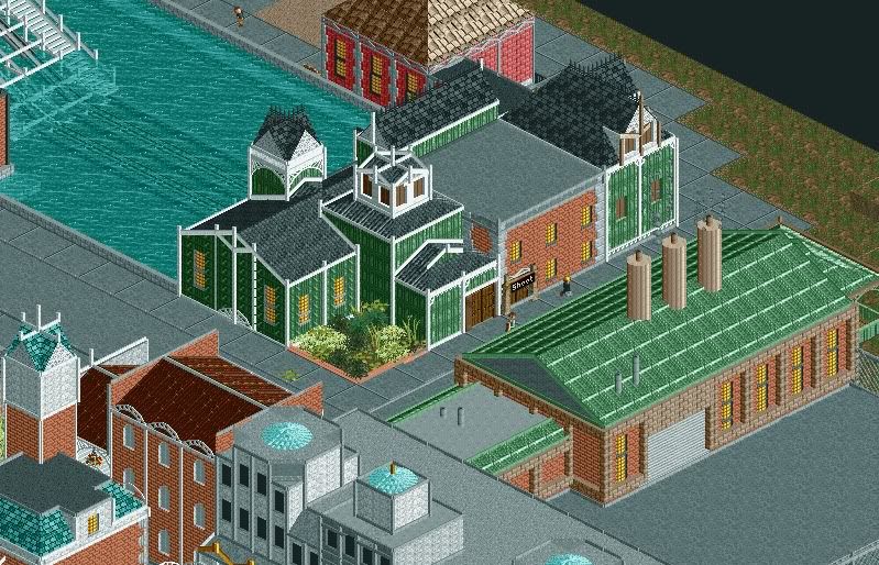
For comparison: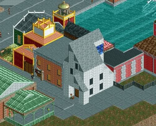
Also, should I demolish this old structure that I made awhile ago? I'm not sure if it looks good or not and it was a bit of a pain to build. Would keeping it lower the quality of my park?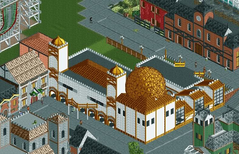
 Tags
Tags
- No Tags
