(Archive) Advertising District / Dump-Place
-
 19-April 07
-

 K0NG
Offline
Probably because they all look exactly the same (except for the original dozen or so).
And...props to Louis on this bench. MUCH better than the one for NEDC. -

TwistedHelix Offline
Both of thoose eateries look really nice.
Coastercreator I like the layouts but feel theres too many coasters there for the size of the area you've shown.
Nin: Thanks for the comment and i can see where your coming from but I think it may have been the angle I was taking the picture from that meant that it had a much heavier western theme to it. I've taken one in a rct style view of the ride so far and althoguh it doesnt look as nice you can see from this angle that metal plays a much bigger role than the first picture showed.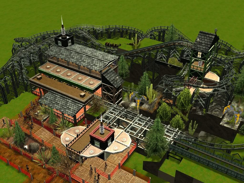
Cheers
TwistedHelix -

 Liampie
Offline
I don't know why, but it reminds me of Calypso Quay. You should've been on Calypso Quay instead of me.
 -

 Louis!
Offline
Thanks K0NG, much love
BTW, these are starter benches. They don't have to be used. However it is nice to see people using them, the RCT2 one will become the 'Official Louis Workbench 2012' once the contest is over. -

 Dark_Horse
Offline
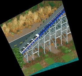
Leonidas, I love it. Reminds me of Asia in Disney's Animal Kingdom.
ivo,
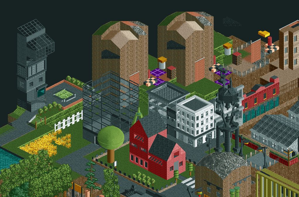
Corrected for spelling.that's so cool in an awkward way


-

 leonidas
Offline
^ It doesn't look random. It seems to be very consciously composed and well thought through.
Looks great, Ivo. You've captured both a suburban and urban atmosphere. -

 Dr_Dude
Offline
Ivo, holy fuck! If this park is more coherent that Taboo it might be one of my favorites.
Oh, also, that screen is incredibly inspiring, Leonidas.
 Tags
Tags
- No Tags


