(Archive) Advertising District / Dump-Place
-
 19-April 07
-

 trav
Offline
I'm not a fan of the landscaping or the sign at all. But the little details like the fence and the little shelter are good.
 -

 Louis!
Offline
Landscaping could definately be done better, don't rush things. But it's nice to see you trying to break into a theme.
 -

 posix
Offline
I think it's really good actually. For once the rocks are used as direct theming and not just landscaping or fillers.
 -

 Dimi
Offline
Coupon: It's really great that you're trying a (new) theme! For the landscaping, I'd suggest using the normal landscaping tool as much as possible, and use the quarterblocks only for the finishing details. That always works the best for me. Als don't use the green bushes on the rocks, it looks better without them. I'm looking forward to seeing more of this!
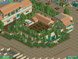
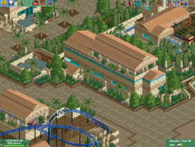
Whitehawk: You're improving, but you still stick with the same colour scheme and the same architectural pattern too much. It's not because one building looks really good that all other buildings have to look the same. Try to vary more without losing the flow. -

 Xtreme97
Offline
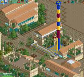
That blue/yellow/pink drop tower is making my eyes bleed. Otherwise, that's pretty good work. Perhaps put a fence around the palm tree planters and add some bushes.
 -

 CoasterCreator9
Offline
I disagree, I like those colors, but I do agree with the fence idea.That blue/yellow/pink drop tower is making my eyes bleed. Otherwise, that's pretty good work. Perhaps put a fence around the palm tree planters and add some bushes.
-

 Xtreme97
Offline
The colour combination as a whole works nicely but set into the egyptain style background the contrast is way too harsh in my opinion.
Some new work of mine: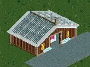
-

 BelgianGuy
Offline
whitehawk if you'd change the path style it would make it blend less and feel more flowing in terms of colours cuz now it's just a blur of tan and is hard to focus since the path has the same colour as the buildings, try something else maybe to make everything be more defined in the screens
 -

 Hex
Offline
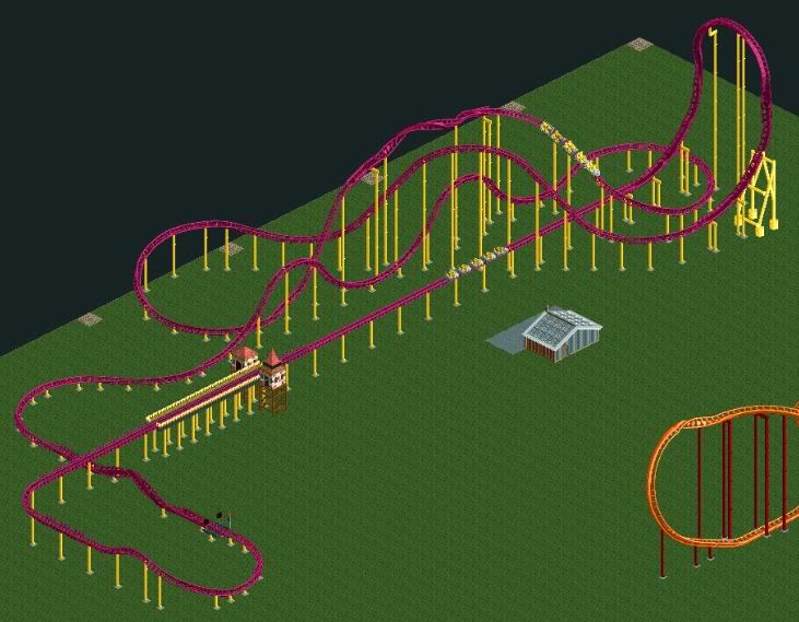
-Xtreme, The layout isn't bad, but the last barrel roll is unnecessary... I'm not too crazy about the color scheme either. But it is a nice layout other than that!
-Whitehawk, being a fellow NCSO builder (basically all the time) I like the style, reminds me of some of my current work. I enjoy the style, but it is very brown. I've learned in the past that when you build an Egyptian theme, you can't always use the crazy footpath, it gets repetitive. Other than that it looks great! -

Whitehawk Offline
Thank you guys! All this feedback is definitely good to hear.
I definitely see your point about the paths, and the brownness, I'll figure something out on that. -

 Fizzix
Offline
Coupon nice to see you exploring themes! Whitehawk, this really gives me a ROB vibe, and I love it(although I enjoy the drop tower's colors, I don't think they belong here). Xtreme, I can't get enough of that layout, great job!
 Tags
Tags
- No Tags


