(Archive) Advertising District / Dump-Place
-
 19-April 07
-

 leonidas
Offline
edit:
The editing is super kitsch, but somehow I like those screens! They have character.
-

 RCTER2
Offline
They are not good so I have to beautify them,edit:
The editing is super kitsch, but somehow I like those screens! They have character.
 Im building some small maps before my huge construction plan
  Still learning
-

 CoasterCreator9
Offline
100% Functional/Rider friendly:
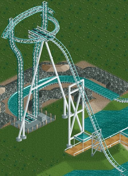
(Surroundings a WIP, thanks to Corkscrewy for the tower inspiration!) -

 GigaG
Offline
And that includes the double lifts on the tower? Like 2 cars can be on it at once? How did you do that?
 -

 CoasterCreator9
Offline
And that includes the double lifts on the tower? Like 2 cars can be on it at once? How did you do that?
Not that part, sadly.
-

 BC(rct2)
Offline
That coaster is the type of the new aquatic coaster of Mirabilandia, called Divertical!
I can't wait to see (I'm talking about your coaster)!
-
 rct2isboss
Offline
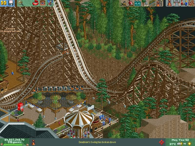
Love it besides the random block landscape in the bottom right corner. Also the umbrella colors could be changed.
 -

 CoasterCreator9
Offline
The umbrellas under the net are odd,
I thought this too. I love that coaster though!
-

 SSSammy
Offline
good interaction. one way to make it better is to follow the "posix principle". it's always better to look down on a passing ride then to look horizontally at it. if that eating area was raised or the natural lie of the land meant that the coaster was in a ditch would make it a whole lot better. try raising the whole non coaster area 1 or 2 units.
 Tags
Tags
- No Tags


