(Archive) Advertising District / Dump-Place
-
 19-April 07
-

 BC(rct2)
Offline
hey guys tell me if this bm wing-rider layout is good.

@hulk: I don't like to much the coaster. I think that it's intense, I don't know,
but that curves are not to intense? Work more with the last part of the coaster. -

 posix
Offline
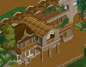
Scots, liking it. Has an elegant tranquility to it. Well done. And I personally don't mind the windows. Looks like it could be a guesthouse where each room must have a window.
What kind of project is this? You shooting for an accolade? -
 ScOtLaNdS_FiNeSt
Offline
Its a design
 . Hopefully, Im just going to do the best i can and see whats happens.
-

 Liampie
Offline
Looking good man, and not too much like your previous stuff. I spot only two of your old habits: 1) arcades, 2) the trims on the roof on the left. The arcades work here so no problem, but that roof doesn't. I'd use the same roof as the middle building and connect them so it looks like one building with two facades. Makes the architecture flow more.
 Good to see you're working again.
-

 posix
Offline
Turbin, I love how your style is evolving ever so slighty. Looks nice, although I think it'd benefit from different shades of brown to more clearly outline what parts belong together (=same shade of brown colour). So for example maybe one darker tone for the edges of the building contours, one tone for the fences, another for the balconies, etc. You have that already, but not enough in this case where everything is brown and needs to be distinguished as clearly as possible.
 -

 constructor
Offline
I'm not sure if I should upload it, because for a coney island (hove beach gta4) fantasy I believe it could be better (more coasters etc.). Besides, I'm not allowed to upload anything (already had this problem some time ago) so I think I will skip this one.Constructor are you going to release this park I know Id love to see it.
-

 Ruben
Offline
Okay, this one comes with a story.
Basically, this is an old park. Some of the Dutch parkmakers on this site may know me and this park very well, it is De Dwezelaar (version no. 4). I néver finished any of the ''versions'' and kept on starting over again. This one was at about 70% when I stopped working on it... I haven't touched RCT for over a year, but a recent Dutch park (Thanks Liam...) inspired me to finally start working on this again, mostly to honor the typical Dutch (especially rct-Guide) building style (ala Paul, Liam, Sven etc.) that seems to be very impopular nowadays.
The next screens are old work, just to give an idea of the project and see what you think of it. I was known for my minimalistic style, which kinda shows in these screens:
The supps are not great, I know. I didn't know much about supporting at the time, and my object selection (started this park in 2006/'7) is quite dated/imperfect.
Is there anything interesting in it? Worth finishing? -

 Liampie
Offline
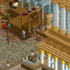
These screens don't do the park justice... The coaster looks extremely boring and the second screen is extremely bare and therefore void of any atmosphere. Unlike the rest of the park, which is full of atmosphere. I'd definately finish the park, but redo some of the weaker sections. Redoing may seem unlogical when you doubt you can finish the park at all, but redoing sections can start a inspiration tsunami. Worth a try.
For a start, get a new coaster and make the second screen more compact WITH TREES. Looking forward to seeing this finish. You will finish this. -

 Dimi
Offline
Turbin: I love it, and I personally think the colours work great! I just feel like the path should be a lot wider, depending on what you want to build in front of the building.
SuicideCarz: nice, but it lacks colour and I think the contrast between all the tan and the bright green grass is too big. I might be wrong, but it also seems like most of the map and the coaster is hidden for the peeps by walls and buildings.
Ruben: I agree with Liam that the parks has better spots, but I still love these screens anyways. I don't think the second screen needs any trees or more compactness. I think it would be great if you'd open a topic and advertise this park with a series of atmospheric screens before releasing. Advertising is entertaining for you and us.
 Tags
Tags
- No Tags
