(Archive) Advertising District / Dump-Place
-
 19-April 07
-

 Xtreme97
Offline
Thanks for the comments guys. I decided to remove the planter altogether and I also got rid of the flowers by the building, but now the path is just big, grey and boring. I'll figure something out eventually.
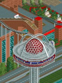
Great screen Roomie. I just don't understand why there are two tracks. Is it supposed to be a giga coaster? Also, your flowers are dying
-

 Roomie
Offline
It's the best you can do for Intamin Box track in LL, look at the Dragon Coaster by Loopy in Silver Valley and you get the idea.
 -

 Liampie
Offline
I'm not liking your realism stuff that much, but the ideas always save it for me. A revolving restaurant is fucking BRILLIANT. I don't care about glitches and colours and shit. It's a revolving restaurant and that's good enough. REVOLING RESTAURANT. BRILLIANT.
 -

 posix
Offline
Very creative idea. You and pierrot really show what codex can do. Still can't ever get over the lack of sense for visual appearance in your work I'm afraid.
 -

 Milo
Offline
It's a nice idea but still very, very rough. The supporting tower could use some love, it'd be very easy to add some glass portions and an elevator to actually make it look like a feasible structure. And the roof needs work, raw wooden track just looks bad imo.
 -

 That Guy
Offline
When the fuck did you get amazing? I especially like the tree in the top right, great plant pot.
 -

 Dr_Dude
Offline
I don't really like the magenta. It works with the ride but not with the surroundings.
 -

 wheres_walto
Offline
Good shit, bro. Only thing is I don't think those planter fences go with the area and type of park you're going for. Keep it up!
 -

 trav
Offline
That looks almost identical to CP6...
Feel free to take that as a good thing or a bad thing, however you see fit. -

 Louis!
Offline
^It doesn't look anything like CP6. CP6's work is clean and sterile, this isn't.
This is fantastic work Coupon. I do think the use of trackitecture will be a bit out of place but it's not that much of a major issue. -

 trav
Offline
^I think it looks identical to it, but I'm not a realistic builder, so this just looks like high quality realistic work, which is what CP6's stuff looks like to me. I'd consider that a bad thing though, as it's not his 'own' work in my opinion.
 -

 highroll3r
Offline
i agree with WW on the planter fence. they look so outdated compared to the rest. great screen!
 -

 Nitrous Oxide
Offline
Looks amazing Coupon. You've improved so much since I first started seeing your work at TPR.
 Tags
Tags
- No Tags
