(Archive) Advertising District / Dump-Place
-
 19-April 07
-

 leonidas
Offline
That looks quite decent FantastiCo, I'd like seeing some more subtle vegetation and textures though.
 -

 Cocoa
Offline
is that expedition everest?? what the fuck?!? cool stuff, send it over to me if you need any help!
 -

 ivo
Offline
I always like those reactions. They keep you sharp. I do agree that "Taboo" was a wrong name for that last park.With all due respect I think you're too busy doing the oposite of what's generally accepted.
This doesn't feel like artistic freedom, it feels like forcing a taboo up our throats, just
for the pleasure of kicking against the "establishment", so to speak.
You seem so focused on doing so that you forget the expression of your work. Don't let it
become nothing more than a superficial statement.
The first screen shows decent design, while the second screens shows nothing imo.
Overall it lacks feeling and atmosphere.
This is the dump place so I dumped. But it got things a little messy. The last three pictures on the previous page plus the first picture of my last post are just technical experimentation. For the last picture needs to be placed within a context. It is designed for an attraction. A drugs experience darkride attraction.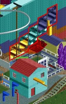
The area within the red part is the rhytmic part of the trip which I tend to experience sometimes. Think of rhytmic songs, counting and such.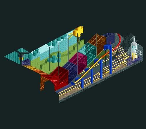
Hallucination -

 Liampie
Offline
Dat ding rechts lijkt op een regenbooghandzeeppompje.
I'm liking this more than Taboo and less than Testament. -

 ivo
Offline
Zin om een keer samen te trippen?
Well Testament was mostly Xcoaster his brain. I just have built quite a lot in it. -

 Dimi
Offline
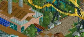
A drugs trip could be a great theming idea for a darkride. However, in that case only the theming itself should be fully surrealistic and 'impossible', whatever you want, while the ride track and supports, the entrance, the queue etc. need to have a certain level of realism and credibility. The second screen is great (assuming it's the interior of the ride), but the first screen is way to messy, unfinished and undetailled to be aesthetically appealing.
 -

 ivo
Offline
@ScOtLaNdS_FiNeSt: I tried to explain with all my power eh. And in all honest I don't do much drugs and it is inspired by the druguse of my friends aswell.
@Dimi: Thanks for the realistic point of vieuw! I think it is pretty realistic concerning supports, ride track and so on. That first screen ain't close to finished and I might have to rethink a few parts.
leonidas & J K: Thanks! -

 wheres_walto
Offline
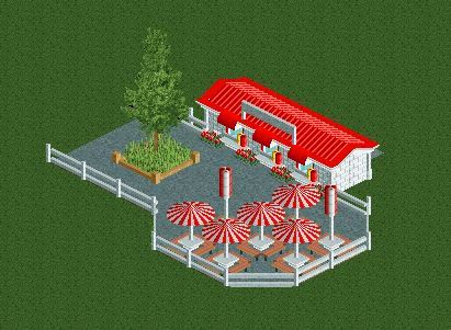
That's a pretty massive planter considering the scale of everything else, and I doubt there would be flowers under the windows while having long grass in the planter.
 -
 coasterfreak101
Offline
Xtreme that's really cute, I like it. I do agree that the planted is a little big, and the long grass doesn't make much sense considering that the flowers are nicely placed just a few feet away. But the seating area and everything is great!
 -

 J K
Offline
Argh I'm starting to get really inspired again. Maybe I need to get back to planning my next park. Awesome to see some roomie work again!
 Tags
Tags
- No Tags


