(Archive) Advertising District / Dump-Place
-
 19-April 07
-
 Jaguar
Offline
The combination of flying saucers, cauldrons, and monorail just looks incredibly messy.
It looks messy, but it's a great idea. Maybe it'll look cleaner without the monorail. -

 nin
Offline
It's good to see you trying new things. While this may be disgusting and messy, it shows experimentation.
 -

 K0NG
Offline
Yeah...it's a good idea and I can see what you were shooting for. But, like previously mentioned, it looks real messy. And I think it would look even messier without the monorail. Keep trying though...you'll figure it out.
 -

 ivo
Offline
@nin: I think Comet Craters is a failed park. Perhaps my only failed park. Not because it is so bad but because it was totally the wrong thing to do in my progress as builder and I had way to little fun on it. I don't really know if I ever return to that style. I pretty much left thinking in styles anyway haha.
-

 wheres_walto
Offline
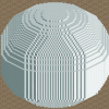
I spent entirely too long trying to figure out what that odd shape in the middle of the first screen was and how you managed to make it.
 -

 ivo
Offline
@Wheres_walto: Haha, that is nice. It was a little idea I had that made people wonder how it is made in rct.
@Cocoa: It is a semi-realistic park. The realism will keep this together.
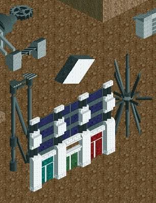
@Louis: for me it is just the other way around haha. I discovered more in the second screen although the first screen is aesthetic superior. Screen 2 will be used, screen 1 probally not. -

 leonidas
Offline
With all due respect I think you're too busy doing the oposite of what's generally accepted.
This doesn't feel like artistic freedom, it feels like forcing a taboo up our throats, just
for the pleasure of kicking against the "establishment", so to speak.
You seem so focused on doing so that you forget the expression of your work. Don't let it
become nothing more than a superficial statement.
The first screen shows decent design, while the second screens shows nothing imo.
Overall it lacks feeling and atmosphere. -

 Dark_Horse
Offline
Just to show I am still alive...
(Please ignore the glitchy-ness, I plan on fixing it) -
 ScOtLaNdS_FiNeSt
Offline
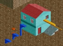
I just dont like it at all im afraid, Too much red for a start and the archy ... I dont like
 -

 highroll3r
Offline
yes. too much red.
-continue the roof otherwise itll look too square.
-the diags on the tower bit are awful. round or square is needed there.
-the building needs a purpose. atm its just hollow blocks. shops or a way into it is needed.
-change the path or colour of the building.
continue playing. every members work here is appreciated by me in some way. you have a good scale awareness. -

 Dark_Horse
Offline
Thanks for the comments, highroll3r and S_F. I agree that it was too much red, so I changed the path and the top of the tower to grey. I also replaced the barn doors and left the facade open.
Turbin3: Pretty good screen. My only complaint is how you have these light colors in the foreground, but the building in the background is so ominous. I would try to make a smoother transition. Try using a lighter color trim on the dark building.
 Tags
Tags
- No Tags


