(Archive) Advertising District / Dump-Place
-
 19-April 07
-

 FredD
Offline
Yeah I'd also change the red carpet. Just || would be better I think. Nice work on the archy!
 -

 Turtle
Offline
I think it looks fantastic, apart from the textureless arches at the front... never liked the texture of those pieces.
 -

 chorkiel
Offline
That are some horrible color combinations, the brown blue and red don't match at all..
 -

 nin
Offline
Excited to see more work from you, though I do think you should return to your Comet Crates style at least once more.
 -

 Liampie
Offline
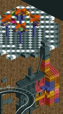
Reminds me of Parc Asterix (the real park). I like it for the most part, good job. Some good details, and wonderful foliage. Three things I don't like: wall on the left is very underdetailed compared to the rest of the screen (an unwelcome contrast), it looks stupid how the round tower gets wider near the bottom as if it's melting, and peronally I'd prefer if the overhanging building was open at the front instead of the sides. And RRP has a point about the paths. Overall, good job though. 70-75%.
-

 wheres_walto
Offline

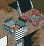
It's in no way a finished screen, but fuck it; I've been productive lately and here's what I've got. -

 robbie92
Offline
The combination of flying saucers, cauldrons, and monorail just looks incredibly messy.
 Tags
Tags
- No Tags


