(Archive) Advertising District / Dump-Place
-
 19-April 07
-

 nin
Offline
That is so good. Your style has always been one of my favorites, and it's good to see that it's improving.
 -

 RCTER2
Offline
Hi, Flap, can you upload your Objdata Folder to another place? Because Megaupload is down now.
 -

 Cena
Offline
Louis, although it's good (better then NE avarage), I still think it looks bad for you being the creator. During H2H5, you were almost on the same level as this, and that's 2.5 years ago. I think you haven't played enough to get a lot better. Would like to see it happen though, but with how busy it is ... I think that will stay as a dream ...
 -

 Louis!
Offline
Was hoping for a few more replies, but hey ho. Thanks to those who have replied.
Maverix - I miss it too Just struggle now with inspiration and doubts of my own ability.
Cena - Really? I thought i'd improved a lot, even if i'm not at the 'full potential' -

 CedarPoint6
Offline
A tribute to Linear Gale, I suppose? Sad to see the real one go, so I'm glad you made one here. It's very impressive, but I challenge you to finish. At least a mini park or something with it. To me, the appeal is in the completion and seeing the idea executed in full. Is this set in Japan as well or somewhere else? I'd really like to see you complete something with it.
 -

 robbie92
Offline
I feel about this like I feel about a lot of your work, in that it's all technically great and has certain aesthetic qualities that are admirable, but it just lacks a certain character that elevates it from good to great. Posix is right in that it feels modelistic, but I see that in a lot of ways as being merely representation of a fuller idea rather than a full manifestation. With people like RRP or CP6, there's this element of character behind the work that seems to give it a history and a background, a subliminal depth to elevate it beyond what's merely represented. Most people miss out on it, but I think it's only a bit more obvious in this case because your work is closely-related in an aesthetic sense, and so the comparisons are easier to find.
 -

 Pacificoaster
Offline
I personally admire this quite a bit Louis. The support work is near perfect in mimicking Linear Gale's, however the track could extend about 30 ft higher. The facades on the street could use more detail and the awnings along side the launch seem to have little to no purpose. other than that it's great to see your 2 progressing.
 -
Xcoaster Offline
Yeah, it was pretty immediately obvious what you were going for, looks very good. However, it does seem like both Linear Gale and the parachute tower were a bit taller in reality.
Also, I think the real one had awnings there for the overflow queue. -

 posix
Offline
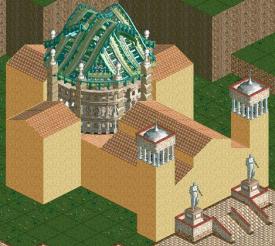
Wow, that is very creative Liam. Really impressive how you used the colosseum to indicate a dome like structure. The stacked blocks work really well on it, too.
It's funny how undetailed the other shapes of the building are because in comparison they look so naked. Obviously, they haven't been touched, I know, but I'm just thinking of what kind of task this would be to match them with a similar detail level to harmonise it all with the middle and couldn't possibly think of how it could be done. What does the brick look like on this? Should immediately make it better. Also if you were to change the green roof to the same red as the other rooves- that would turn it into an italianesque chapel sort of thing.
Anyhow, very intriguing! -

Airtime Offline
That is fucking good Liam! I'm not sure on the colour of the wooden dome, it seems too contrasting with those colours. -

 Louis!
Offline
Cheers guys
 and CP6 - Yeh the plan is to complete it as a mini park, but expand on it in phases, eventually ending up like Tokyo Dome City, where it's 3 areas completely seperate from one another. And yeh, set in Japan, although not exactly set anywhere.
-

 Cena
Offline
If you want the ferris wheel from Thunder Dolphin ... get on msn and I have a little surprise for you.
 -

 SSSammy
Offline
the red carpet is WAY too sickly. also, i almost wish those ornate things on each side sat atop a tower of some sort. an easy way of accommodating this is moving small scenery on those tiles using MOM then building underneath. but yeah please do something about that red.
 -
 Timothy Cross
Offline
"Fantissima", something about that name I love, lol
Agree with SSSSSSSSSSSSSSSSSSSSSSSSSSSammy. Maybe if the red carpet was more like checkered red and asphalt in certain areas. Also yeah, i too would say the towers on each side need more purpose for being there,
dig it though, sweet stuff.
 Tags
Tags
- No Tags

