(Archive) Advertising District / Dump-Place
-
 19-April 07
-

 Flap
Offline

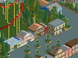
Verry WIP, The story behind this coaster you can read later, but everything here is designed on a story behind the coaster. Greetings from Holland. -

 Cena
Offline
A few tips.
1. Other pathing inside houses/buildings.
2. I have no clue what the buildings are, maybe identify them more with color or signs.
3. Coaster look nice ... try to make it more visable for peeps.
4. Now you have planters with tropical trees, try to stick with one environment, or hot, or cold, and use the trees for that
5. Maybe add a flowerbed or fountain to the pathing, all those individual planters/trees look too busy in my opinion.
I like the colors you are using
-

 Baros
Offline
hello everybody i'm new here and like to have some feedback http://www.nedesigns...ark-portoverde/
be gentle i'm noob
Grtz Baros
-

 Flap
Offline
One tip: I think this is not the right place to ask for this question. If you want feedback, create a topic here before you upload something.
 -

 turbin3
Offline
Flap, why do you still post here? You always say how much you hate NE and how bad it it and so on! Dumbass!
 -

 SSSammy
Offline
don't be hating in here, please. keep the handbags to pm's. i don't come on here to read this shit.
 -
 ScOtLaNdS_FiNeSt
Offline
Yes please keep your 'agenda' with flap in private, as sammy said i too thought when i saw, "Dump Place" ... Turbin3, I thought good a new screen but to come on and see your pointless post about flap. Discuss your dislike of Flap turbin in pm not in dump place
(Edit) Ohh and Flap, Im sure i have seen this screen before or something extremely alike, I am not to sure im a big fan of this screen. -

 Cena
Offline
Flap, I want to download your objdata folder ... But the FBI don't let me. Maybe re-upload it somewhere else since MegaUpload is now under FBI supervision...
 -

 K0NG
Offline
@In Flames: Not terrible, but a little diversity would do wonders. Right now, every square of every building is exactly the same as every other square on that building. Switch things up and...not every wall needs adornment (particularly with NCSO).
 -

 Flap
Offline
@Cena sorry i'm not able to upload a new one cause i installed TT and WW again now to reopen some old skool stuff.
To the others, this won't be a Design win, i just let you show i still build as just a hobby besides my work of a themepark engeneer now which is designing a brend new themepark for Europe.
This is also not a Design contestens here. i just using NE as Exchange cause this is the only one left online. -

 Louis!
Offline
NE has been so quiet recently it's ridiculous. So to hopefully get everything going, have a rare screen from me:
Inspiration
Enjoy
-

 Liampie
Offline
Wow, I love that. Not really liking the ground textures though, because it's all supposed to be on a roof. Grass and sand makes it confusing, at least it took me a while to figure everything out.
 -

 Louis!
Offline
Sorry should have said, Grass can be turf and Sand can be gravel. Use your imagination
-

 Liampie
Offline
That's true, it's perfectly realistic, but still confusing. I'd get rid of the plants on the gravel, that would help a lot.
 -

 hulkpower25
Offline
Louis Yes, Inspiration. Great work on the last Screen.
I have been working on a rct2 park for the past year, but now i need to finish the the last 2 islands.
Toon Lagoon, and Seuss Landing.
Anybody?
or should i remove both sections and make it work with three. Marvel,Jurassic,and Last Continent -

 Liampie
Offline
Why can't you finish them? Three areas is not enough in my opinion. Four is the minimum.
-

 BelgianGuy
Offline
do whatever you feel like I'd say if you are inspired to do the extra 2 just go for it and build them:D
 -
 Maverix
Offline
I really like that Louis, my only concern is that the past serval screens you've shown seem to all be separate parks, or at least have nothing else around them. Is it all one park or do you have serveral going on? I miss the "old" you where you just pumped out designs (though don't get me wrong, I'd love a whole park from you.)
 Tags
Tags
- No Tags
